iGaming · PWA · UX audit · Design system · AI in the process
101 RTP RevShare platform flow rebuild: frontend in 1 week instead of 4
The RevShare platform built in Claude didn't pass the developers' review. I ran a UX audit and fixed 65 issues, from the cashier to account security. I rebuilt the user flow on components already in the frontend, so development took a week instead of a month. To keep future versions from falling apart, I loaded the design system and the user flow map into Claude's context. Now it builds new screens by the rules and 2–3 times faster.
RoleProduct Designer
TeamThe only designer on the rebuild
Period2026 · MVP and rebuild
StatusIn production, being tested
Rebuild results:
UX audit65 issues fixed
Frontend1 week instead of 4
Design systemScreens 2–3× faster
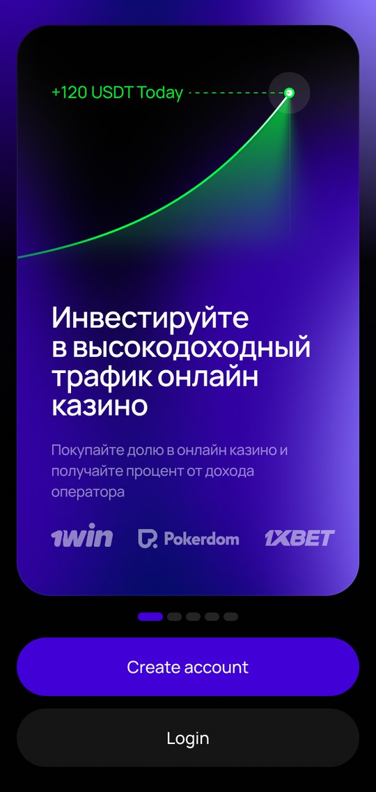
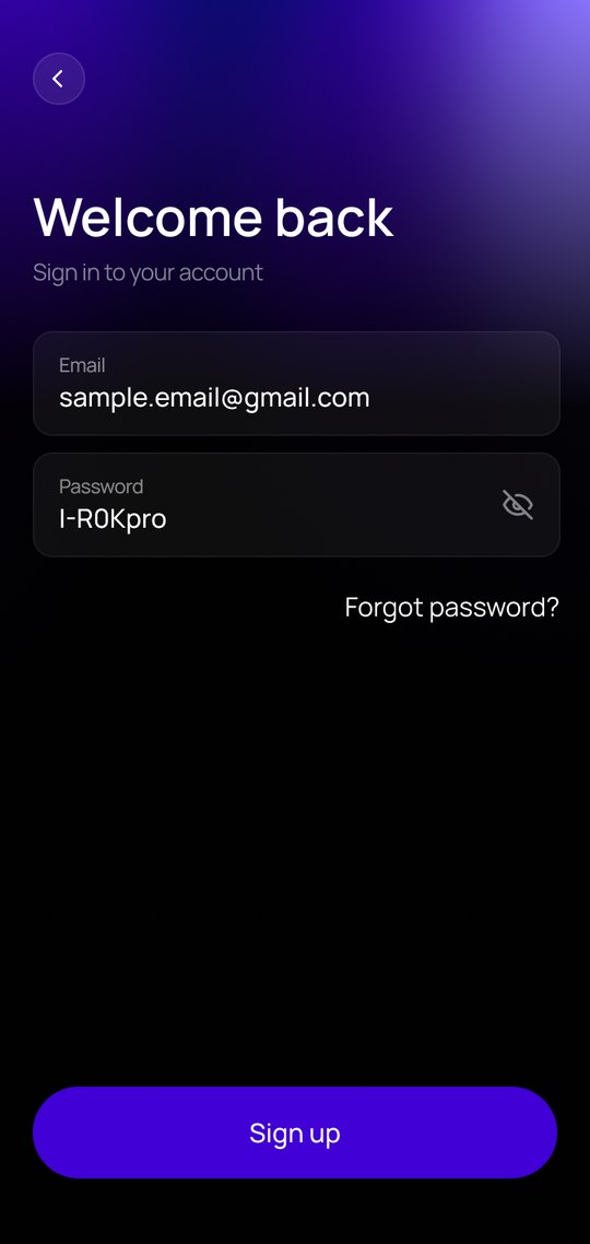
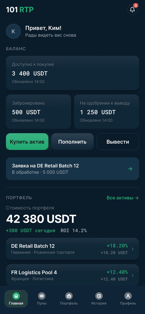
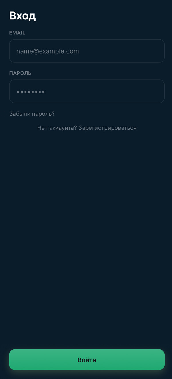
01 · Sign-in
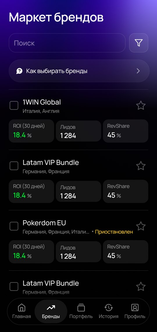
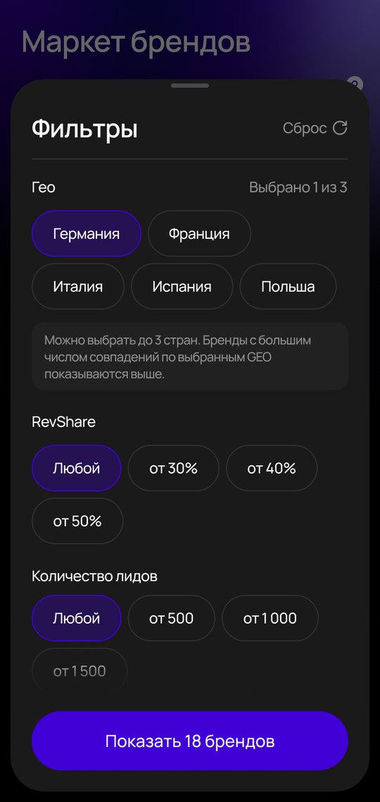
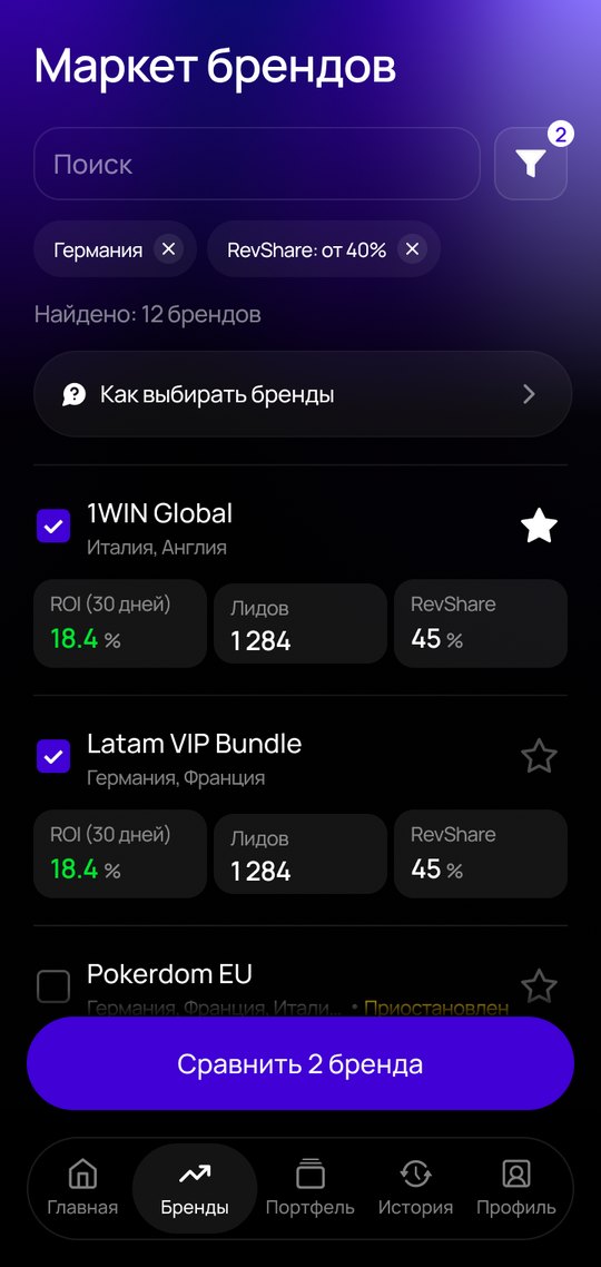
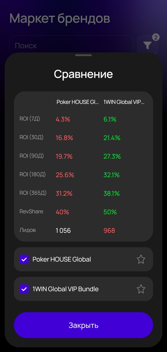
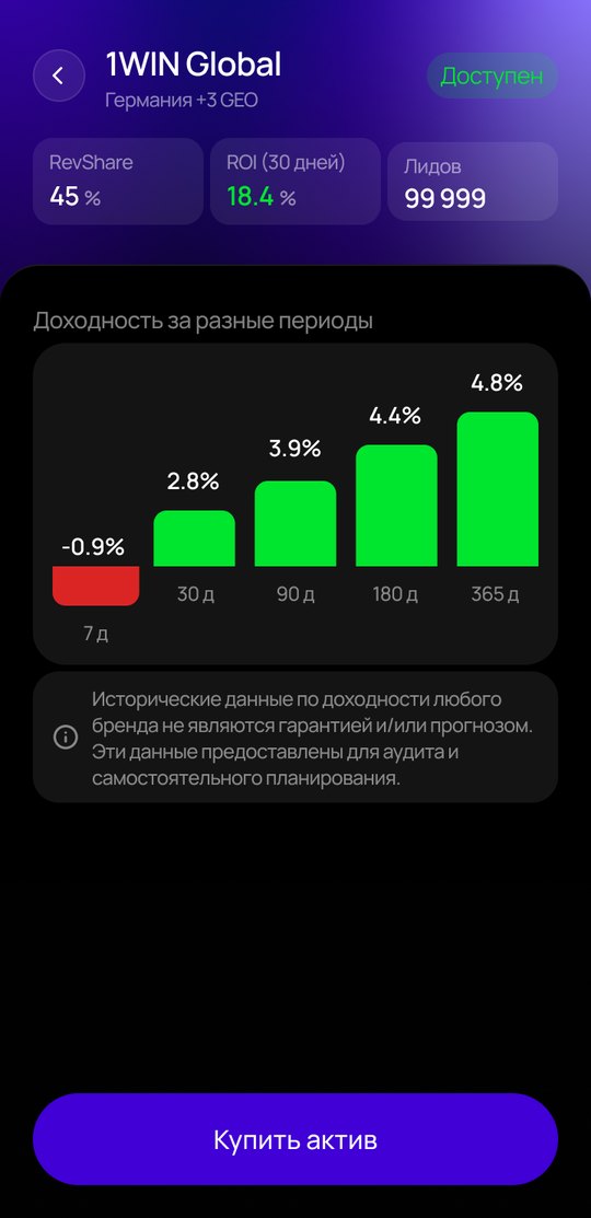
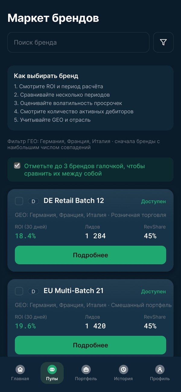
02 · Choosing a brand
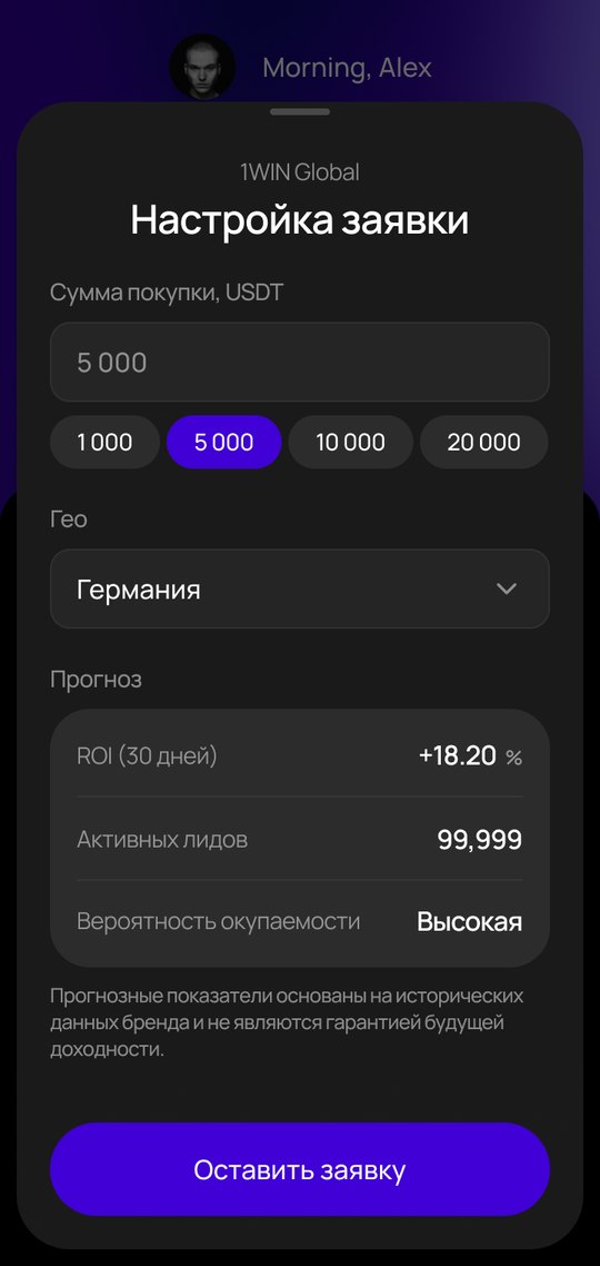
03 · Request
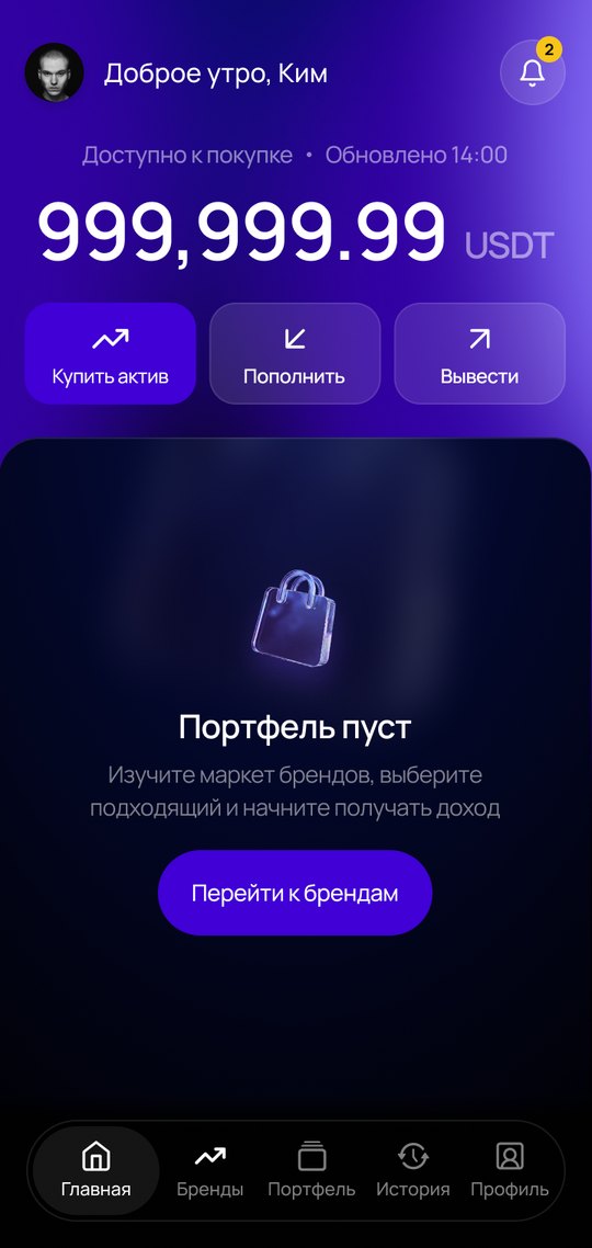
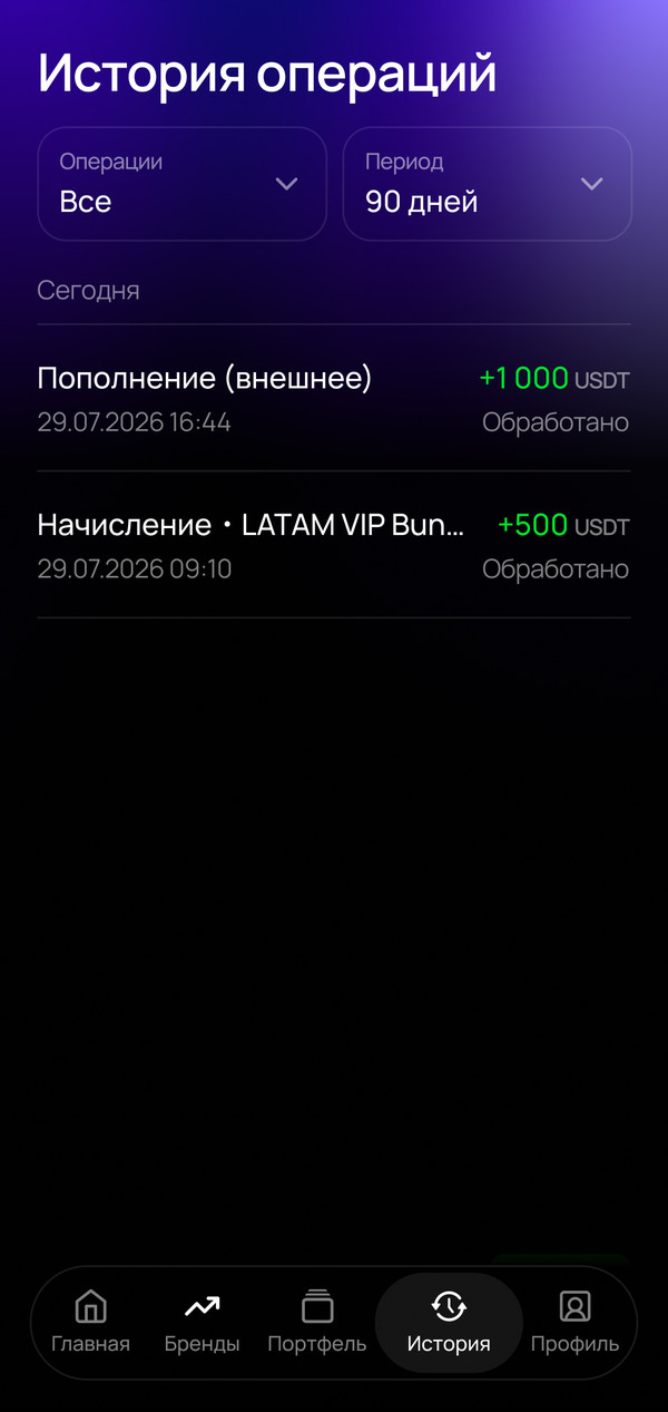
04 · Portfolio
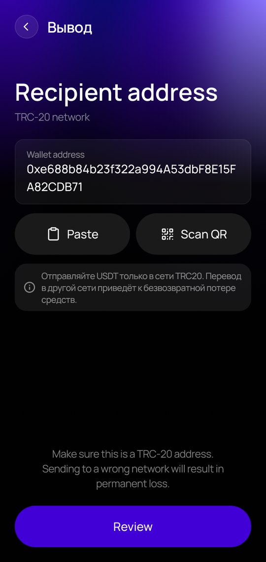
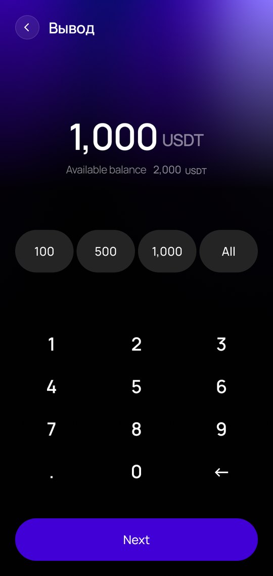
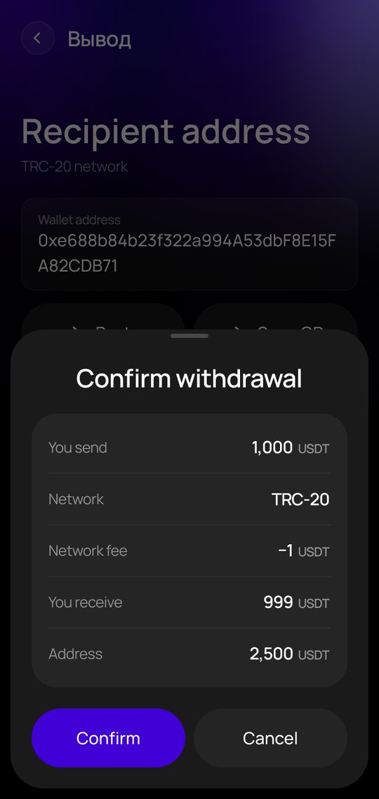
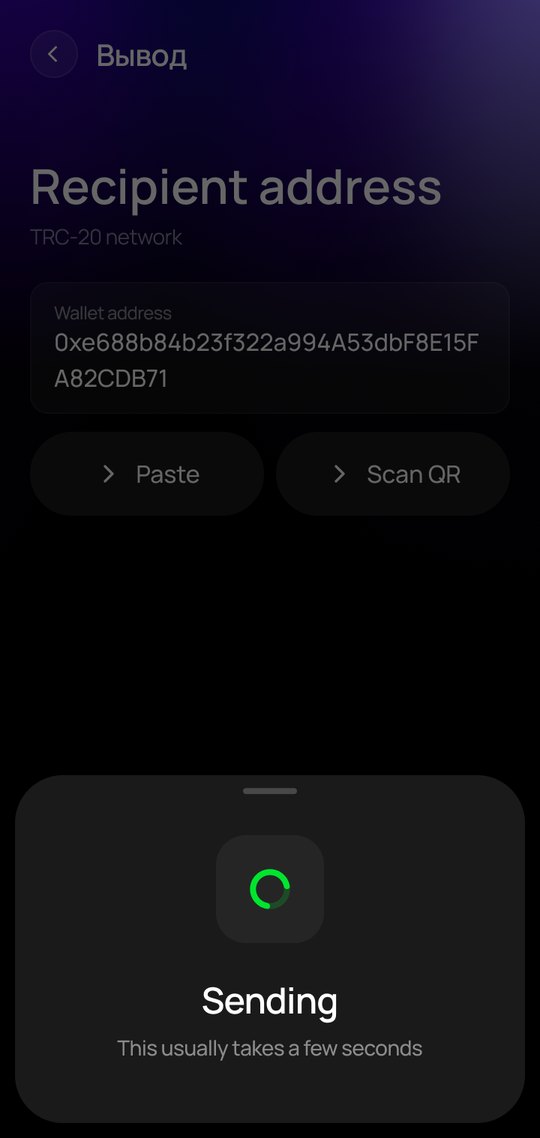
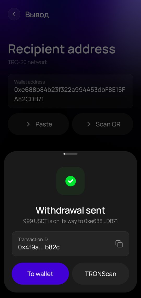
05 · Withdrawal
What the product does
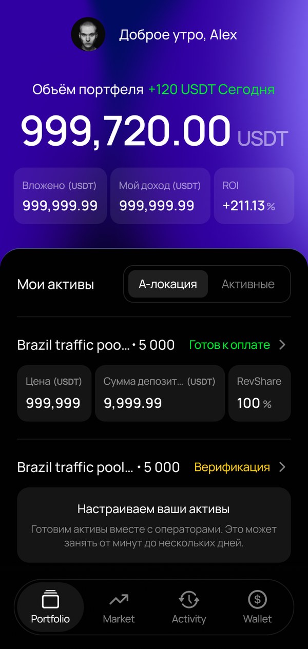
A B2C RevShare platform for mobile web (PWA). Users buy a share of online casino brands' revenue (a share of GGR), pick brands by GEO, leads and ROI, and get weekly payouts in USDT.
Brand market
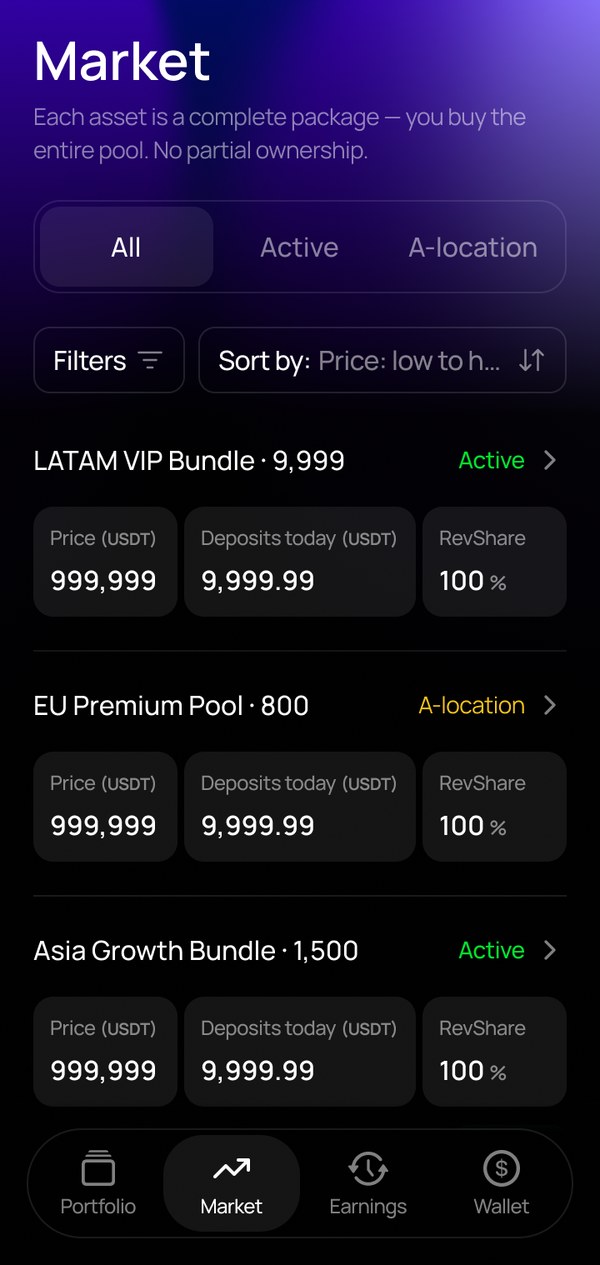
Filters by GEO, RevShare and leads, comparison of up to 3 brands.
Share reservation
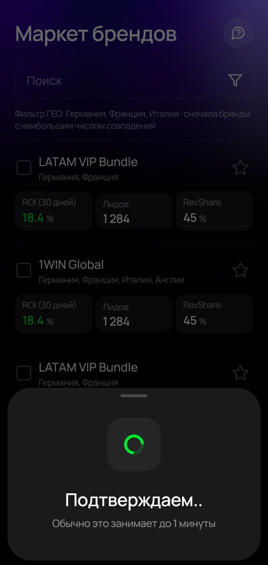
Request, funds reserved, 5-minute cancel window.
Cashier
USDT deposits and withdrawals on TRC-20, transaction statuses in History.
Portfolio
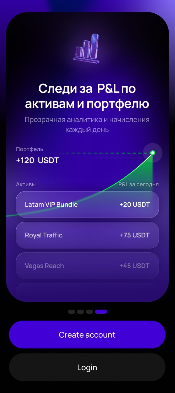
ROI by week and period, daily P&L.
Security
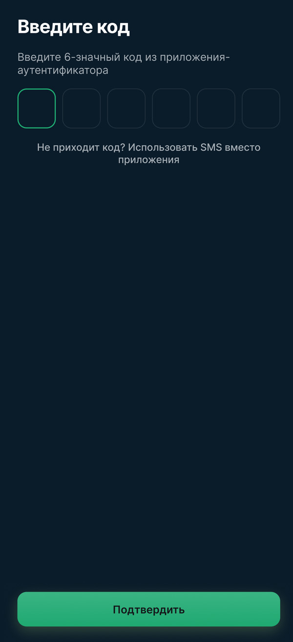
2FA, withdrawal address.
Context
I joined on a referral for a project-based contract to finish the MVP design other designers had started. In spring 2026 the designs went to development, and my part ended. The team then ran a round of product research and MVP testing, and the user flow was heavily reworked based on the results. To save money, they built the new version in Claude, without a designer.
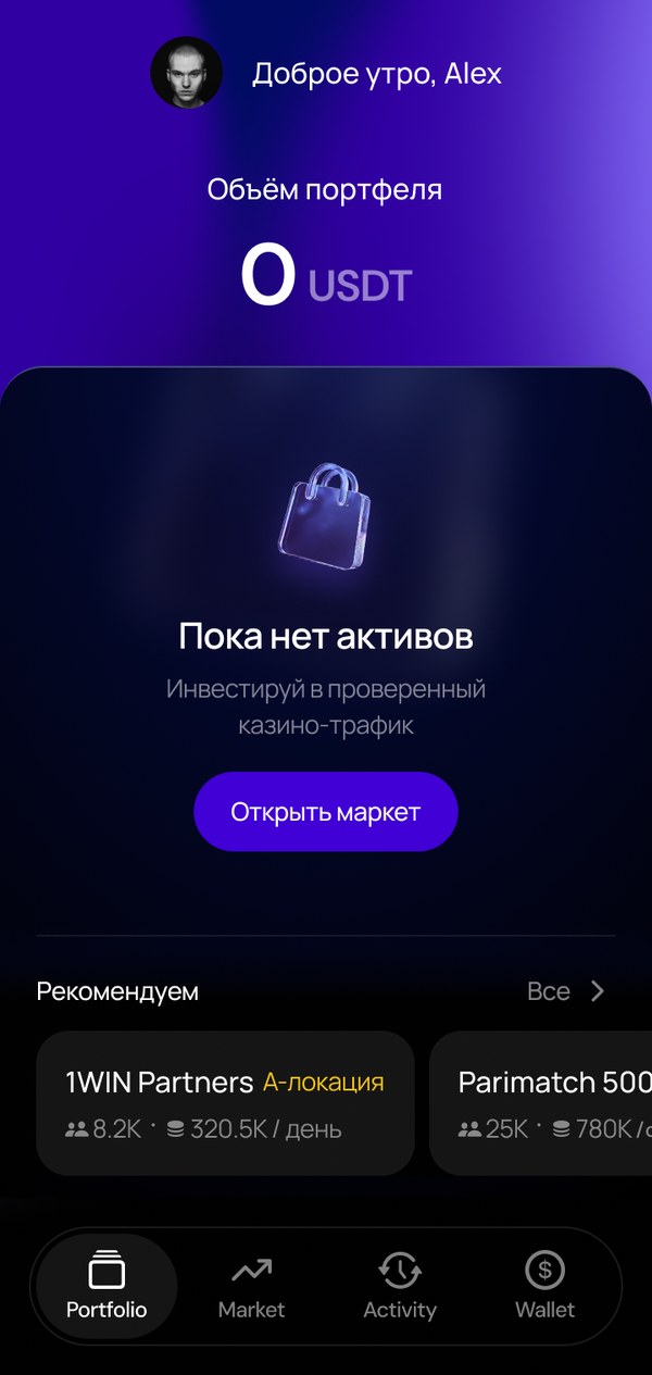
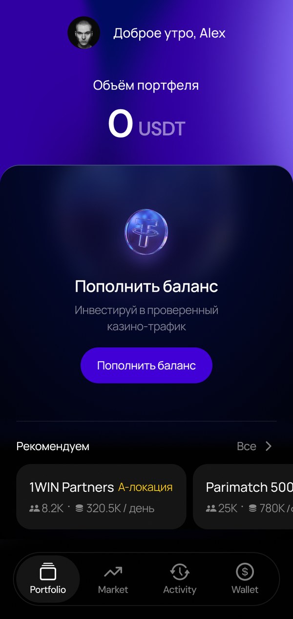
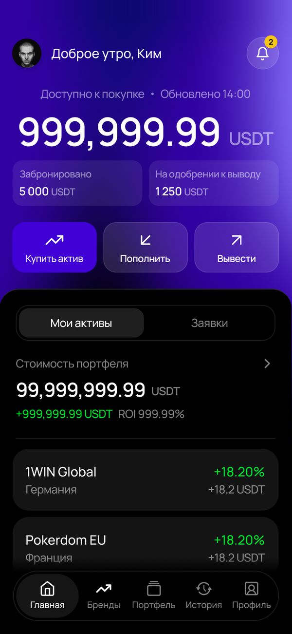
MVP design: dark background, purple accent, amounts as the main element of the screen.
Problem
The developers reviewed the new version and suggested the team bring me back. There were three problems.
The flow didn't add up to a working product. It had gaps, dead ends and logic errors.
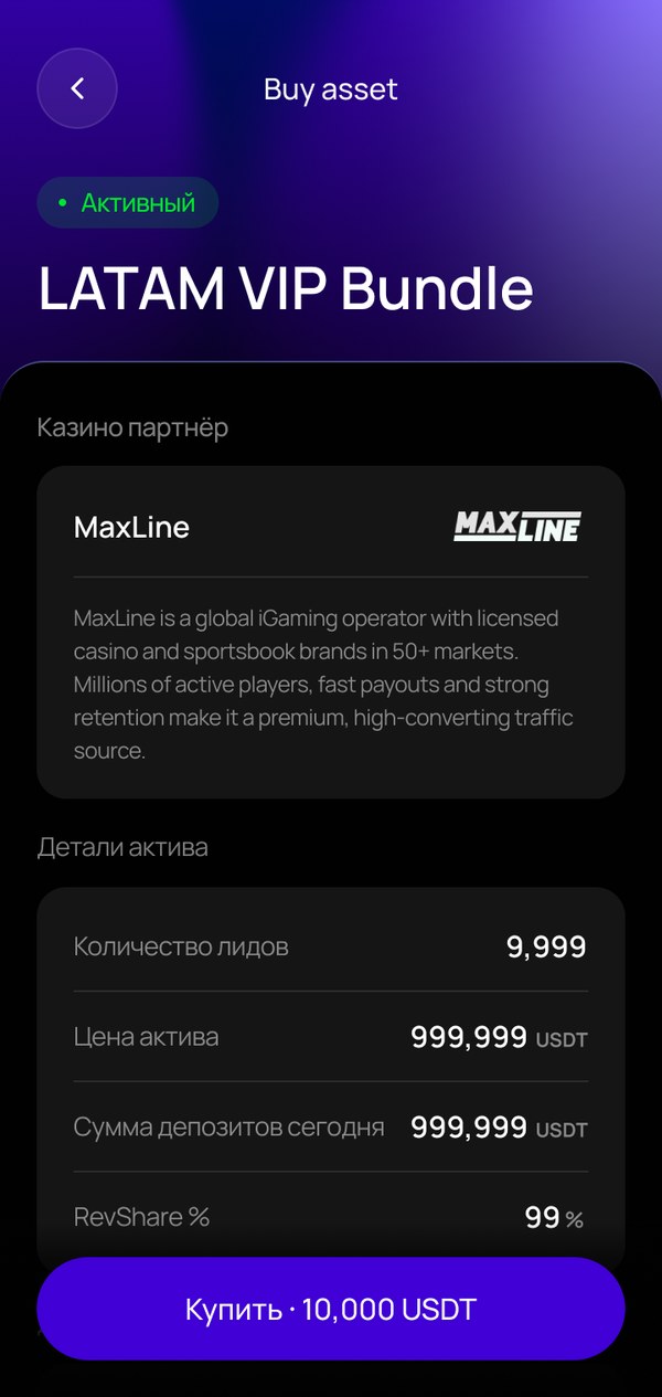
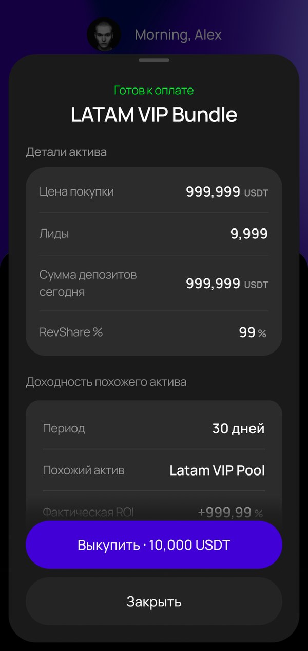
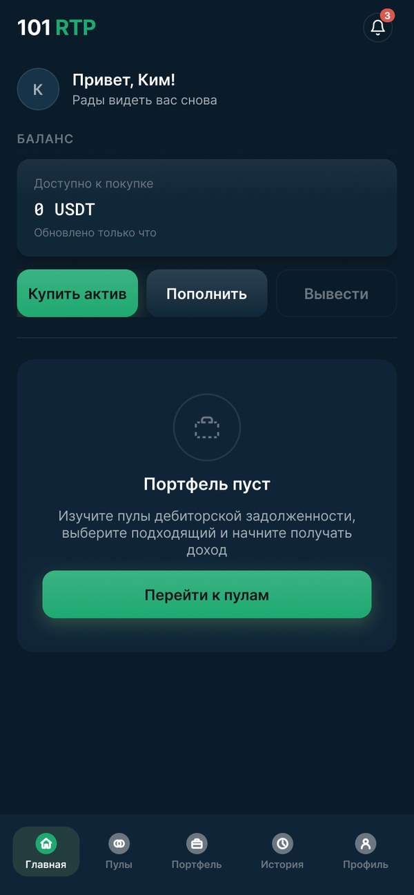
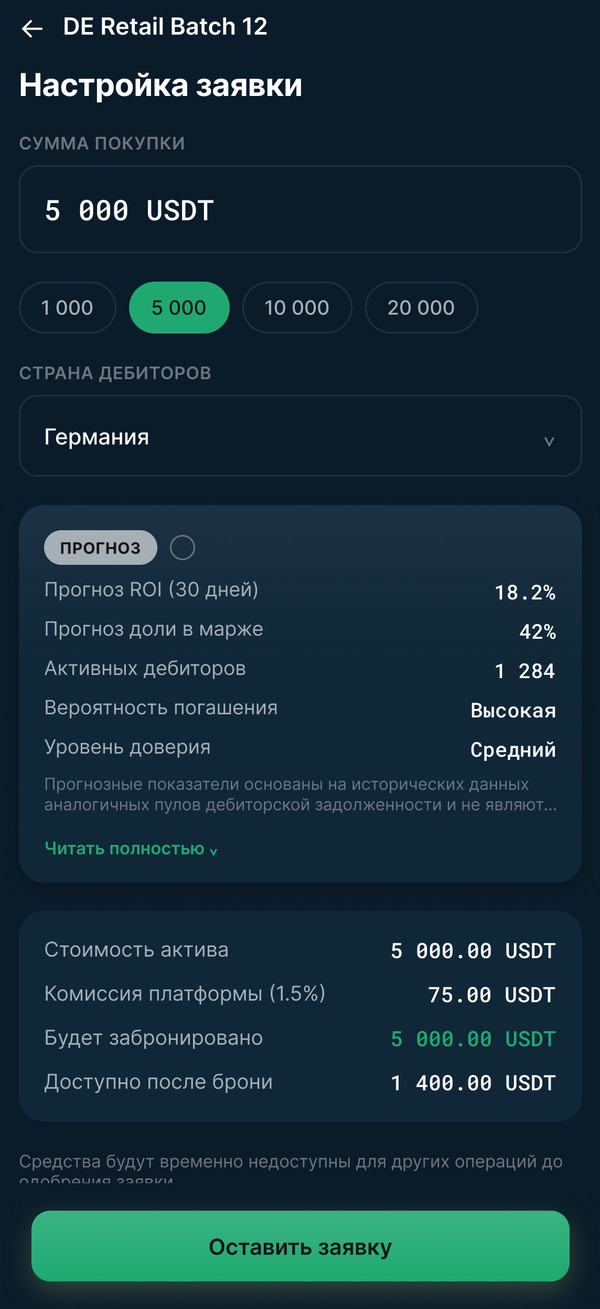
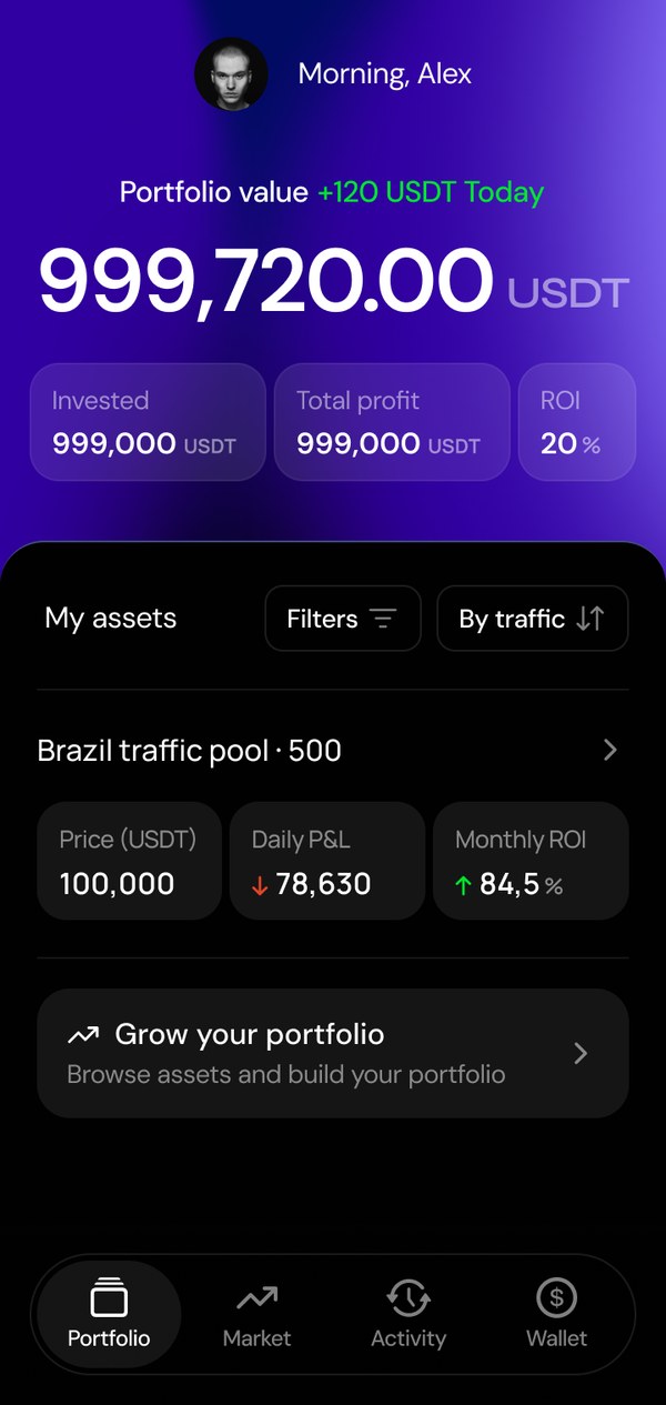
The interface looked like a technical draft, hard to trust with money. One accent color did everything: CTAs, filters, statuses. The primary “Buy asset” button carried as much weight as a secondary action like changing your name in the profile. Amounts, the key data of an investment product, got lost in identical cards.
The frontend would have to be rewritten from scratch. What was built for the MVP didn't fit the new UI.
Claude version: one green for CTAs, statuses and secondary buttons, amounts lost in identical cards.
Solution
UX audit of the flow
To find gaps and errors, we needed a user flow map with every screen and the transitions between them. There wasn't one, so I decided to build it with Claude.
Me
Set the method: check every screen against the client's spec and Nielsen's 10 heuristics, prioritized by risk, with money and account access first. Validated the findings and rated their severity, and took the disputed ones to product and engineering as batches of questions with solution options. Designed the missing screens in the product's UI.
Claude
Built the flow map in FigJam and went through the screens using my method, flagging gaps, dead ends and heuristic violations. Drew wireframes for each gap and double-checked the new screens.
14
logic errors
18
gaps and dead ends
33
usability issues
Below are three examples out of 65 issues: security, the cashier and fund reservation.
Example 1 — account security
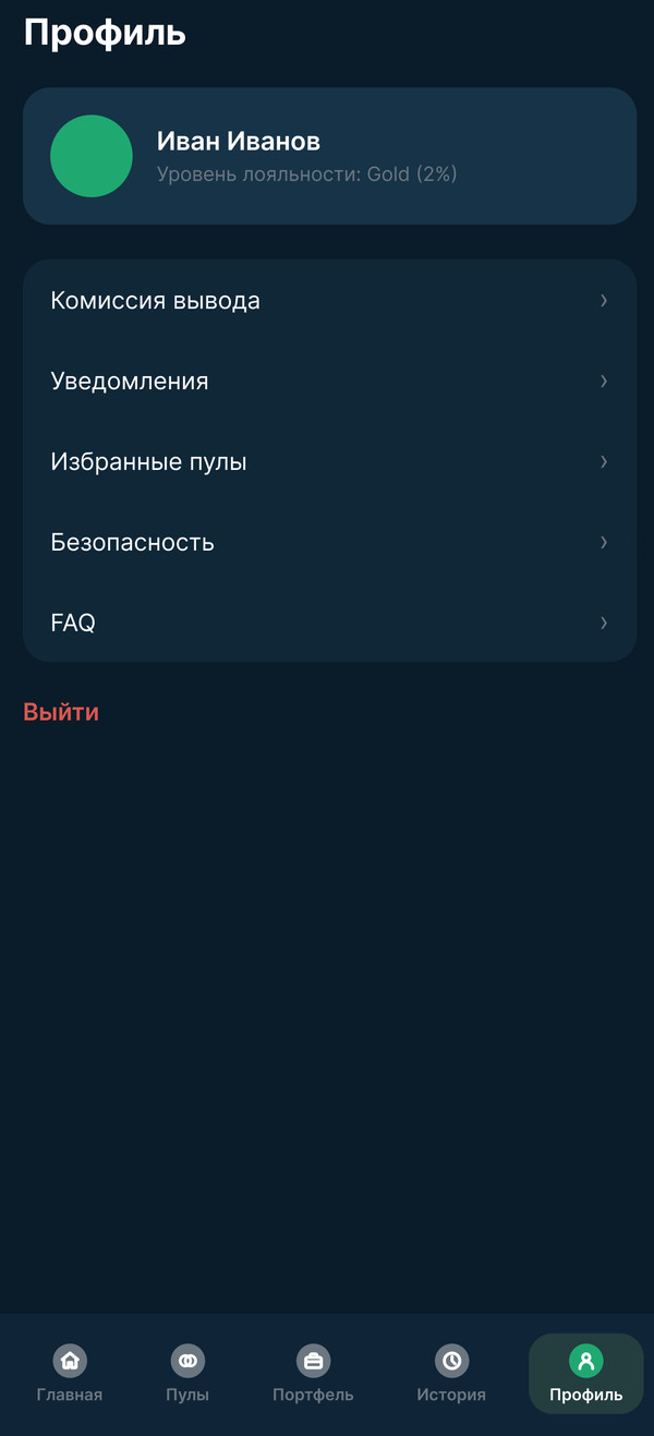
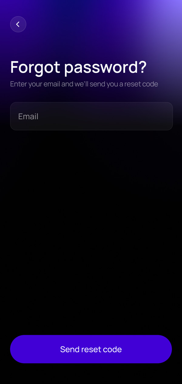
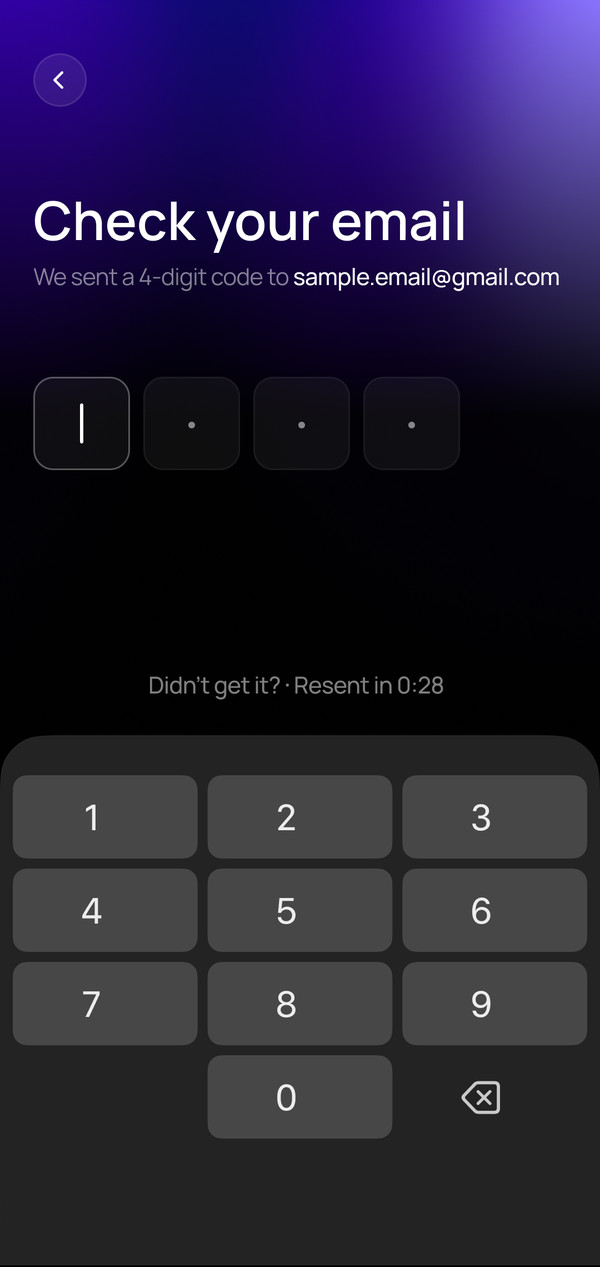
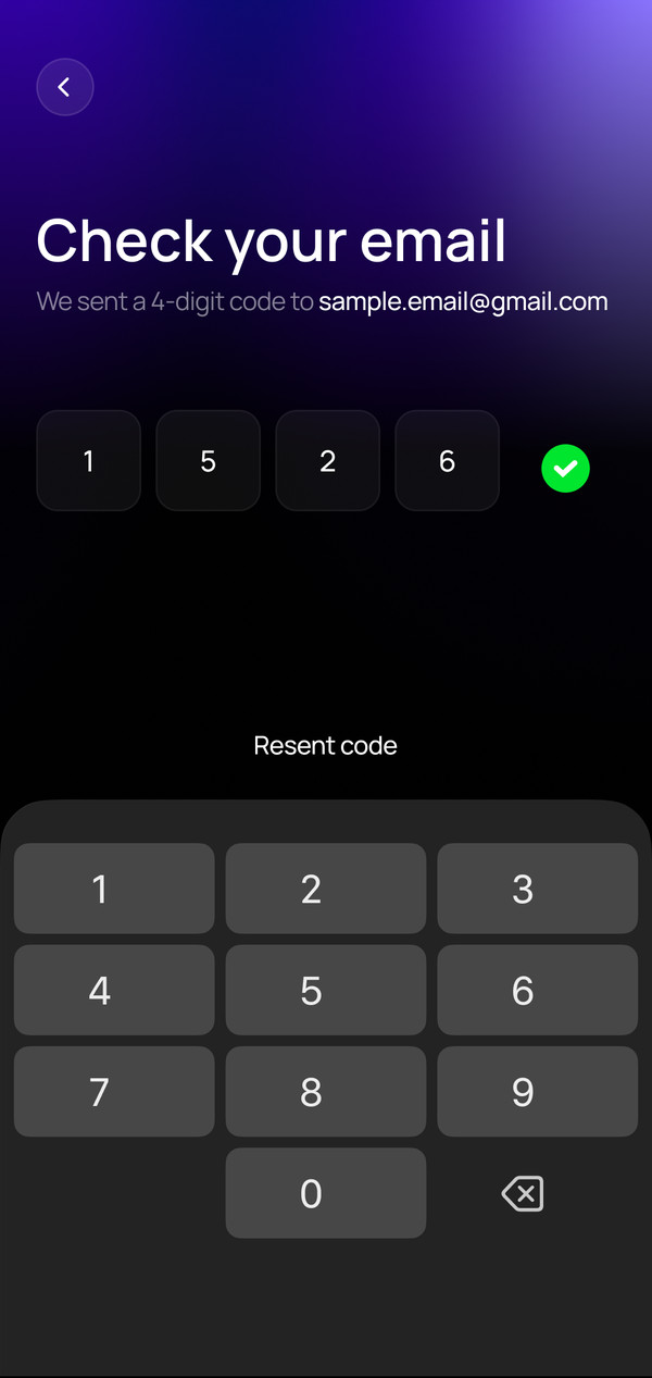
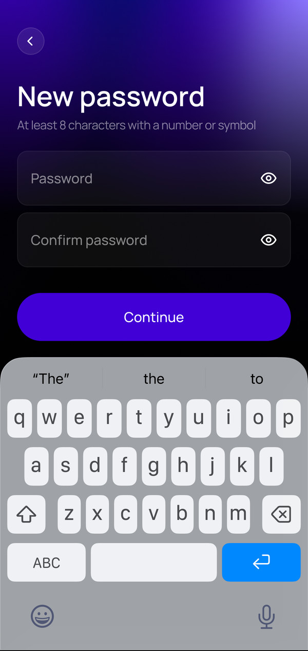
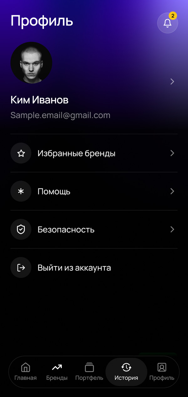
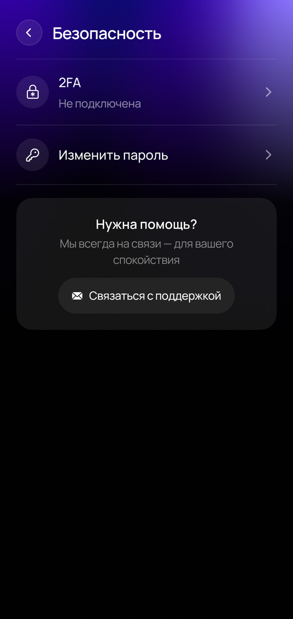
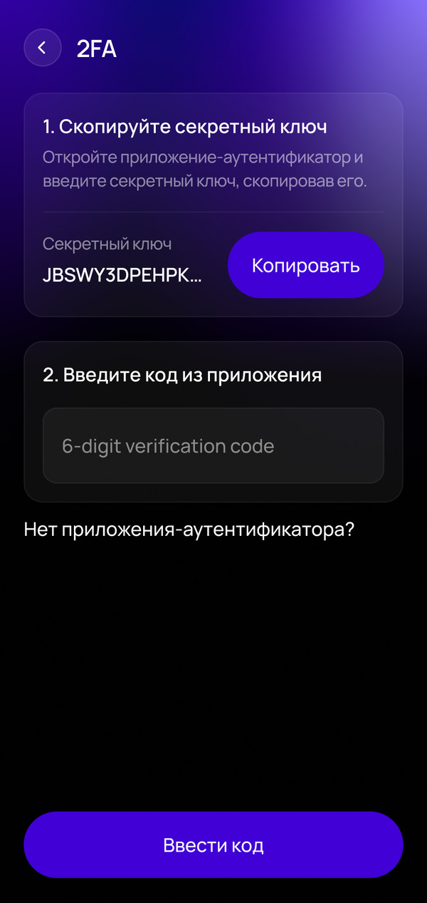
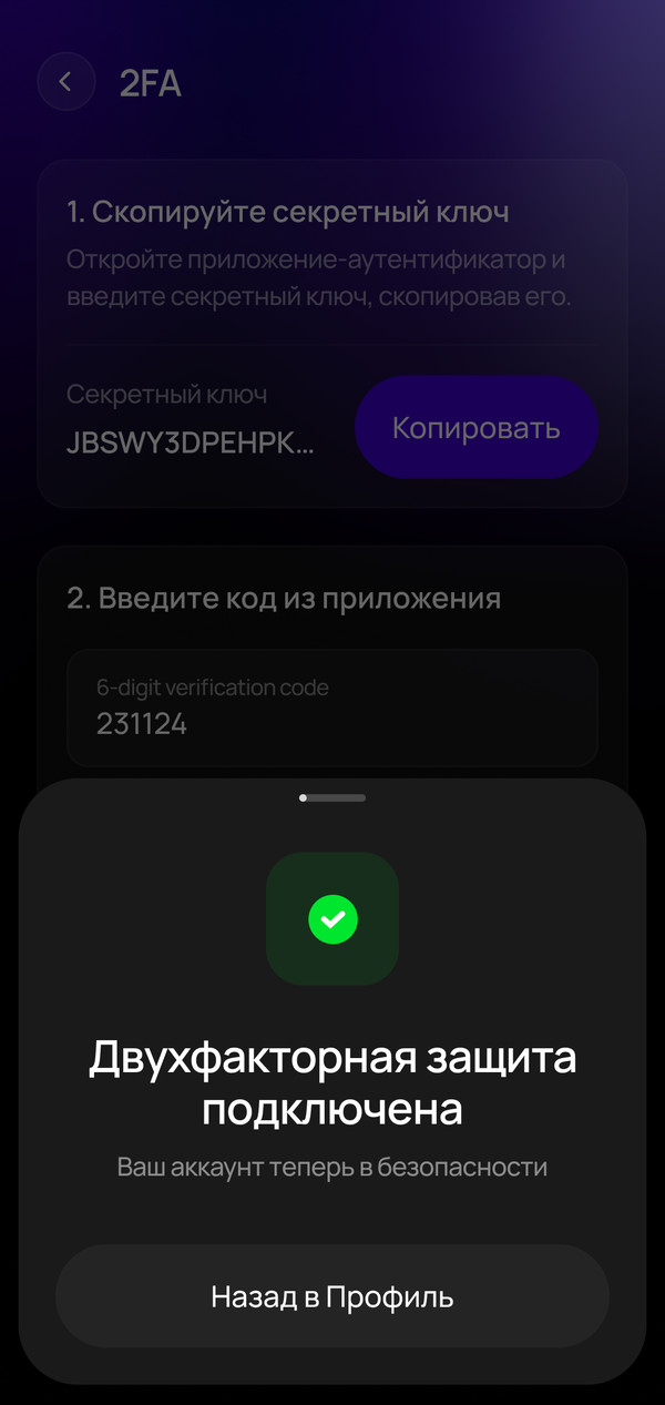
For example, the “Forgot password?” link led nowhere. And all there was of two-factor authentication (2FA) was a code screen at sign-in, while the “Security” section where you turn it on didn't exist. I designed both flows end to end.
Before
“Forgot password?” leads nowhereThere's a 2FA code at sign-in, but nowhere to turn 2FA on“Security” in the profile leads nowhere
After
Password recovery: email, code, new password
“Security” section and 2FA setup
Example 2 — cashier
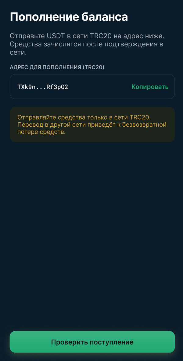
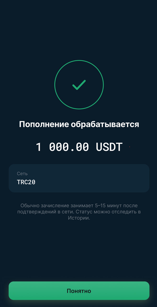
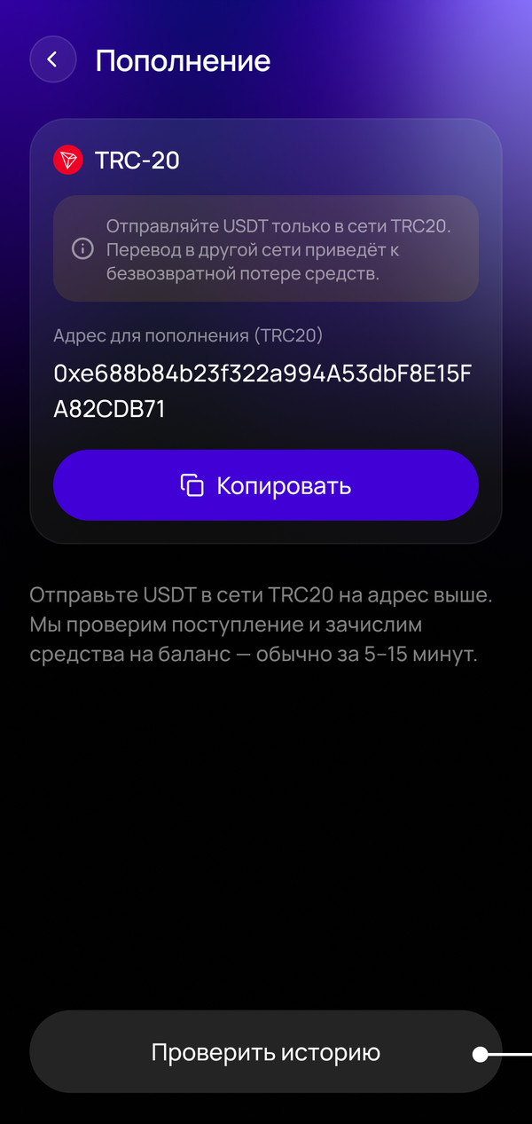
The “Deposit processing” screen showed a status that didn't exist, because the backend doesn't get a transaction status until the deposit is confirmed manually. I removed the screen and explained the crediting process right on the top-up screen. The CTA now leads to History, where the deposit appears once it's confirmed.
Before
“Check deposit” leads to a status screenAn amount and status the backend doesn't know yet
After
The crediting process is explained on the top-up screen, the button leads to History
Example 3 — fund reservation
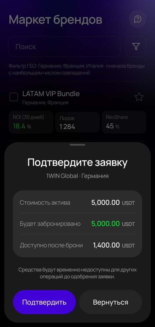
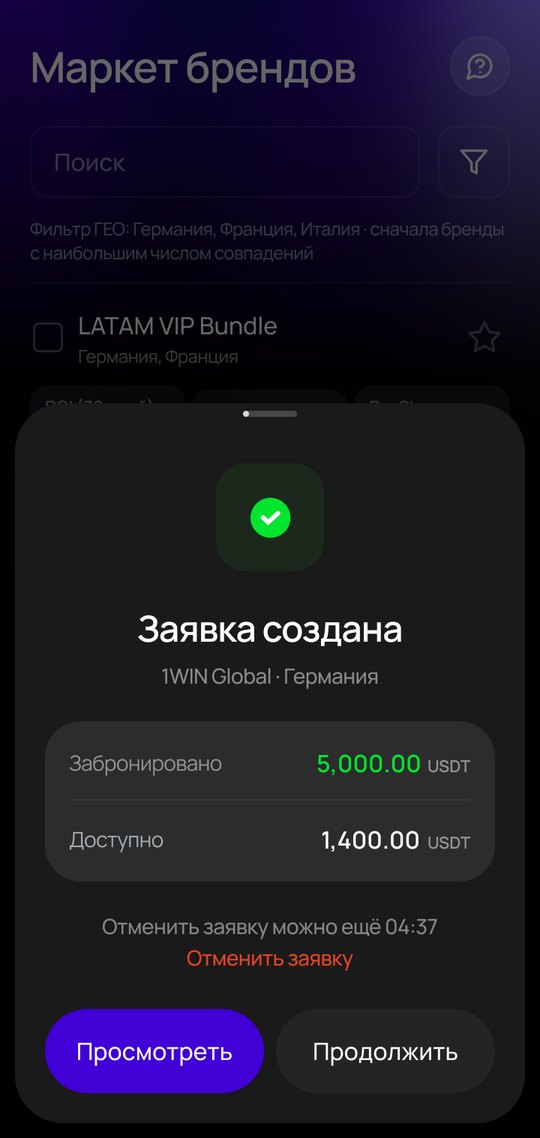
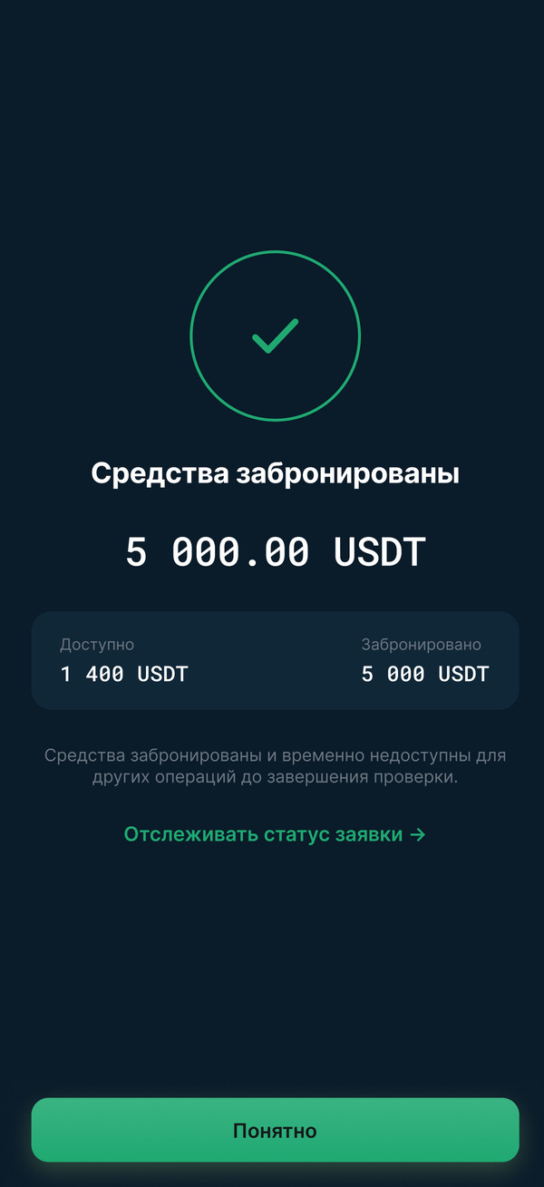
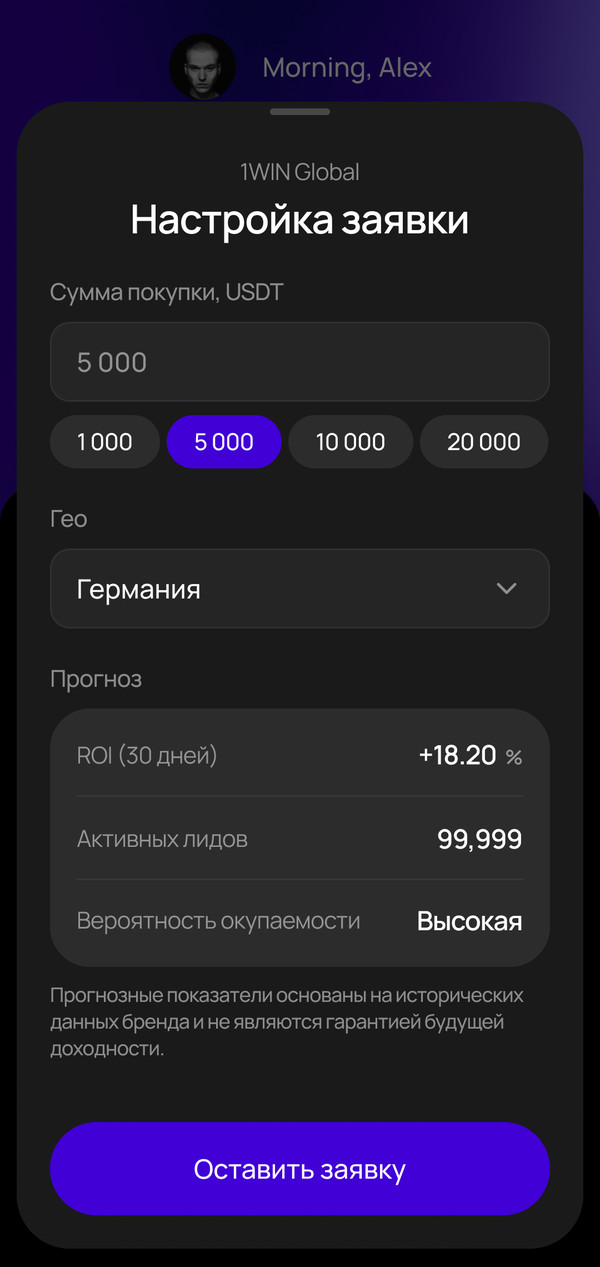
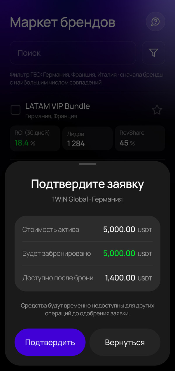
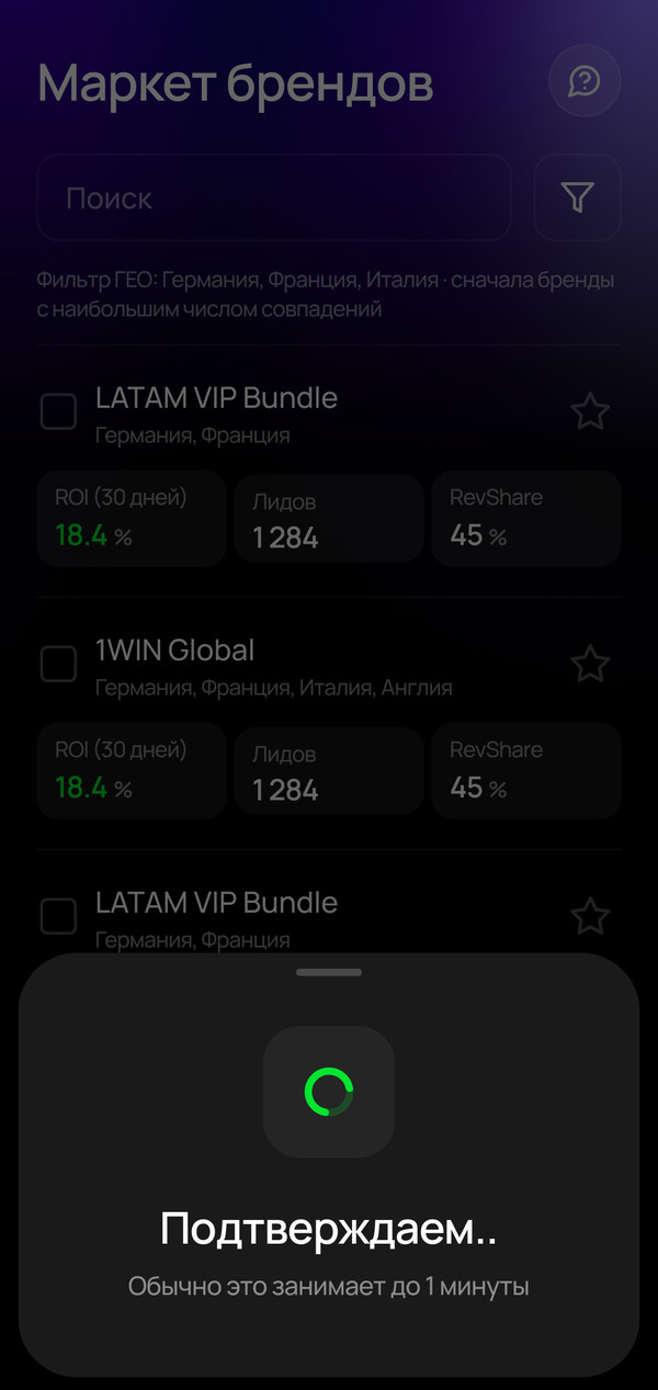
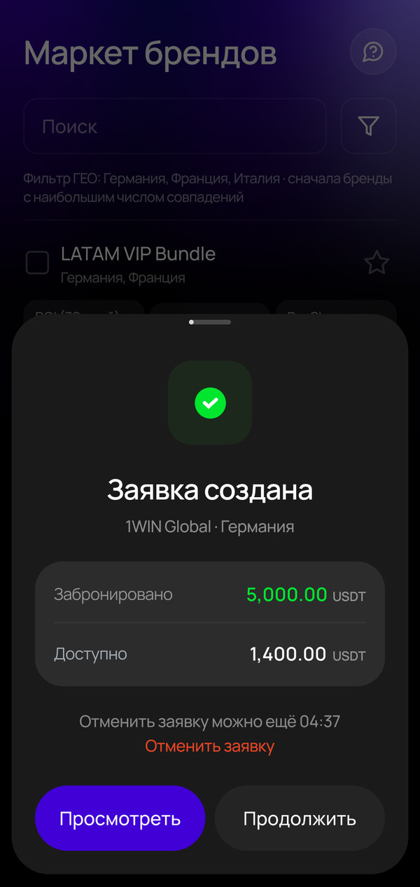
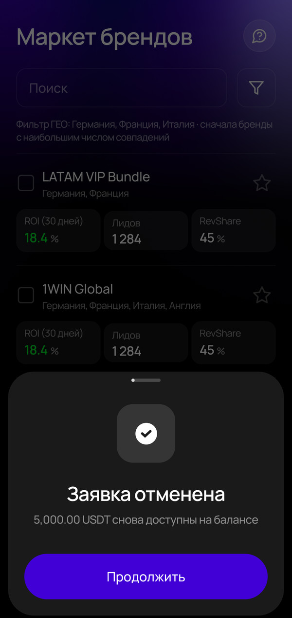
“Submit request” instantly locked 5,000 USDT for up to a day, with no confirmation and no way to cancel. A typo in the amount would cost a person a day without access to their money, and cost the platform their trust. I added a confirmation step before reserving and a 5-minute cancel window with a timer.
Before
“Submit request” instantly reserves 5,000 USDTNo confirmation and no way to cancel
After
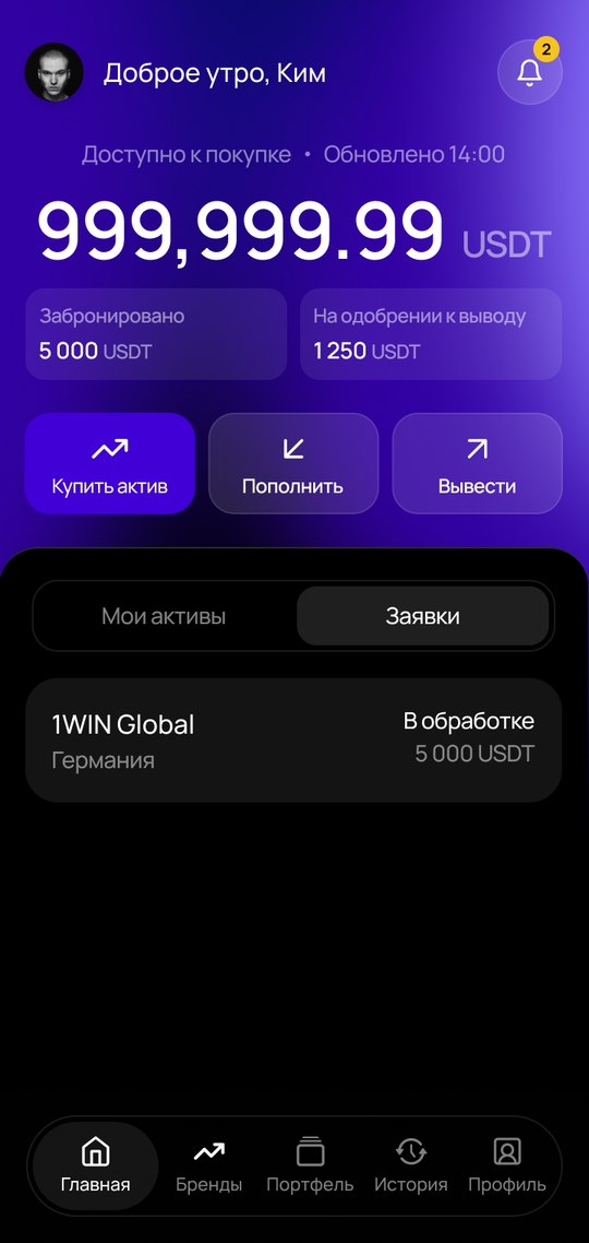
Confirmation before reserving and a request with a cancel window
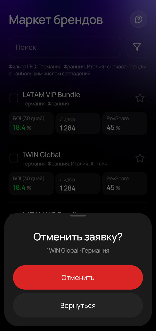
Cancelling a request: extra confirmation
New flow in the MVP design
Once the flow logic was solid, we had to decide which design to build it in. The Claude version would have meant rebuilding everything from scratch, both UI and frontend. The MVP design had visual hierarchy and brand style, and the developers had already built the frontend for it. We chose it together with them: one week of frontend work instead of four.
The trade-off was fitting the new flow into the MVP screens. I refined the ones that barely changed and drew the missing ones in the same style in 5 days.
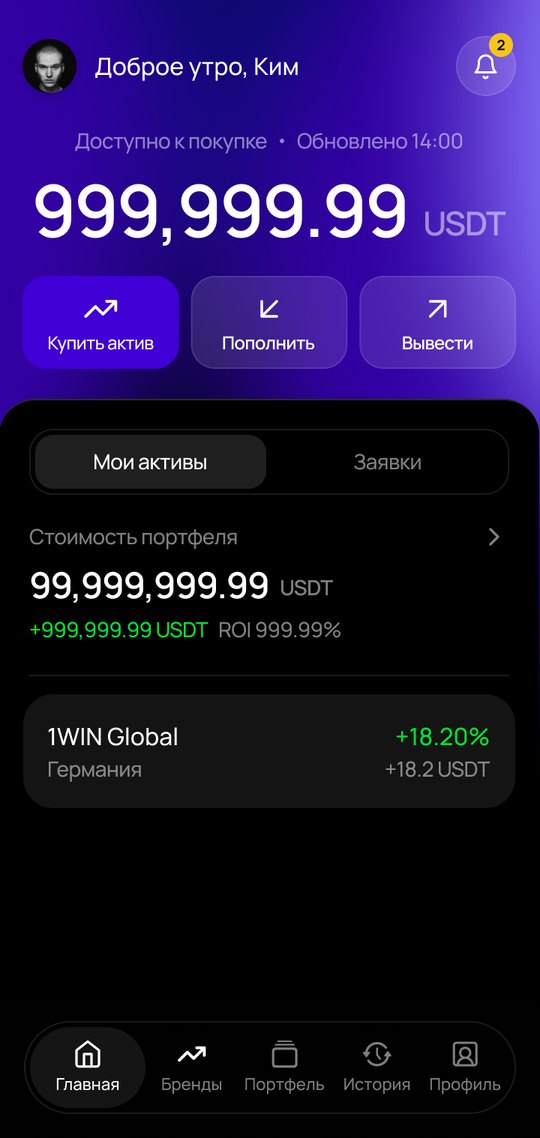
Left, home in the MVP. Right, home in the new flow, same style.
Design system
So that new versions wouldn't need rescuing again, I built a design system together with Claude. I started from the MVP system. Claude organized it and migrated the new designs to it, and we identified the missing components together.
3
style sources in one file
3
fonts: Manrope, DM Sans, Inter
32%
of fills on variables
Styles lived in three places, and there were three fonts. Only a third of fills were on variables.
Palette · hidden from the pickerRole · used in designsWhere
violet/600→accent/defaultPrimary button, CTA
white-alpha/8→background/glasscards on “glass”
neutral/900→background/elevatedsheets
green/500→status/successgrowth and income
red/400→status/error-texterror text
Split color into two layers: about 33 palette colors and about 33 roles in 6 groups. Hid the palette from the picker, so designs only use roles. Left room for a light theme.
H1 · 32/32Invest in brand traffic
H3 · 20/28Invest in brand traffic
Body · 16/24Invest in brand traffic
Caption · 12/16Invest in brand traffic
Numeric/Large · 485 000.00 USDT
Spacing
2
4
6
8
10
12
16
20
24
32
40
48
Radii
4
8
12
16
20
24
32
full
One font for everything, amounts included: 20 text styles, with separate ones for numbers and currency. 12 spacing steps, 8 radii.
Red text only via the error token, since plain red on black fails contrast, 3.6:1 → 5.5:1.
A disabled button is a muted purple, not a transparent layer.
No shadows in the product. Depth comes from “glass” and glows.
56
Buttons are always 56 px, currency is always “USDT”.
Built the product's rules into the system: red contrast, an honest disabled state, no shadows, one button height.
ChipFilters and amount presets: sizes M and S, selected and not
Default
With badge
Filter ButtonFilter button: without a badge and with the number of selected filters
Default
Filled
Error
Search · Default
Search · Active
Search · Typing
Search · Typed
InputField on “glass” and search: empty, active, typing, filled, error
Brand CardBrand card in the market: ROI, leads, RevShare, select for comparison
Asset
Order
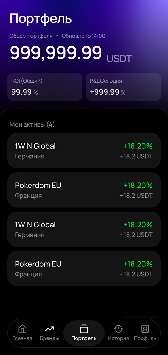
Asset RowAsset row in the portfolio and a pending request row
Home
Brands
Portfolio
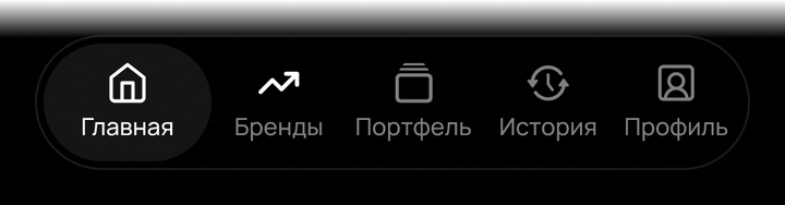
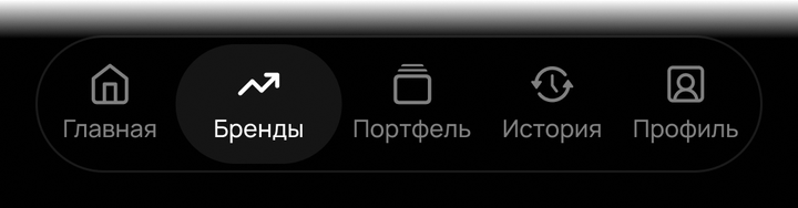
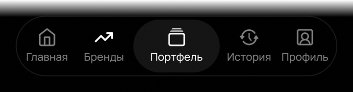
Tab BarApp navigation: 5 sections, the active one on a backdrop
App IconApp icon
Positive
Negative
Pending
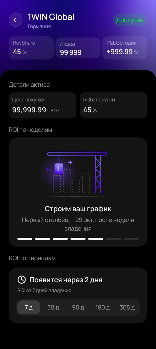
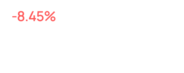
ROI PeriodsReturns for a period: growth, loss and “available in N days” for a new asset
Default
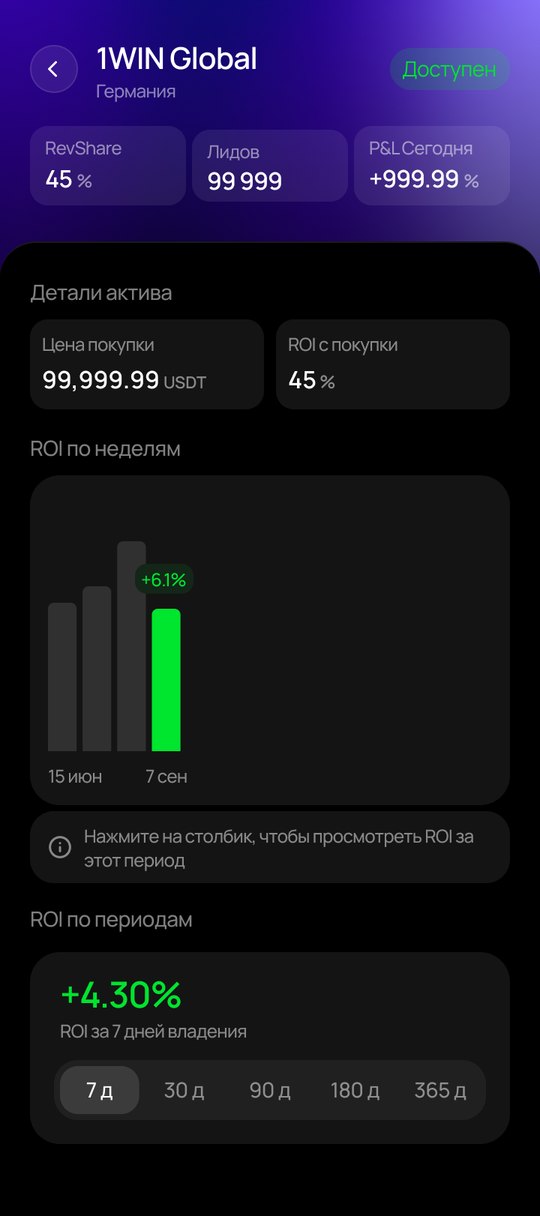
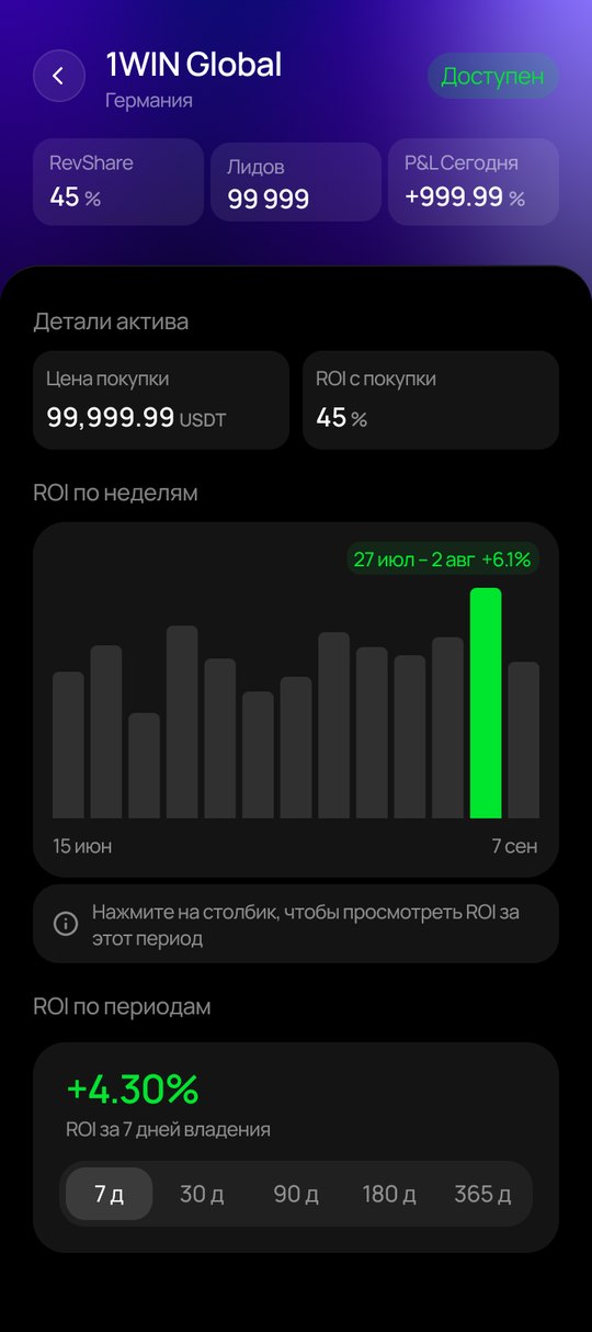
Bar Tapped
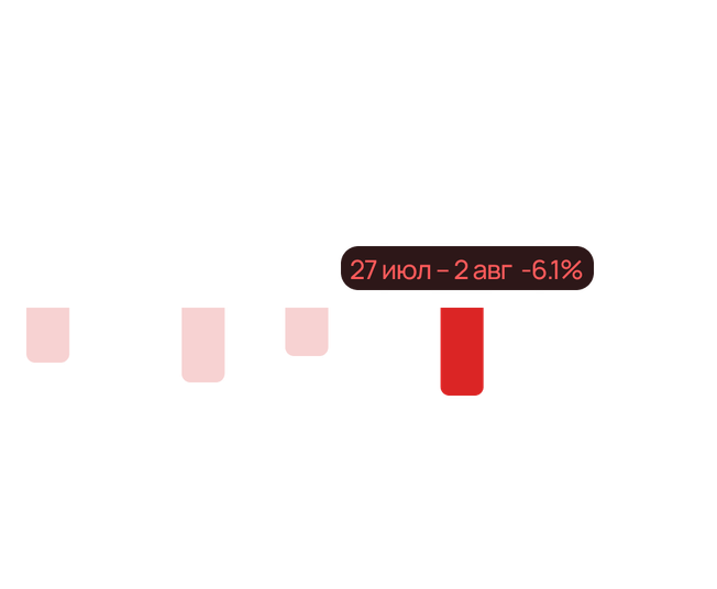
Negative Now
Negative Weeks
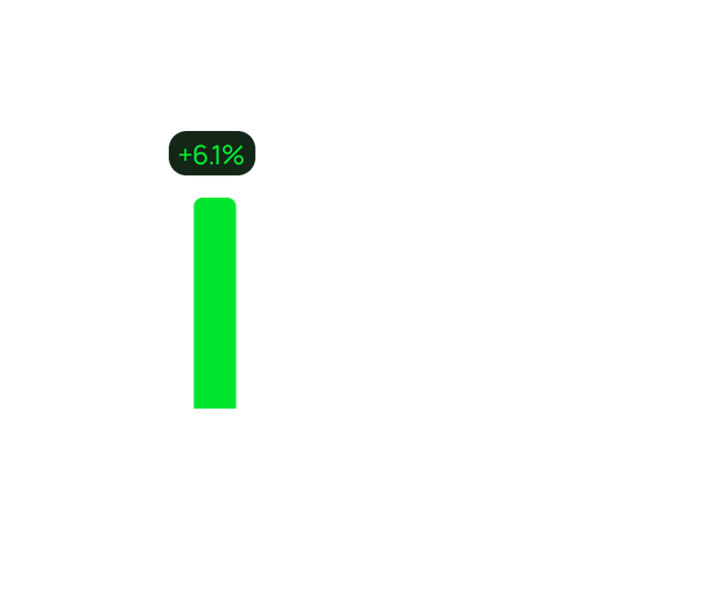
New Brand
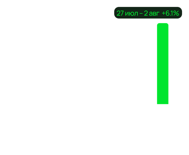
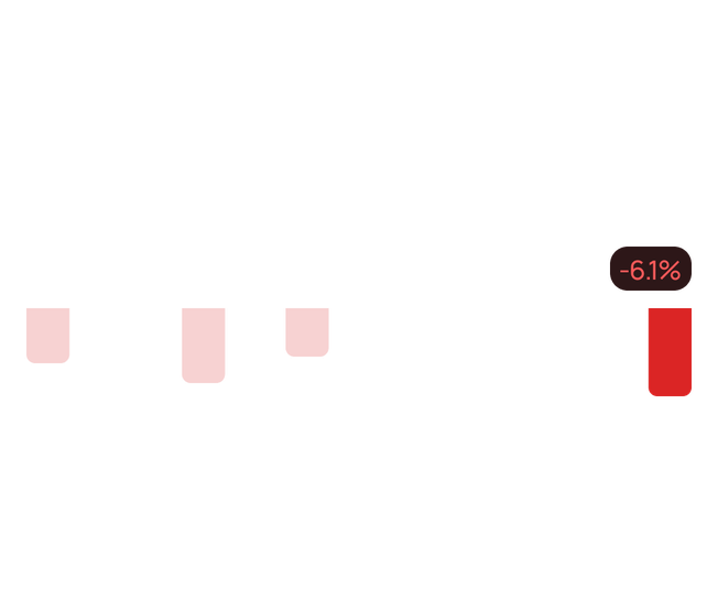
ROI ChartWeekly ROI chart: default, selected bar, loss, new brand
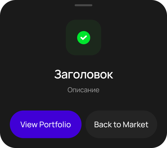
Success
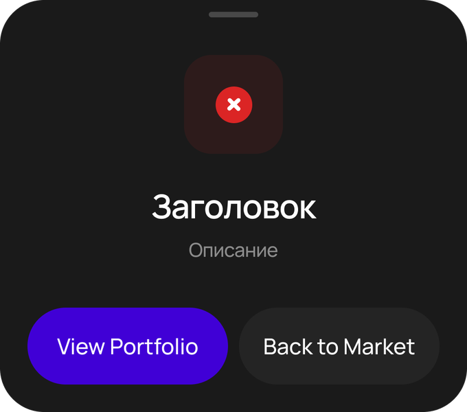
Error
Info
Info Sheet
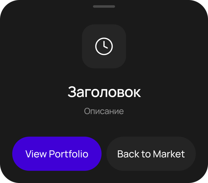
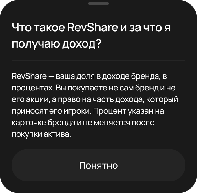
SheetStatus sheets and an explainer sheet
Icons31 Lucide icons and the TRC-20 network logo, colored with the content/primary role
About 50 components in 9 sections. Each has a description in Figma, all variants and the number of uses in the designs.
Then I described the system, the rules and every screen of the flow in markdown files that Claude reads before work. It no longer has to re-parse the designs, because the component and screen library is already in its context. That's why it builds new screens more accurately and 2–3 times faster, while I review the result and fix things precisely, by prompt or by hand. A new flow can now be put together in days and go through usability testing as a prototype before development.
I set the systemvariables, components and rules in Figma
Library in markdownthe system, rules and all screens in Claude's context
Claude builds a screenonly from components and variables
I reviewand fix precisely, by prompt or by hand
I set the rules, Claude builds by them, and the final call is mine.
## Product rules built into the DS
No shadows (except dropdowns and glows) · USDT in caps ·
button — 56 · 100% of text in styles · red text — status/error-text

## Controls
| Component | Variants · properties                                 | Where                  |
| Button    | Style: Primary · Secondary × State: Default ·         | height 56              |
|           | Disabled · Loading                                    |                        |
| Chip      | Size: M · S × State: Default · Selected               | filters, amount presets |
A slice of the markdown library: product rules and components. Claude reads it before every task.
In one day, using the system: 15 chart variants, 10 screens updated with one swap, 3 new screens, this one included.
Results
Flow
Passed the developers' review and went to production: 65 issues fixed.
Interface
The MVP's visual hierarchy and brand style came back, so CTAs, amounts and statuses are distinguishable again.
Frontend
1 week instead of 4, by the developers' estimate.
Design system
Token coverage ~99%, text in styles 100%. The system and the flow map are in Claude's context.
Before: a flow that failed review and a month of frontend work from scratch. After: the flow in production, frontend in a week and a design system that builds new screens 2–3 times faster.
What carries over to an iGaming product
A cashier with crypto deposits, withdrawals and transaction statuses, fund reservation and cancellation, account security, returns dashboards and a design system the team uses to build and check new flows fast.
Looking back
Now I'd suggest rebuilding the flow with AI on top of our design system from day one, loading the system into Claude's context myself or showing the product manager how to do it. And I'd run usability tests on prototypes before development. In this project, research happened when the frontend was already built, so both the developers and I had to do the work twice.
Let's work together
Happy to talk about your project. I reply within a day.
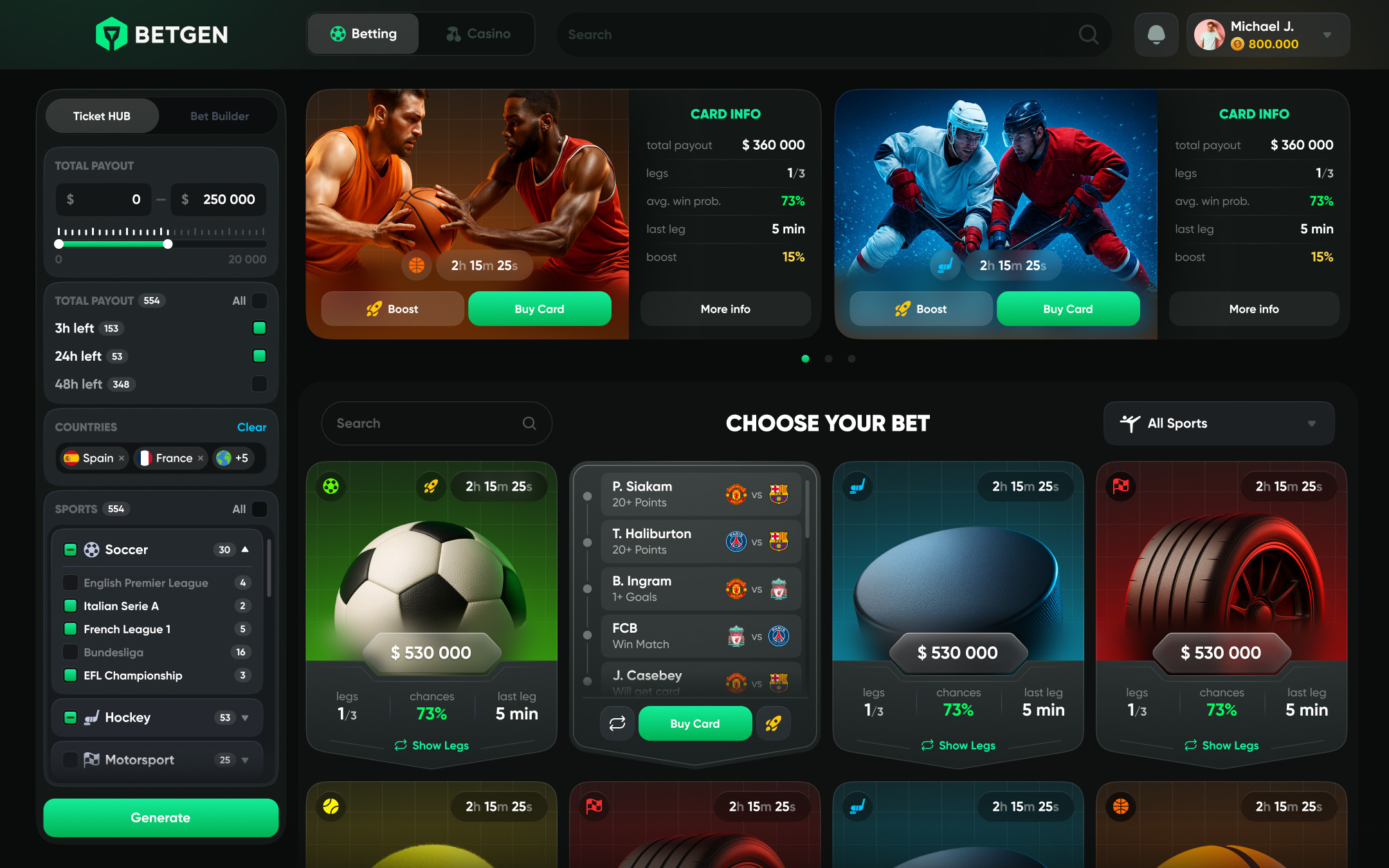
Poker Planets gaming platform design: poker, casino and sports betting
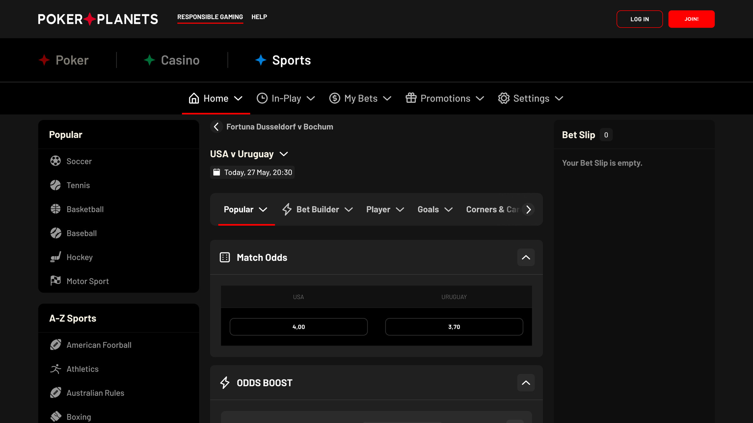
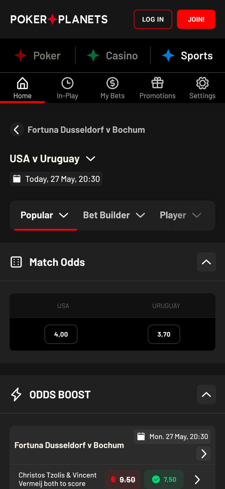
Three products under one header: a poker room, an online casino and a sportsbook. Each has its own navigation, with a shared cashier and promos.
RoleUI designer on the team
Year2022
PlatformWeb, desktop and mobile
ProductPoker, casino, sports
The project was done by a team of designers, and I was part of it. The case shows the product's key screens.
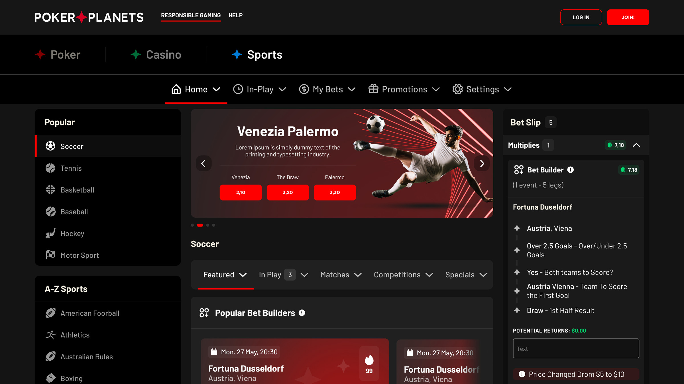
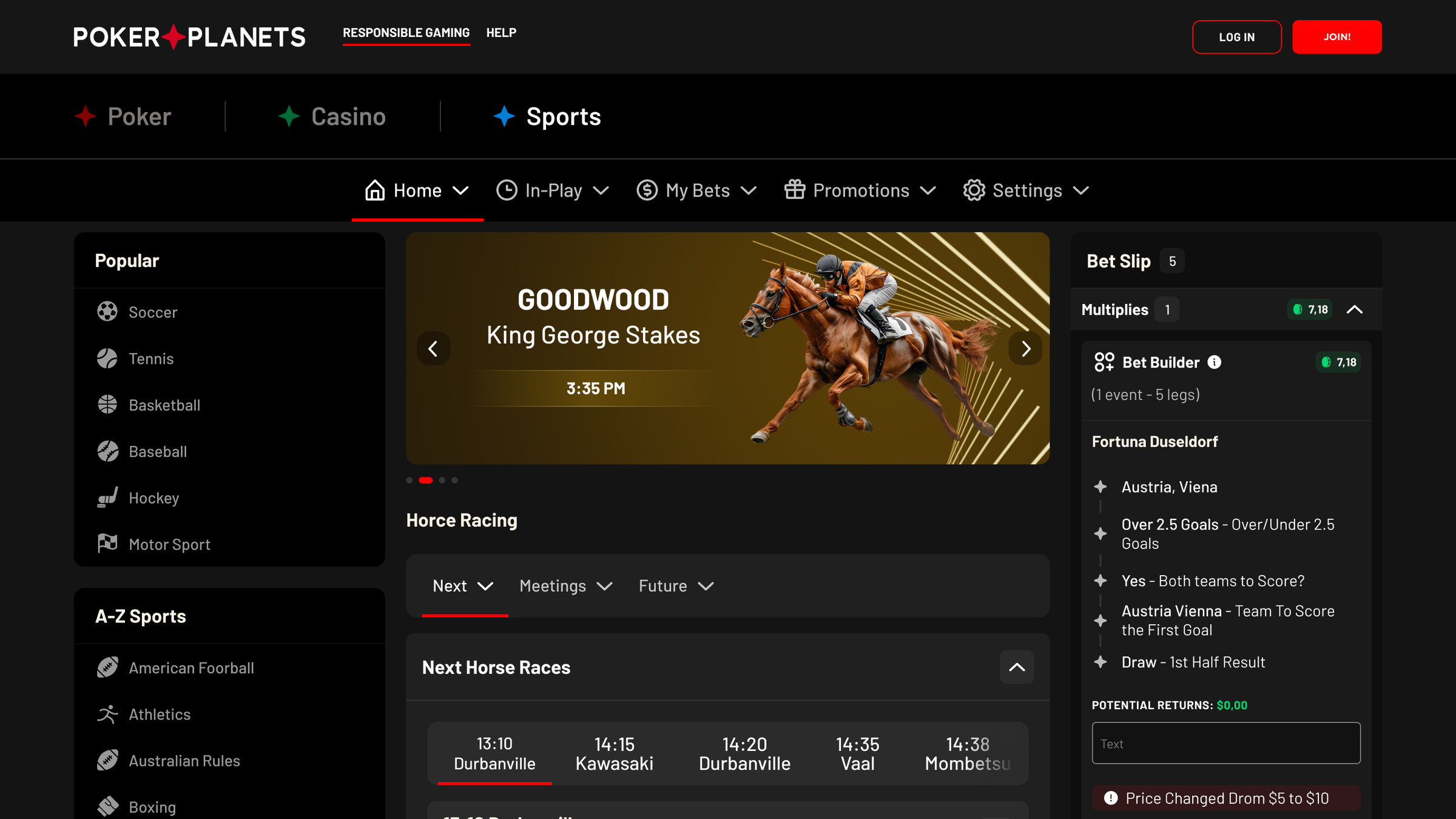
Football: bet builder and a filled bet slip
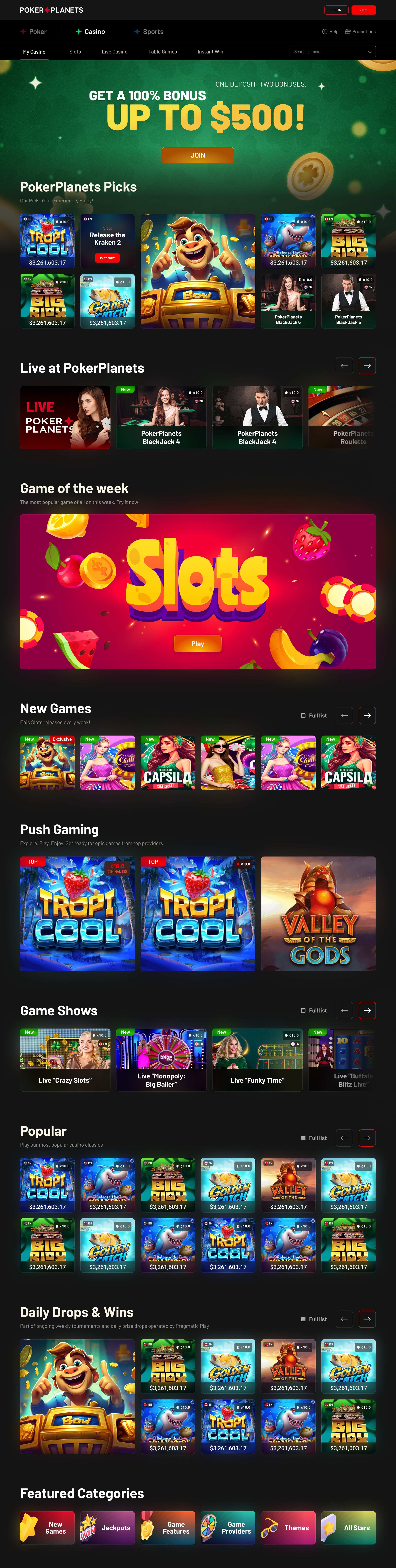
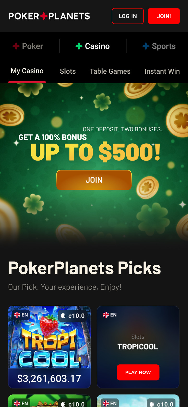
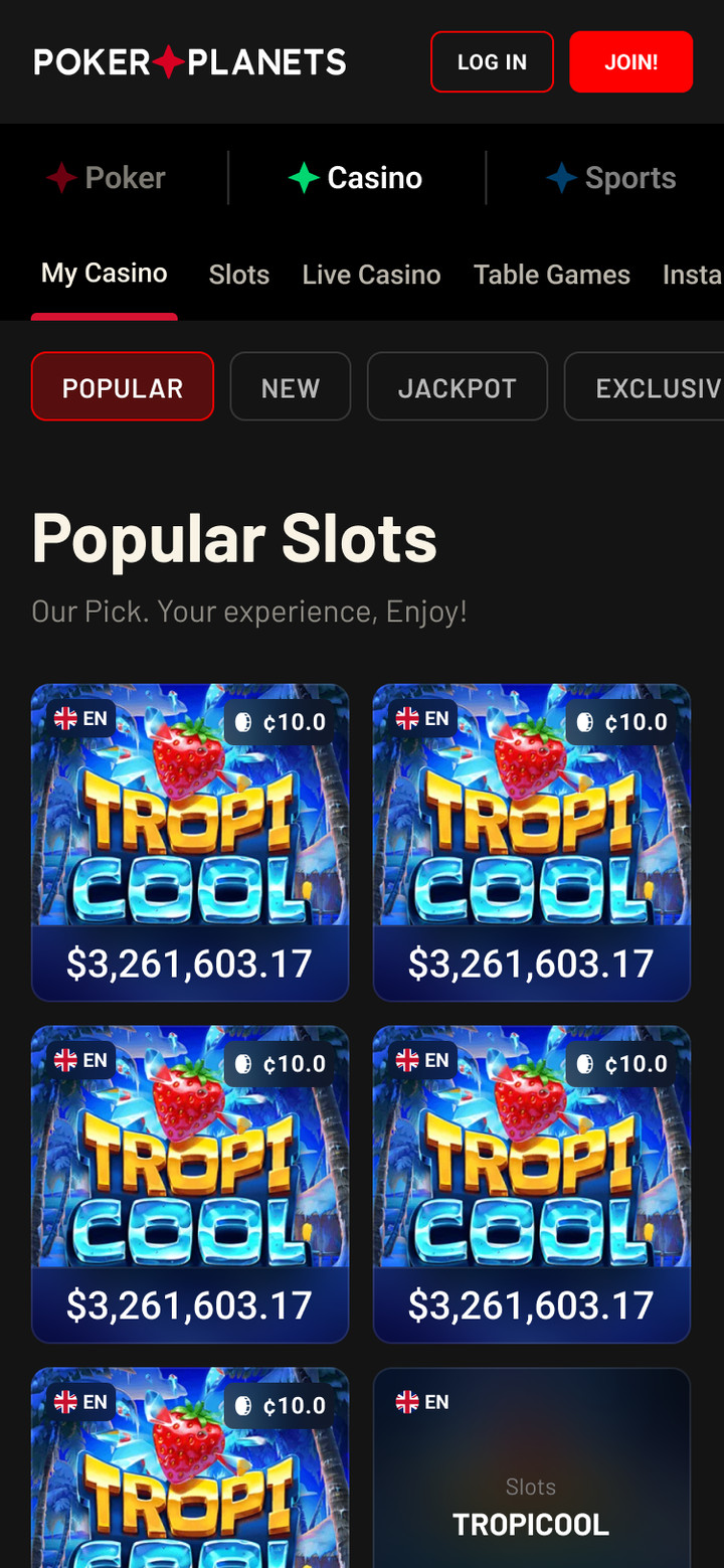
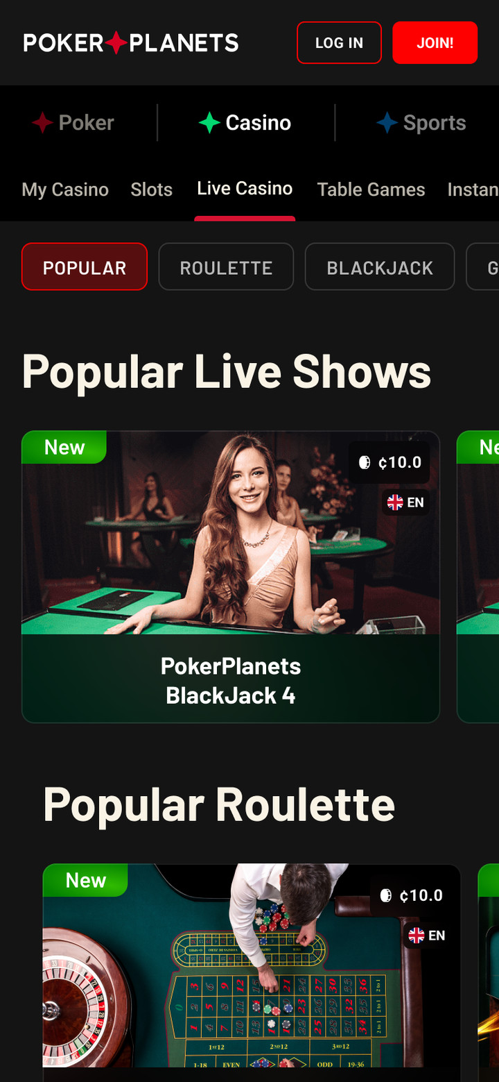
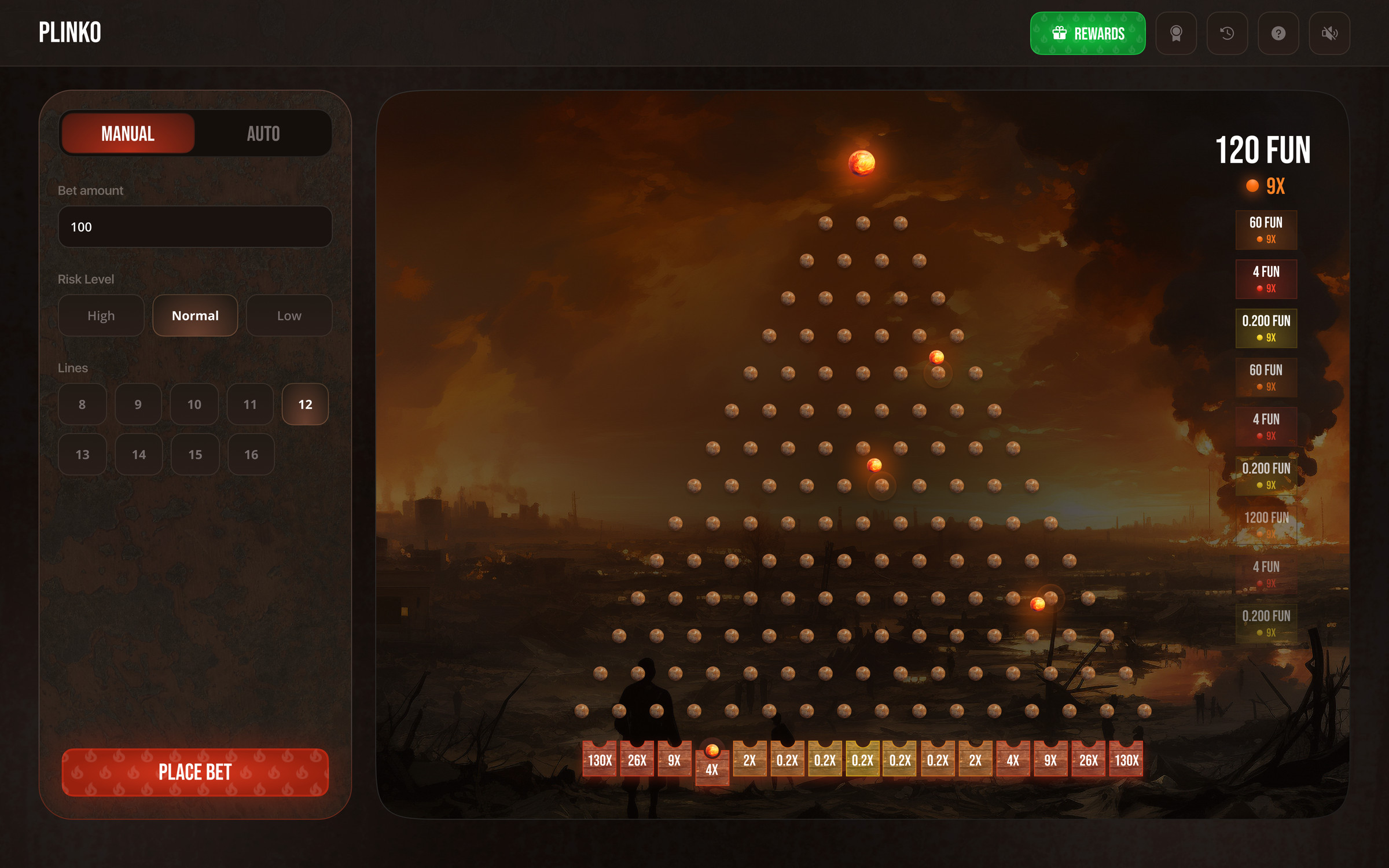
Casino
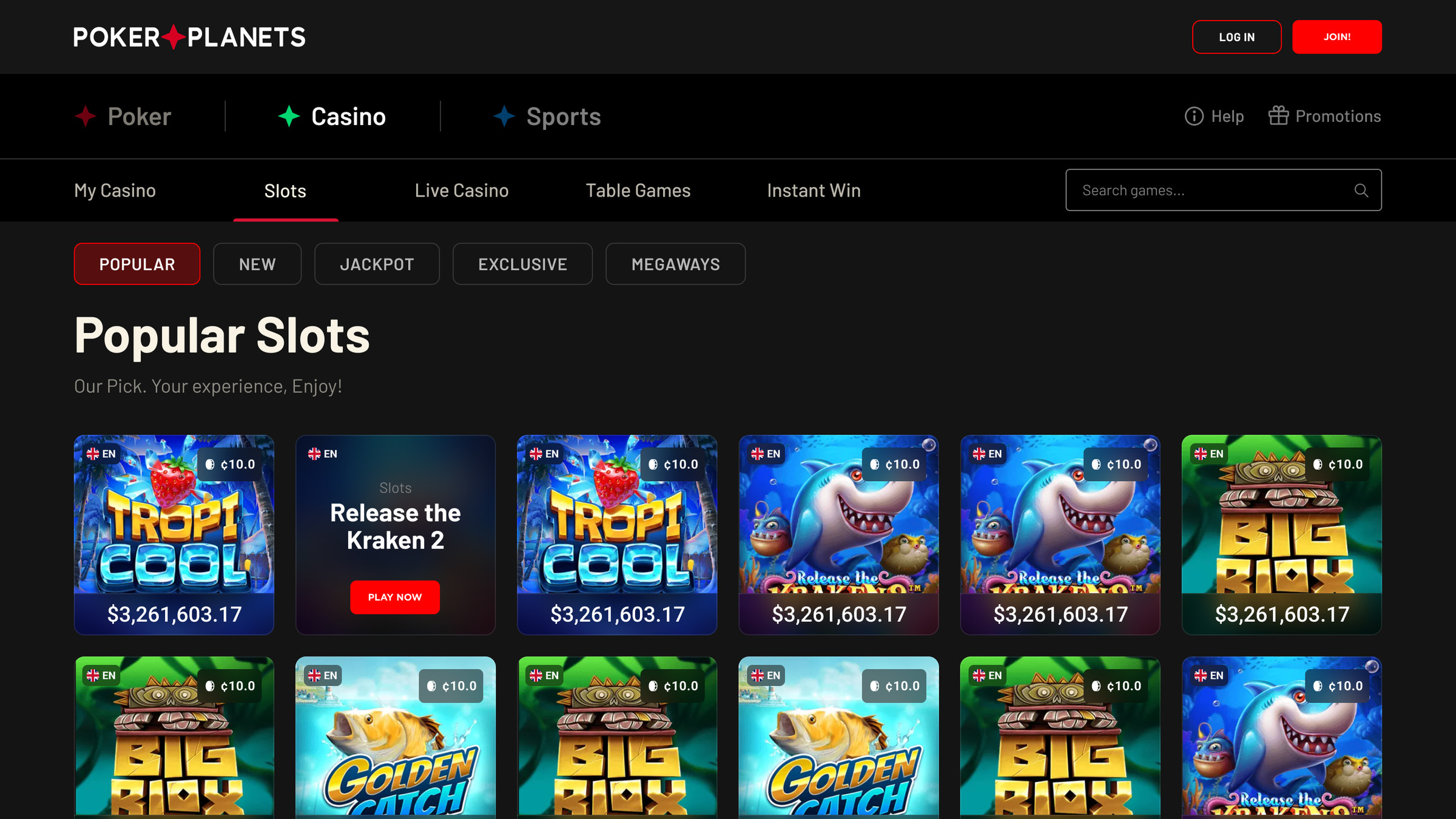
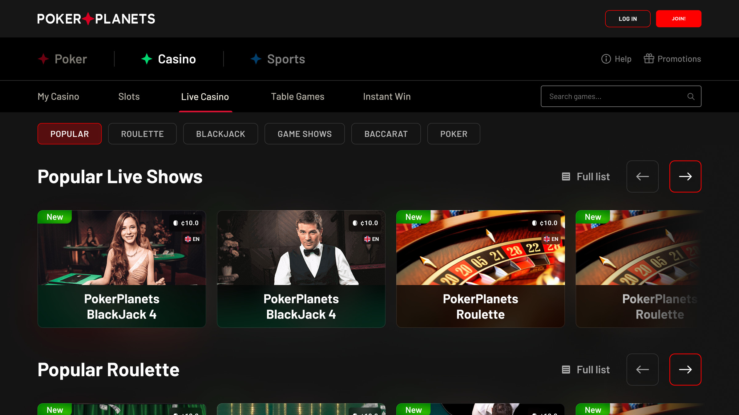
Lobby: collections, live casino, new games and game of the week. Slots, Live Casino, Table Games and Instant Win sections, filters and search. Each game tile shows the jackpot, minimum bet and language.
Casino homeSlots: filters and game gridLive casino: collections by game type
Casino home, slots and live casino on mobile
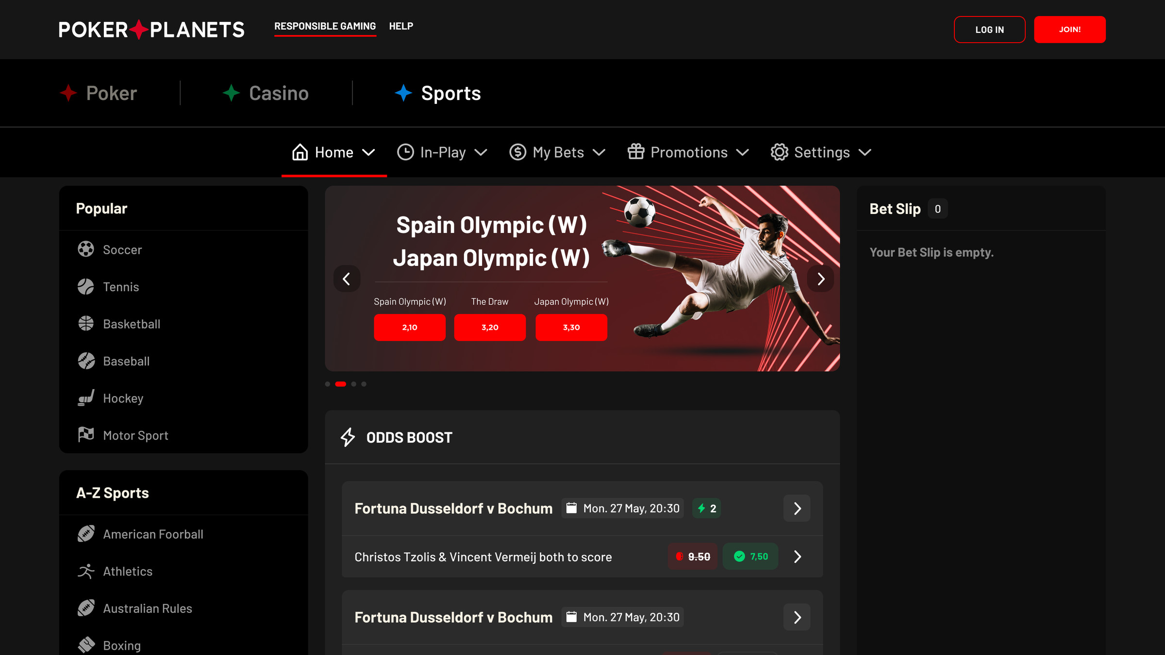
Sports betting
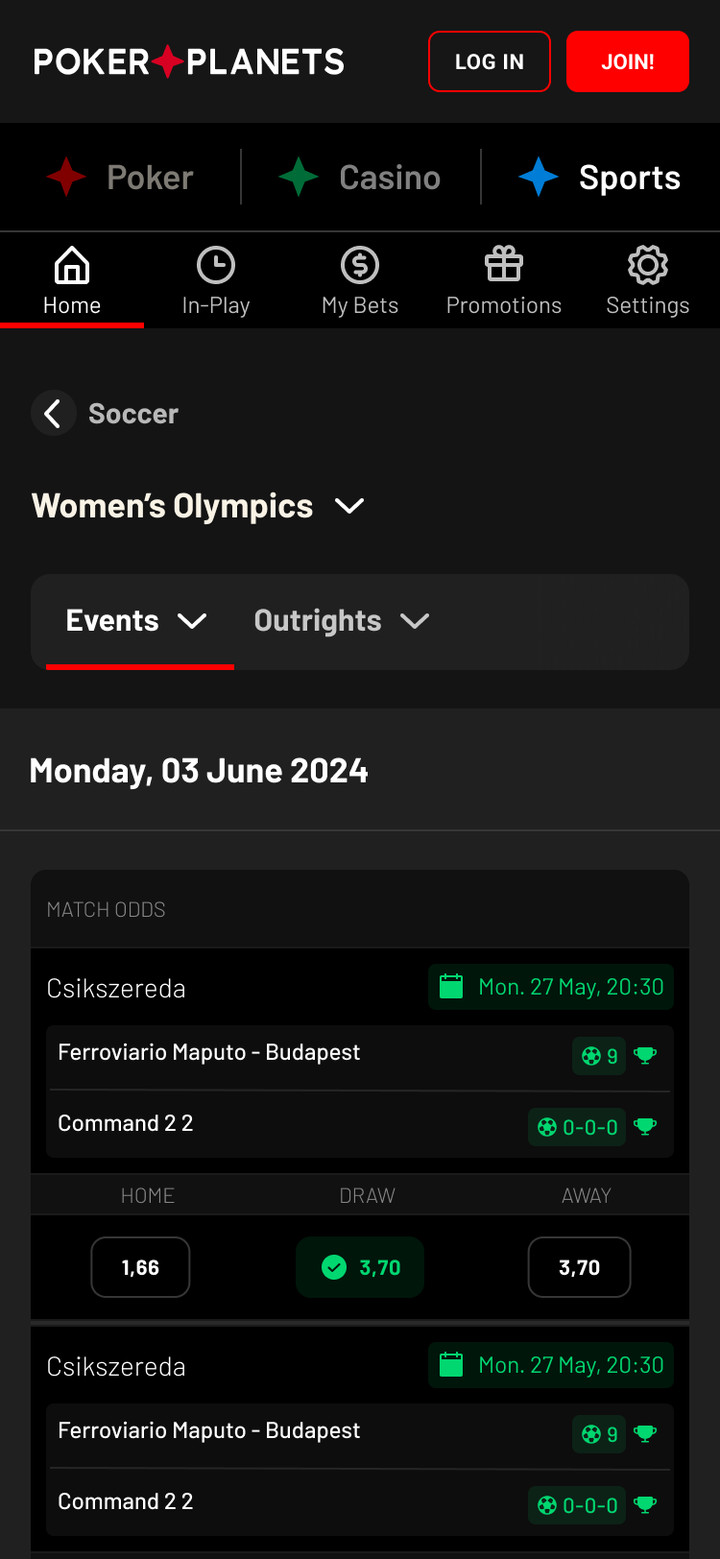
Popular sports and an A–Z list, odds boost, bet builder and live. The bet slip always sits on the right with singles and accumulators, potential winnings and an odds change warning.
Sports home: match of the day and odds boostMatch: betting marketsHorse racing: upcoming races
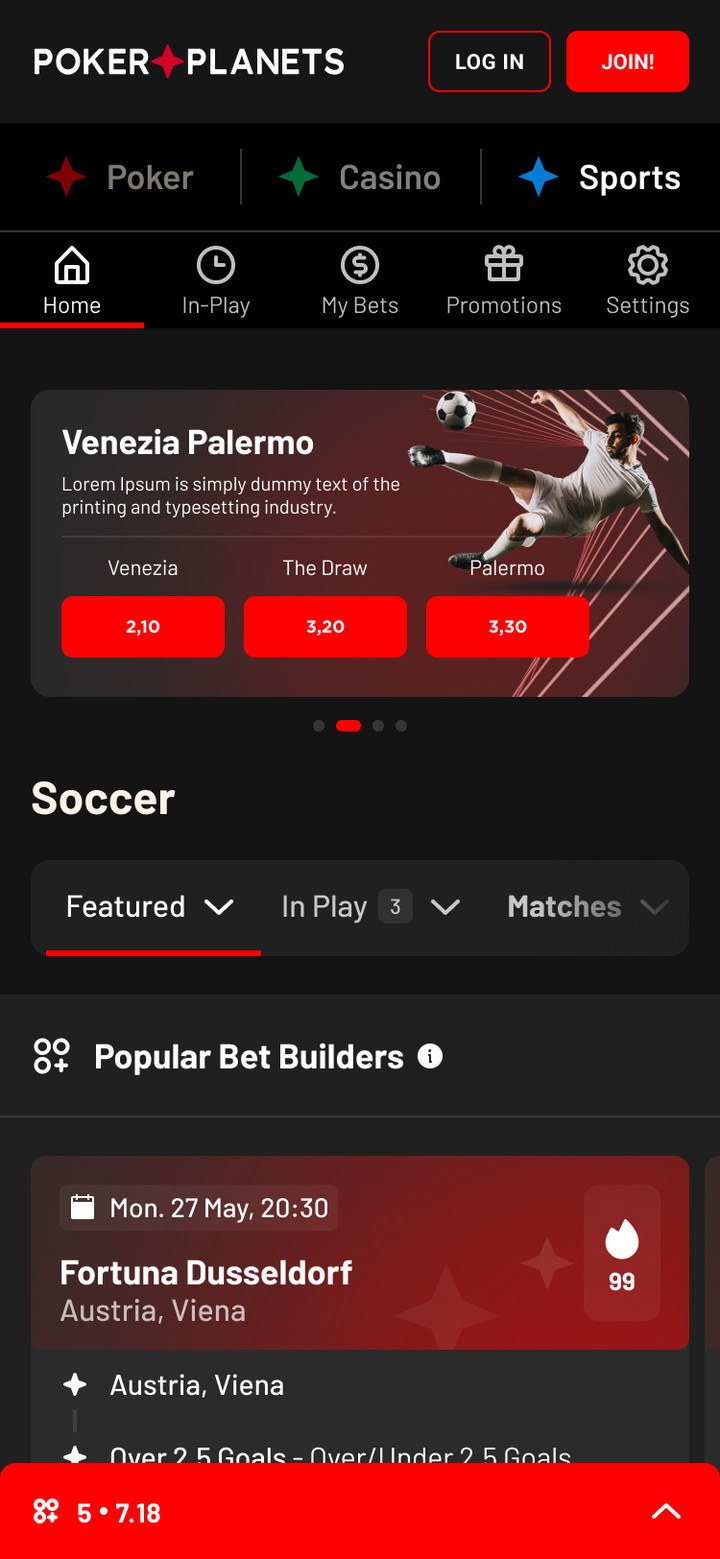
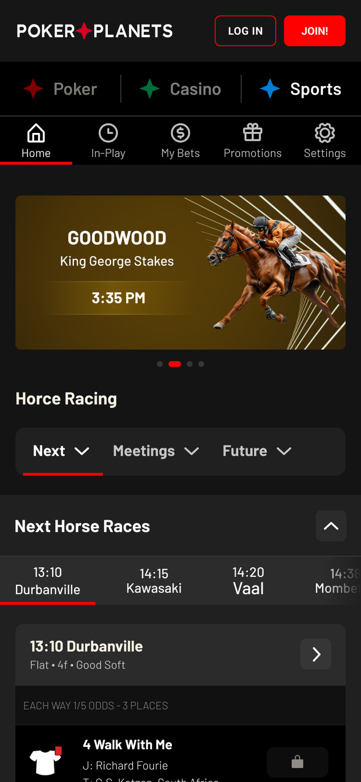
Football, horse racing, match and tournament on mobile
Poker
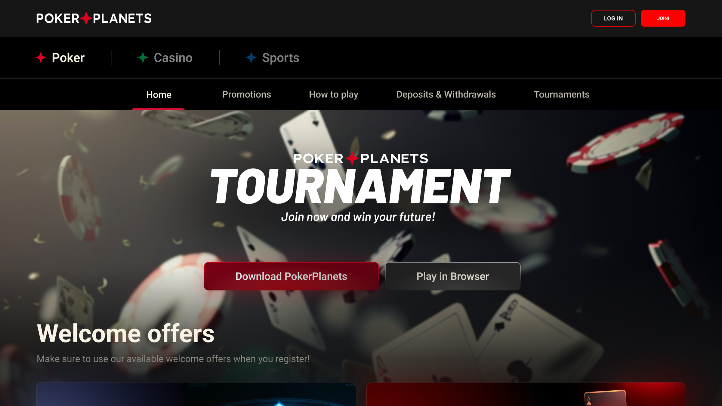
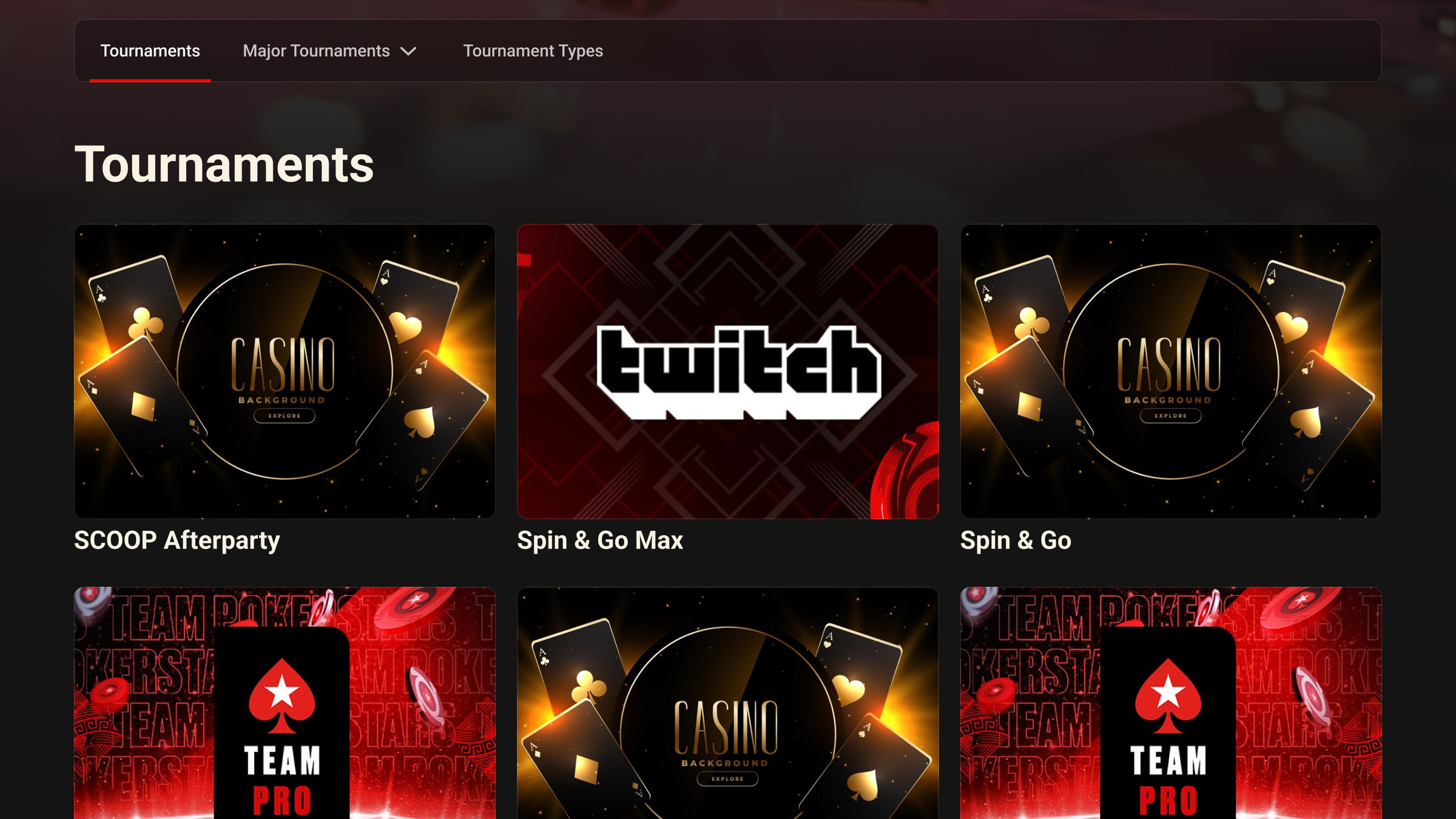
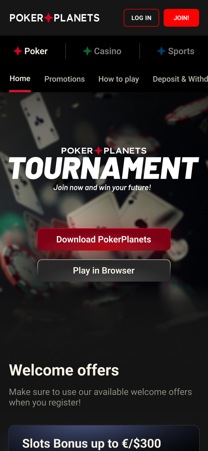
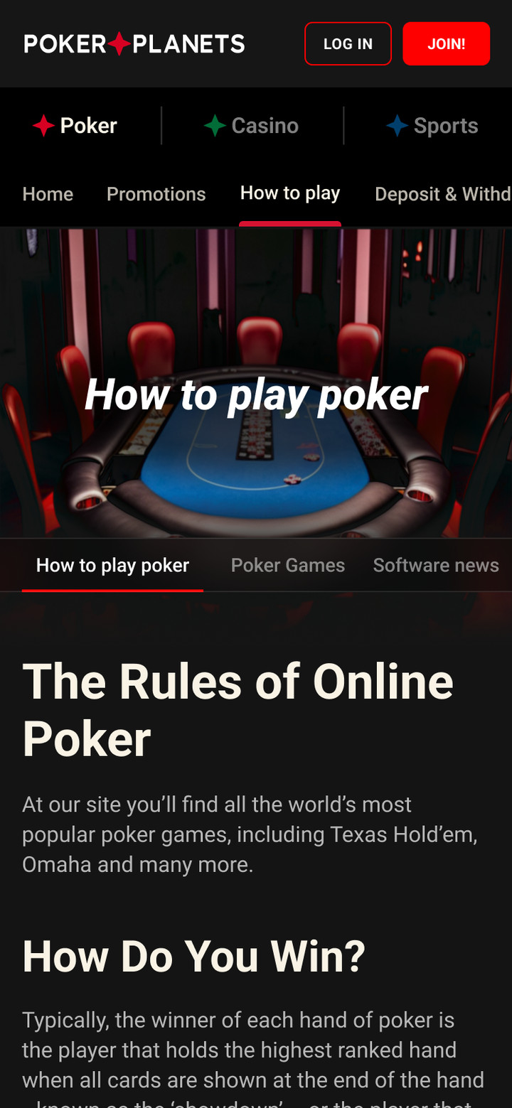
Poker room website: welcome bonuses, tournaments, promos and game rules. The client can be downloaded or opened in a browser.
Poker homeTournaments
Home, promos and game rules on mobile
Cashier
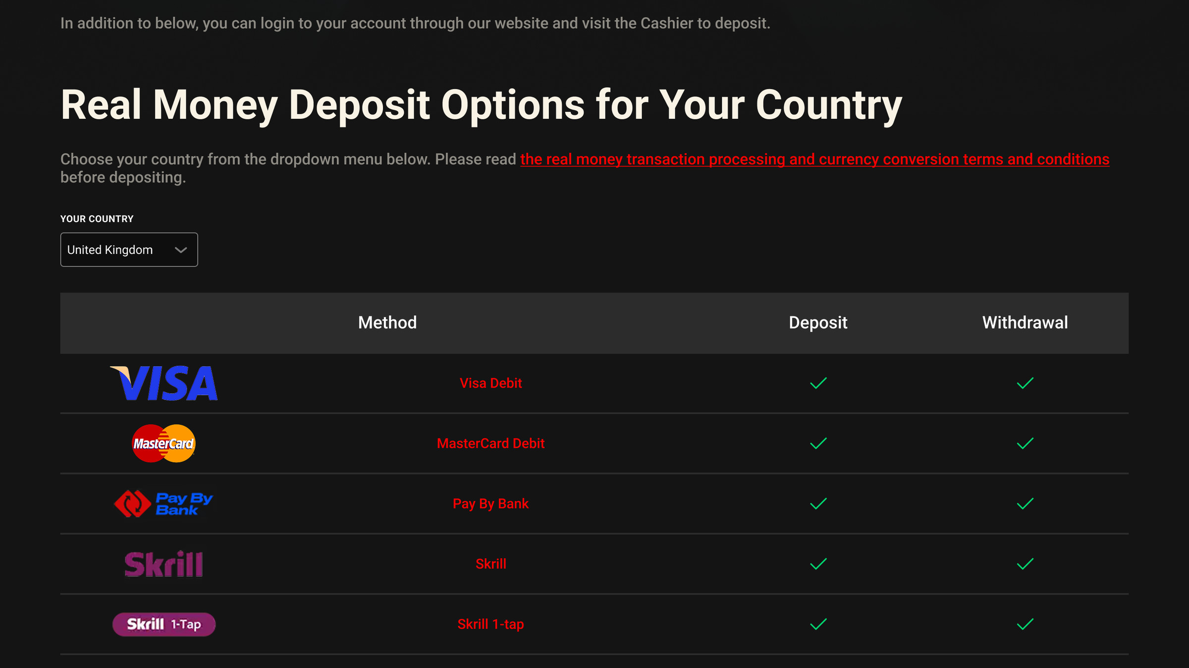
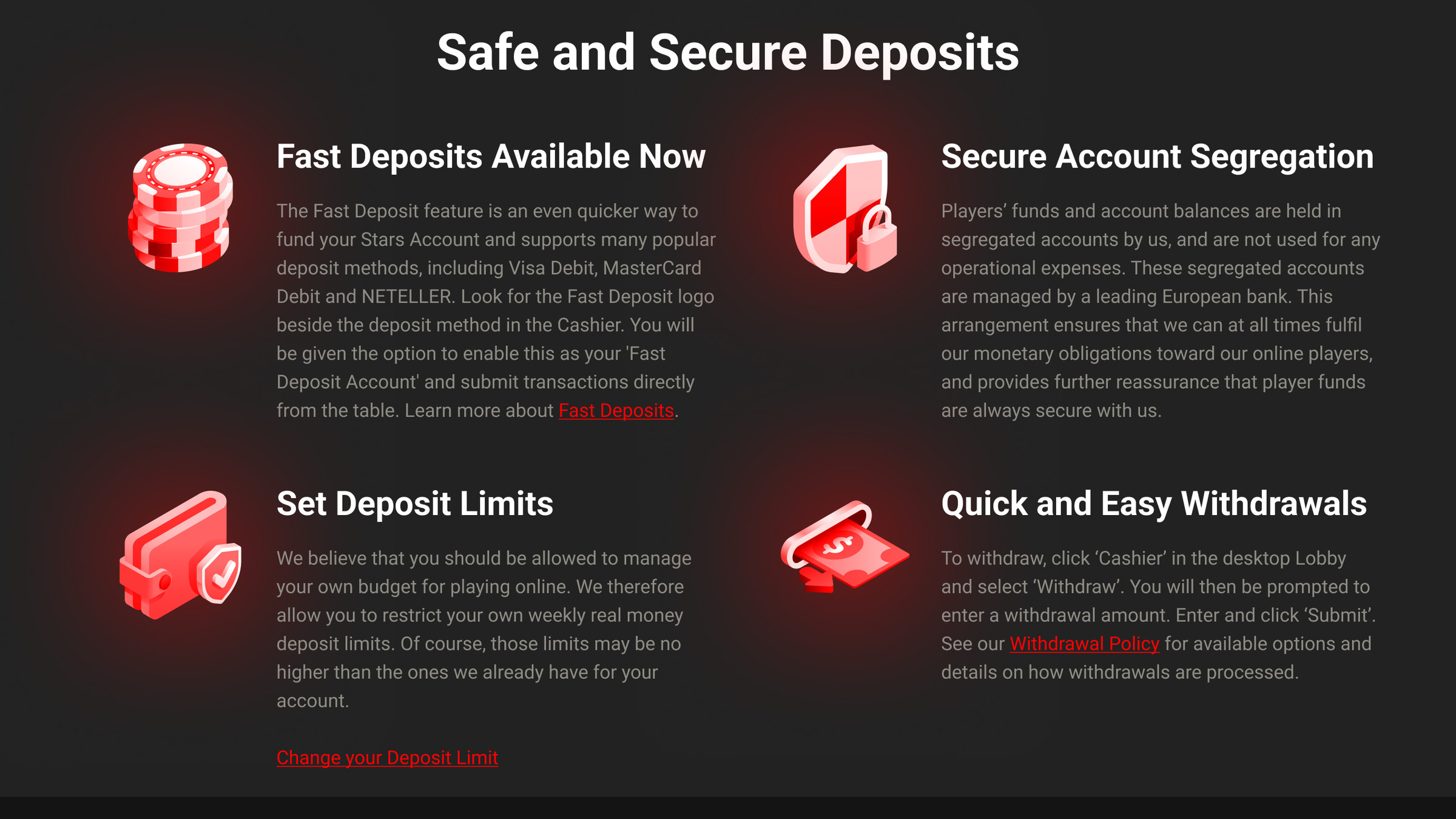
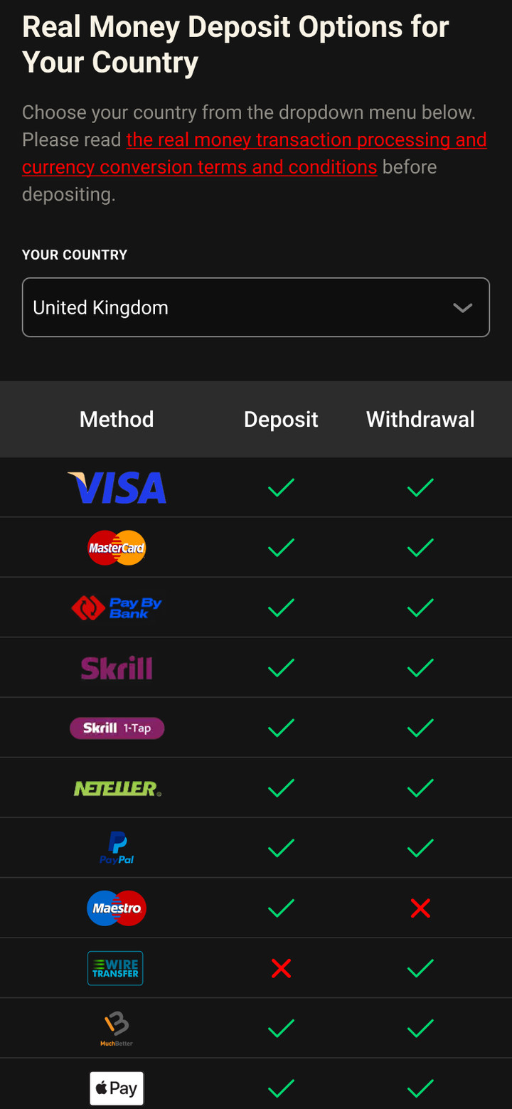
Deposit and withdrawal methods for the player's country, deposit limits and withdrawal rules.
Deposit and withdrawal methods by countrySecurity: deposit limits and withdrawals
Payment methods on mobile
Let's work together
Happy to talk about your project. I reply within a day.
SkorNet live-score service design: matches, stats, favorites and video
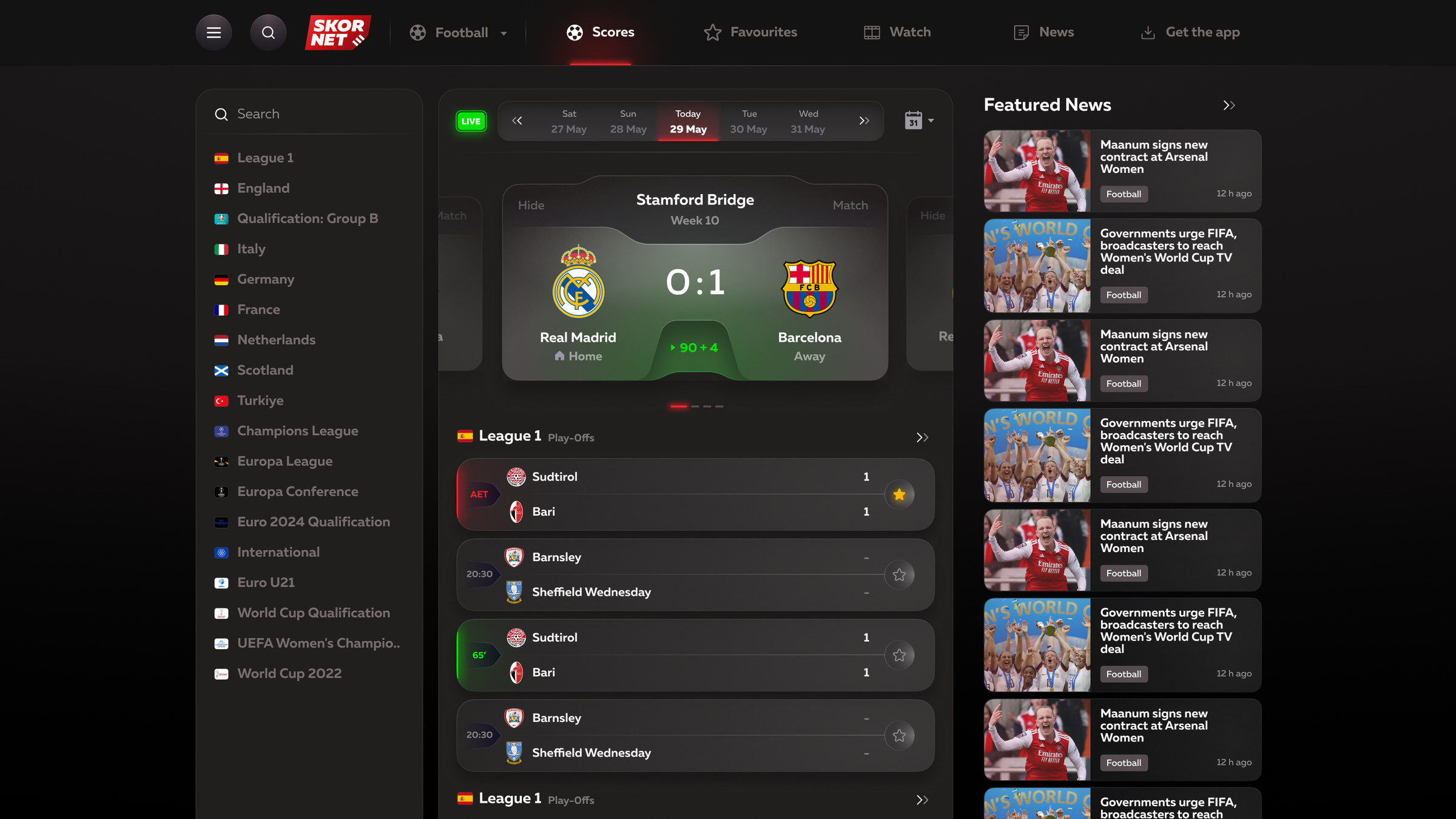
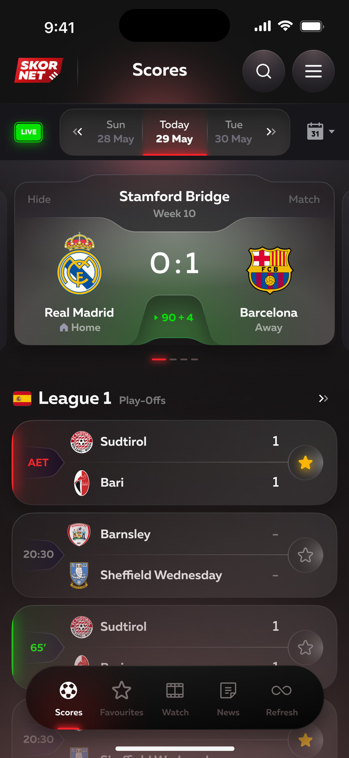
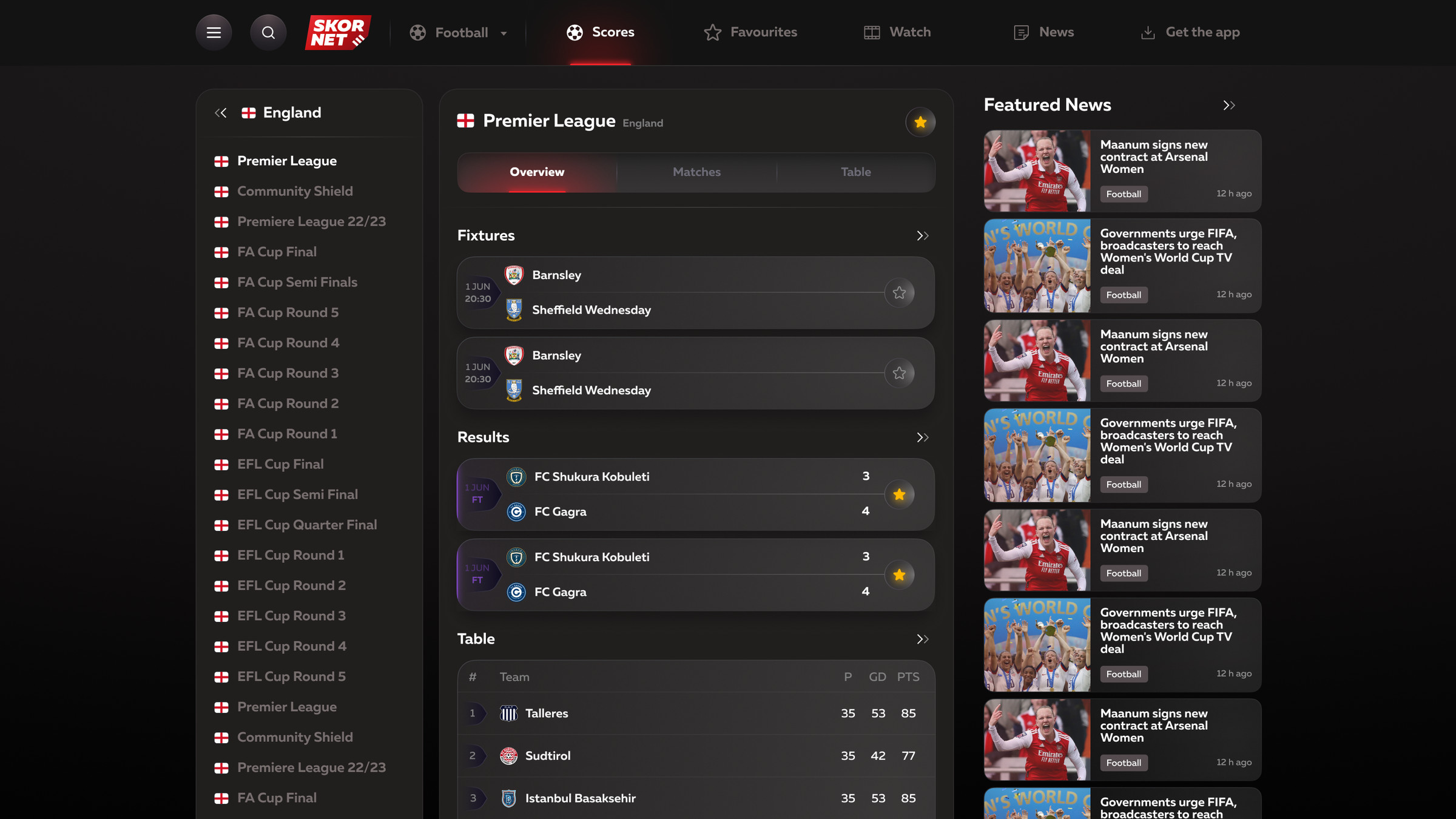
A football live-score service for fans and bettors: live match statuses, team form, head-to-head, stats, video and news.
RoleUX/UI Designer
AgencyMoreThan Design Agency
Year2022–2023
PlatformWeb and mobile app
The case shows key screens. The project has more sections and states.
Home: today's matches and live score
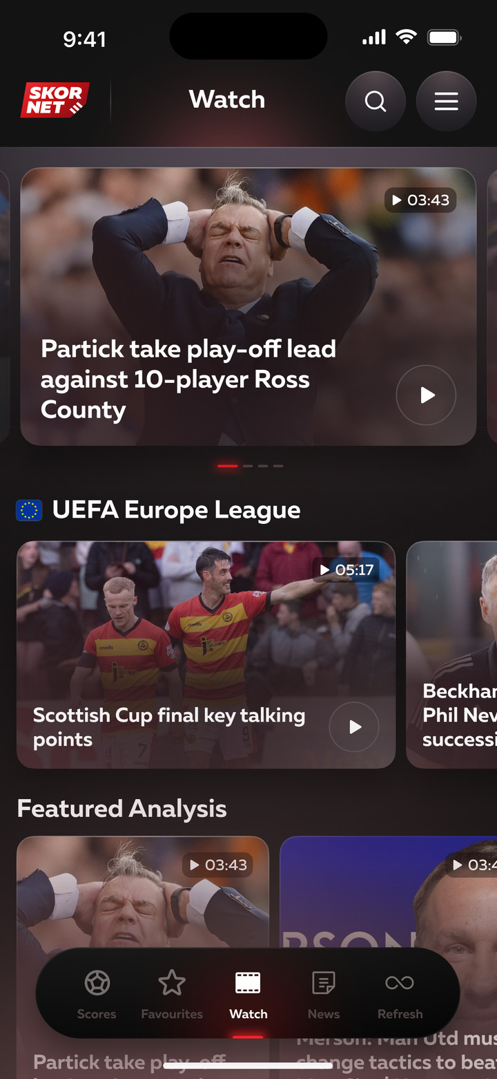
Home
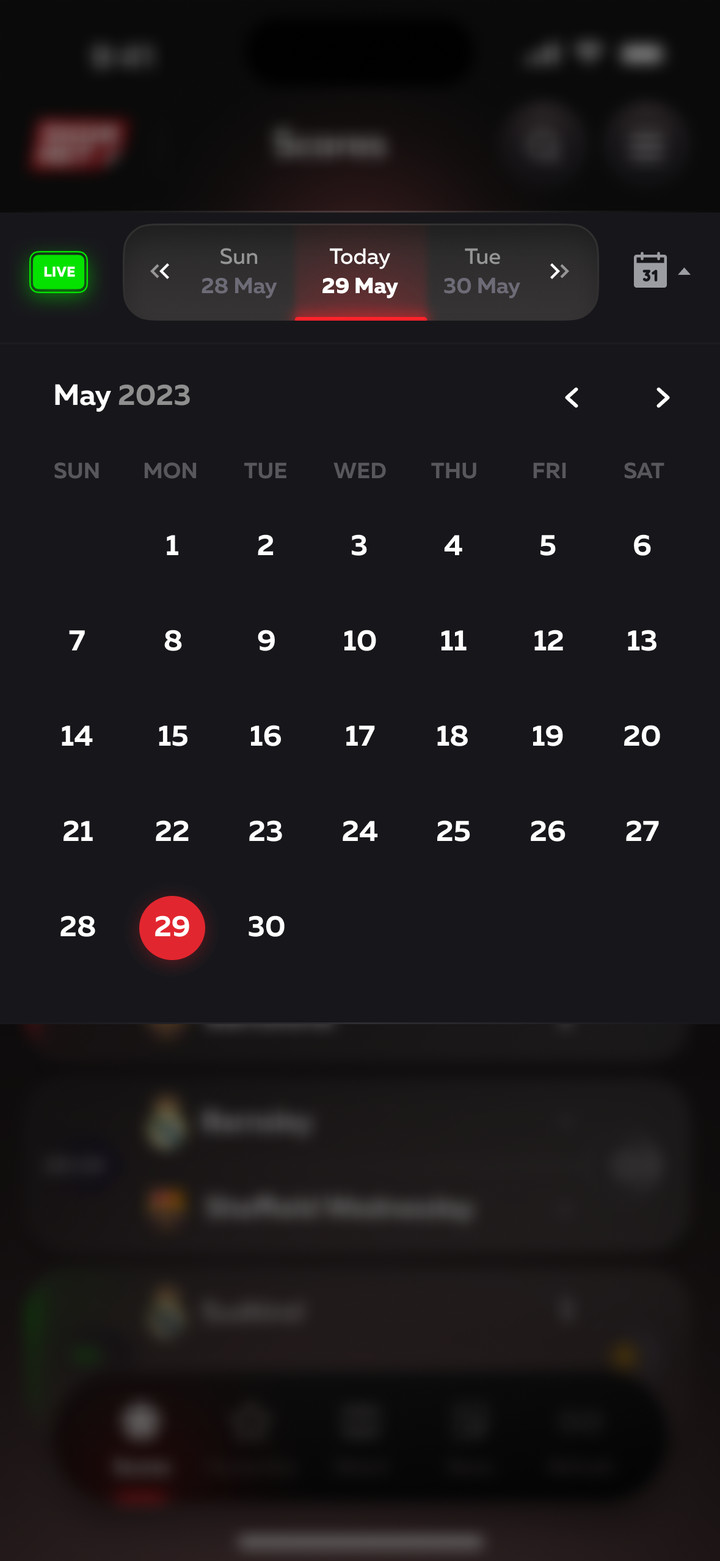
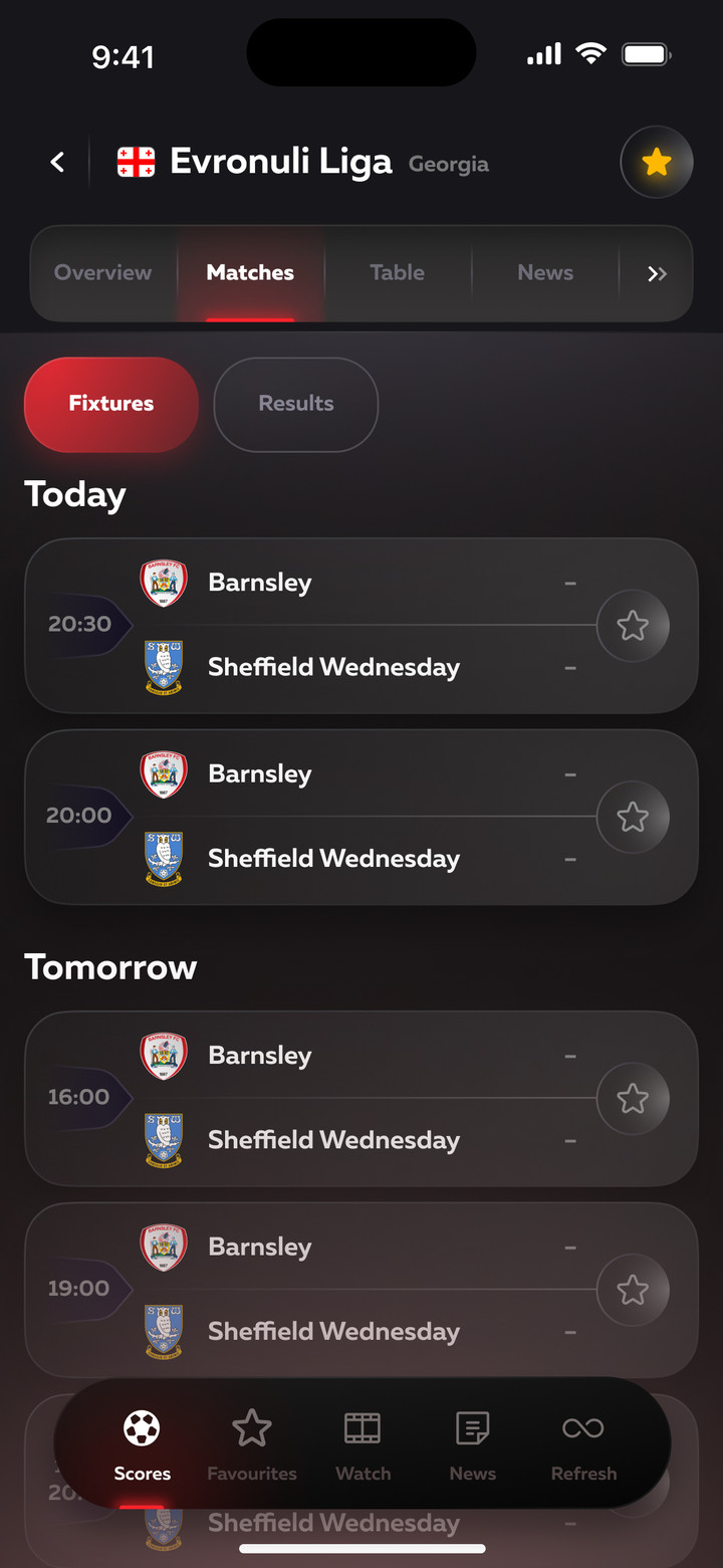
Today's matches by league. Each match has a status: live (match minute), finished in extra time, not started yet. The LIVE filter keeps only ongoing matches, and the calendar jumps to any day.
Home, calendar and favorites on mobile
Match
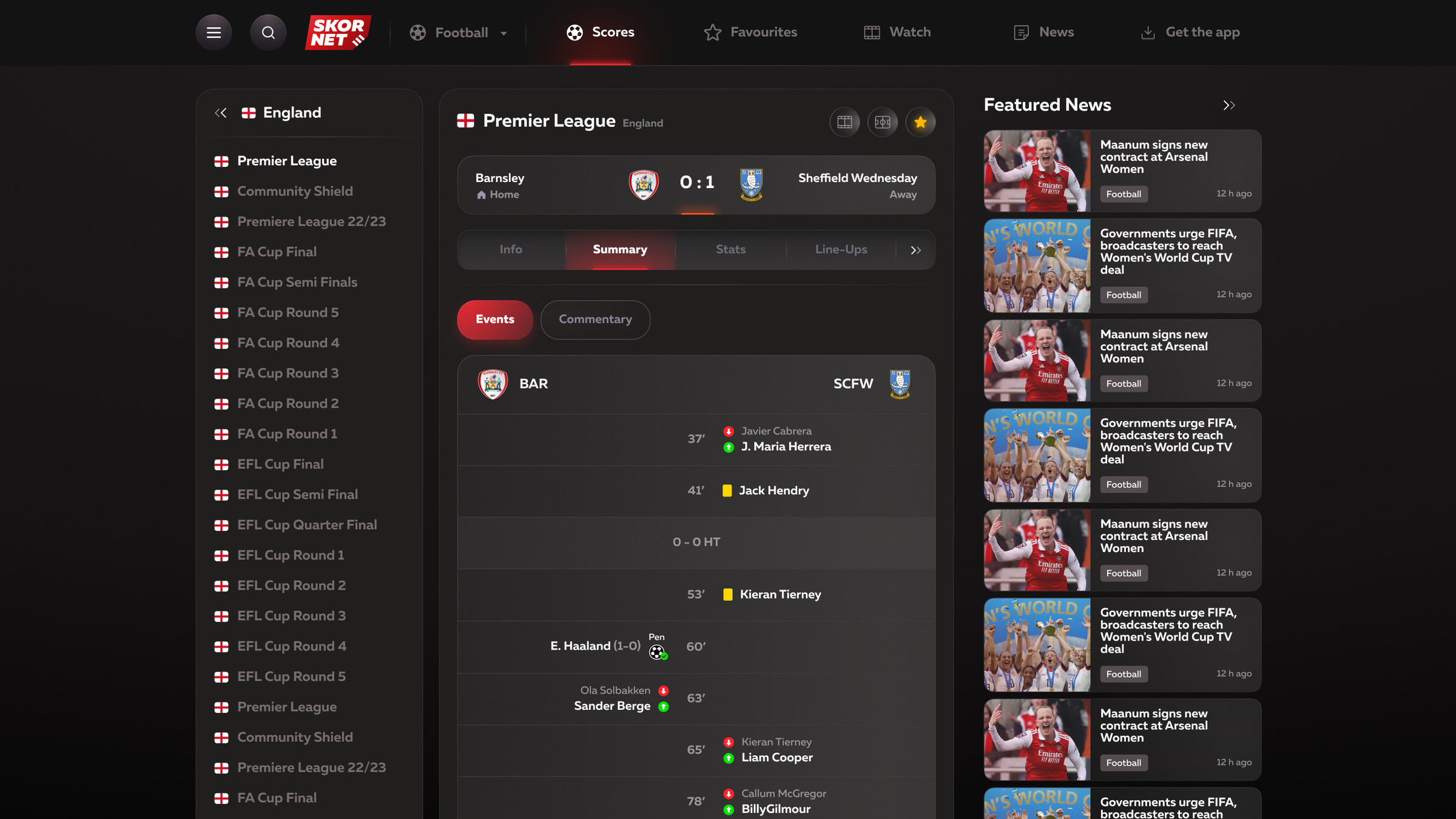
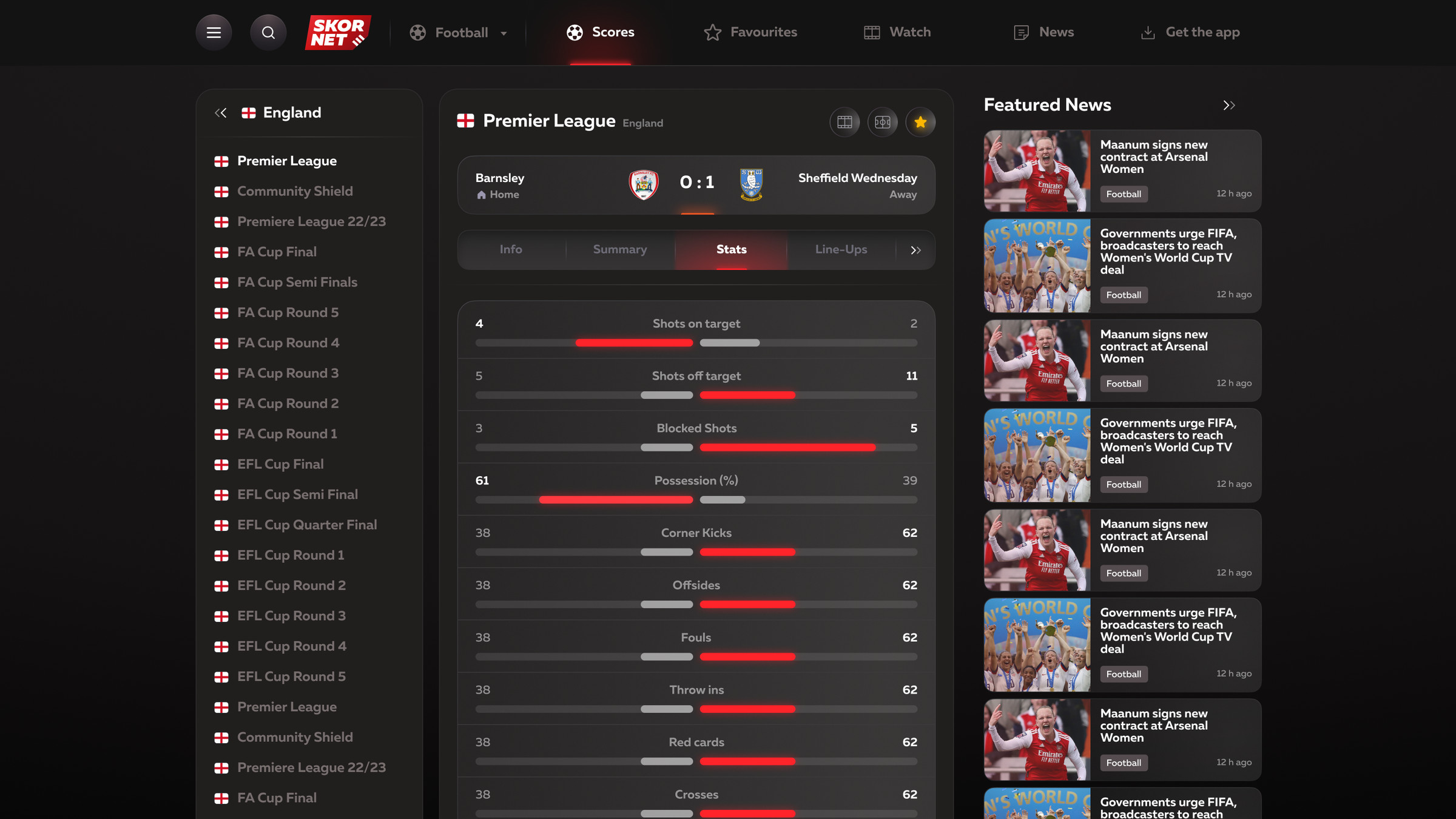
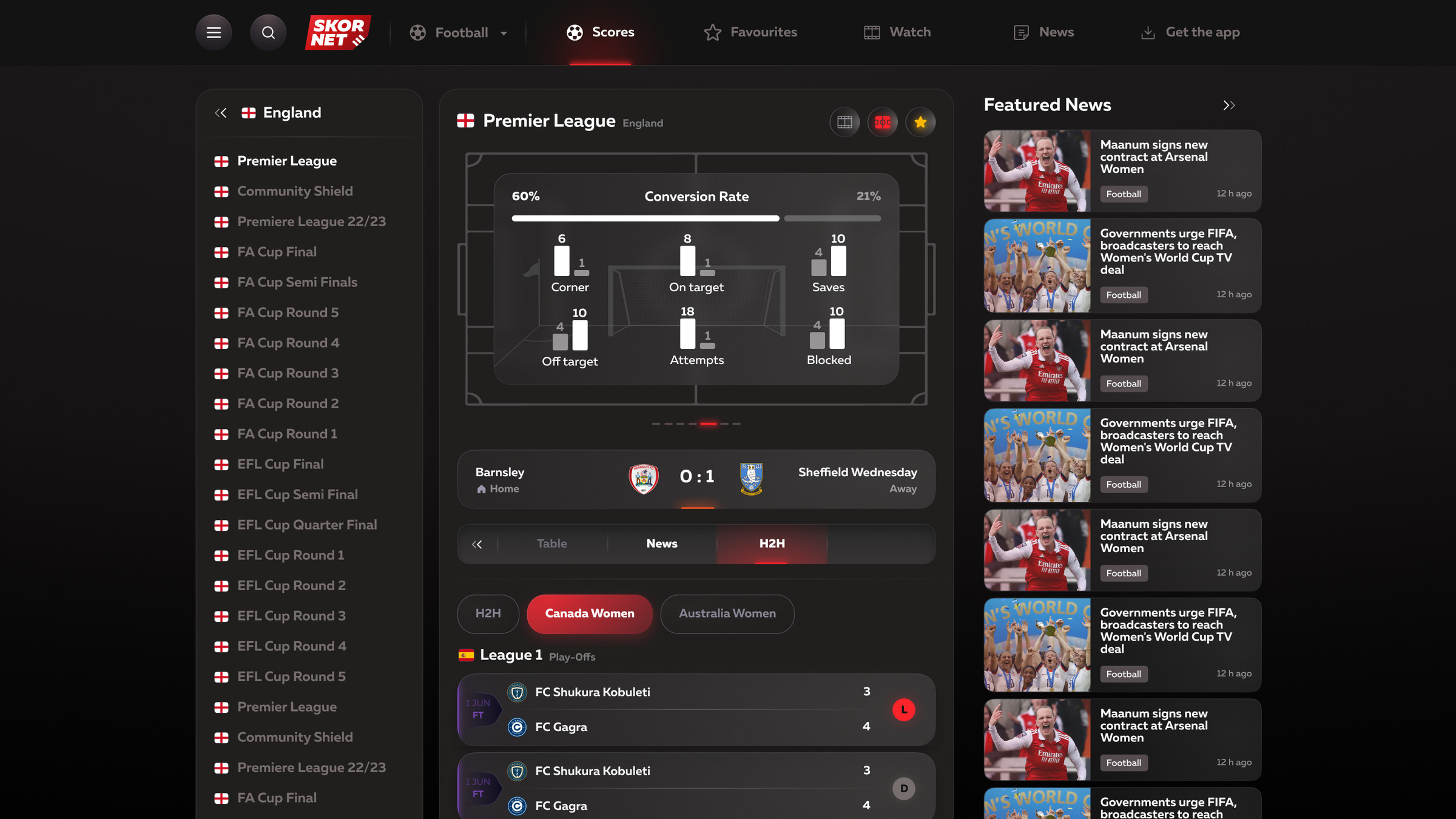
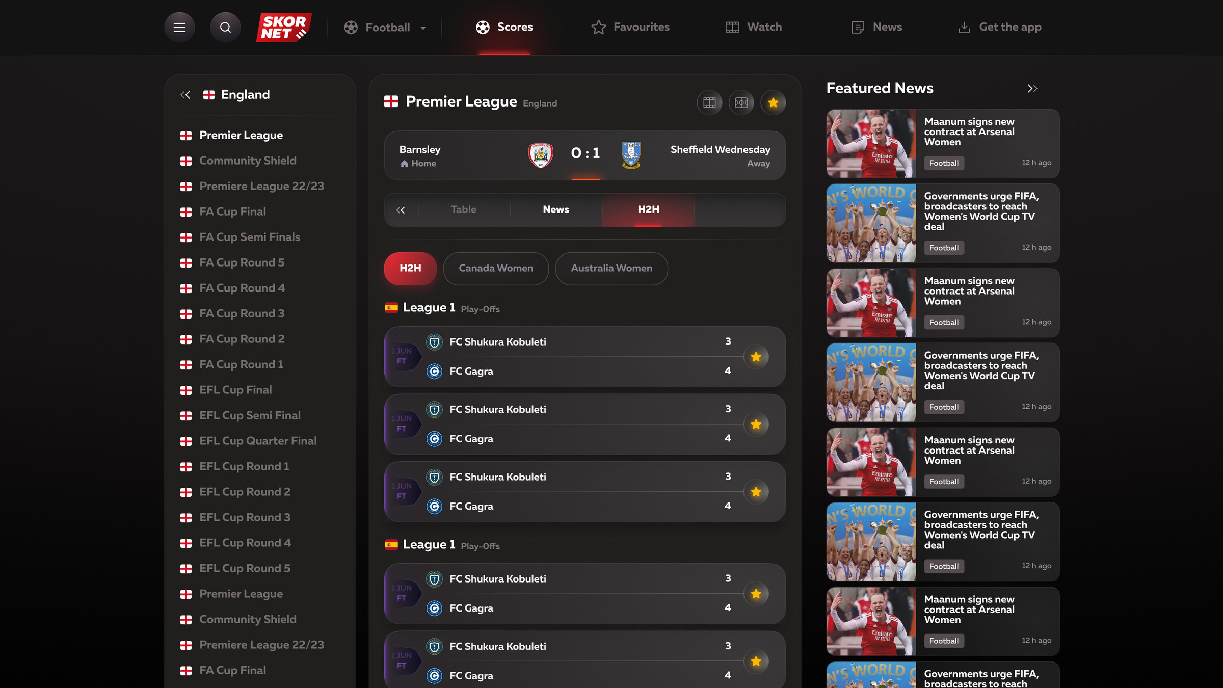
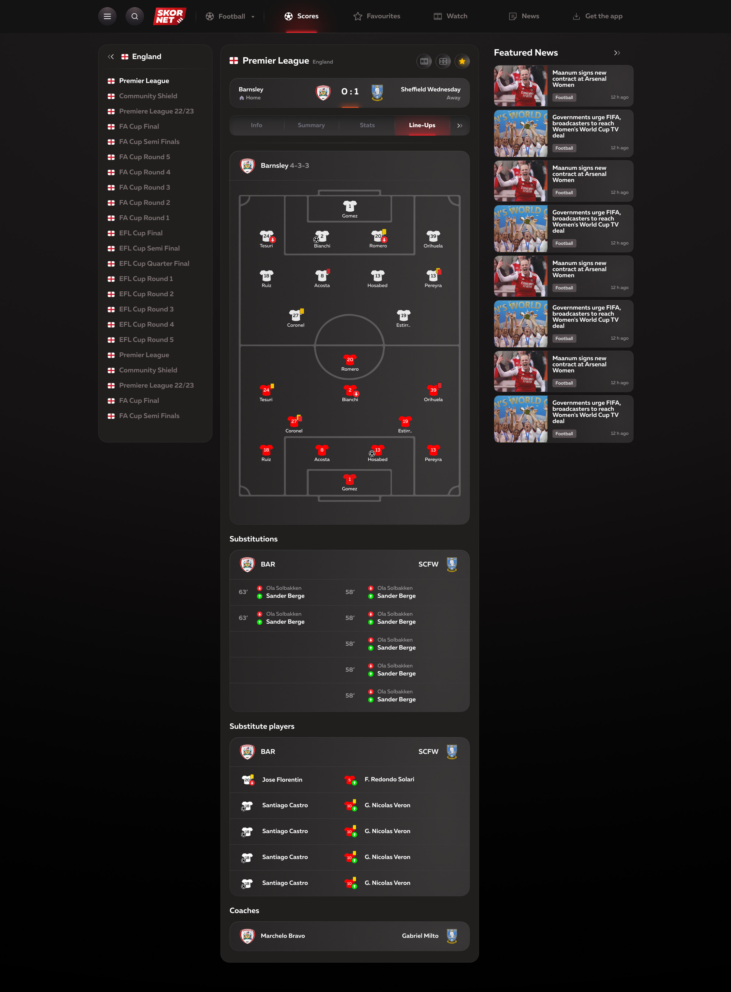
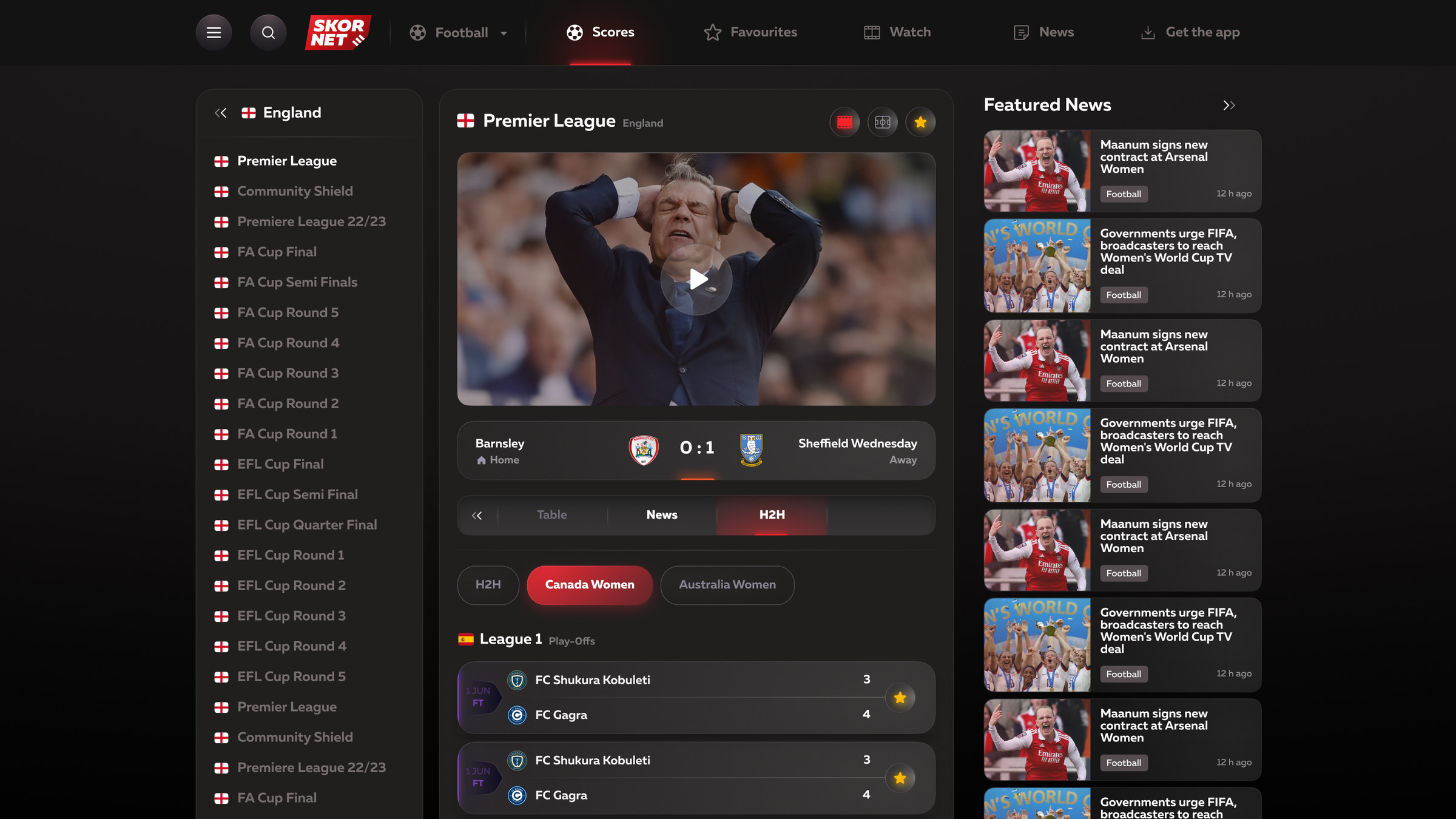
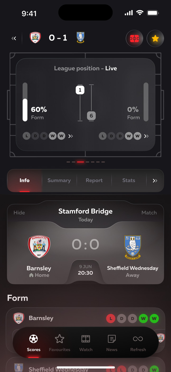
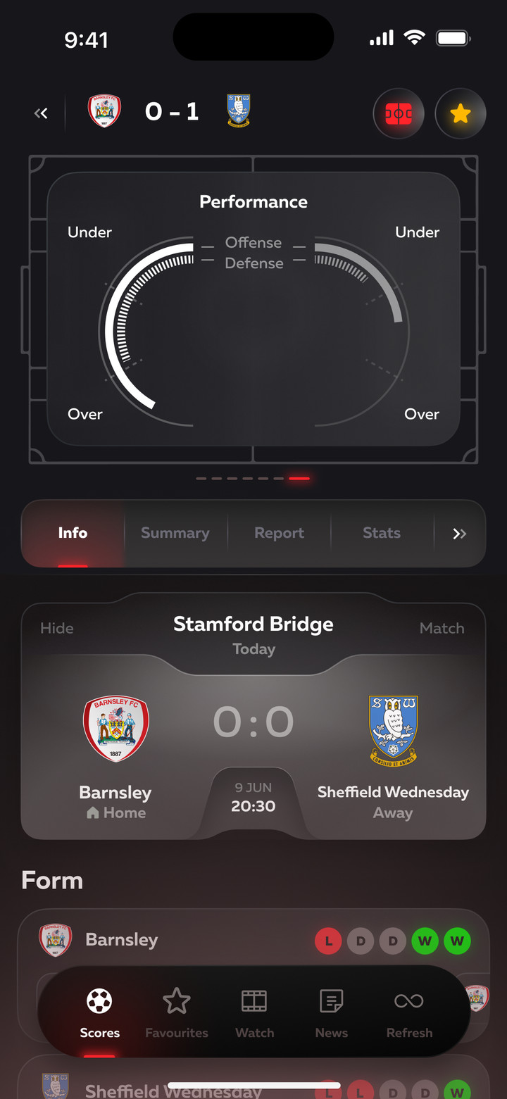
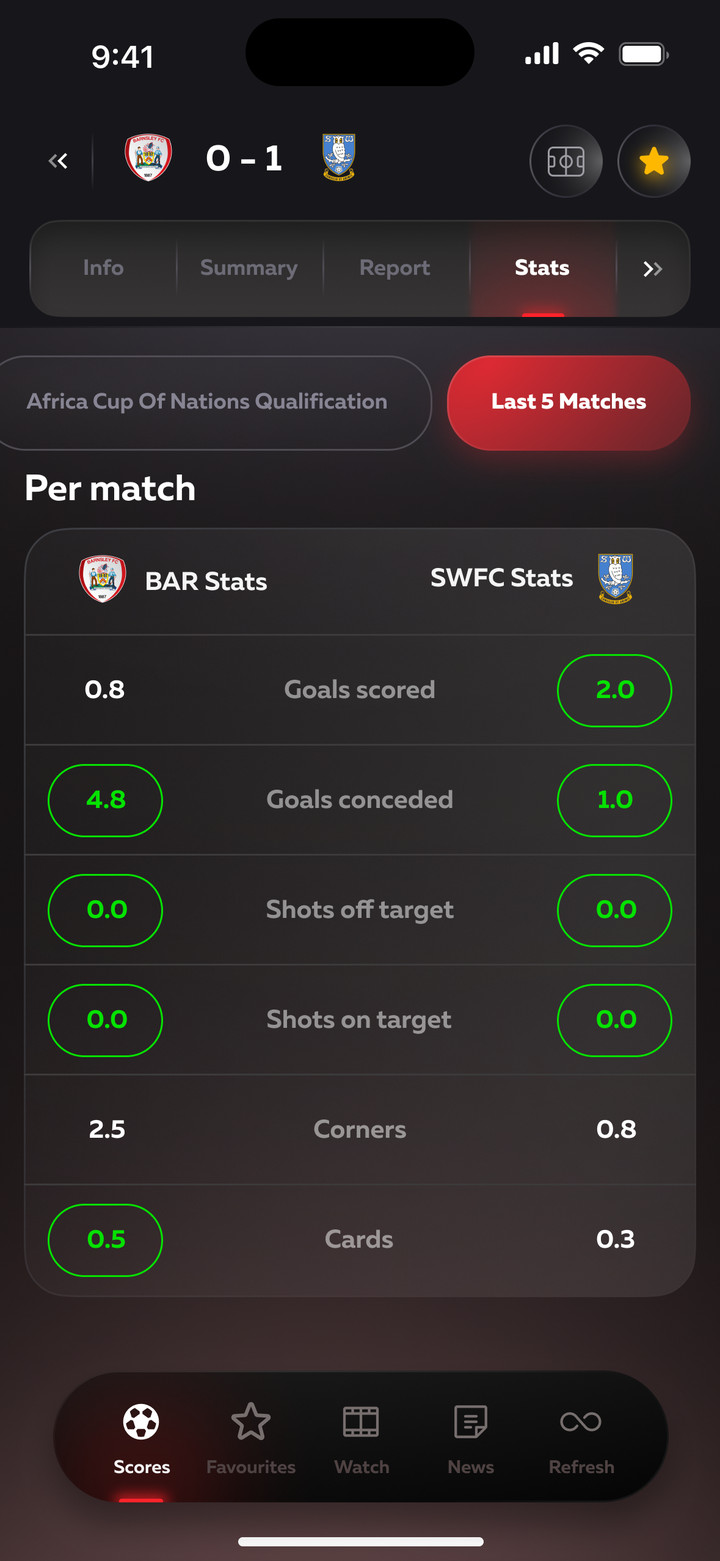
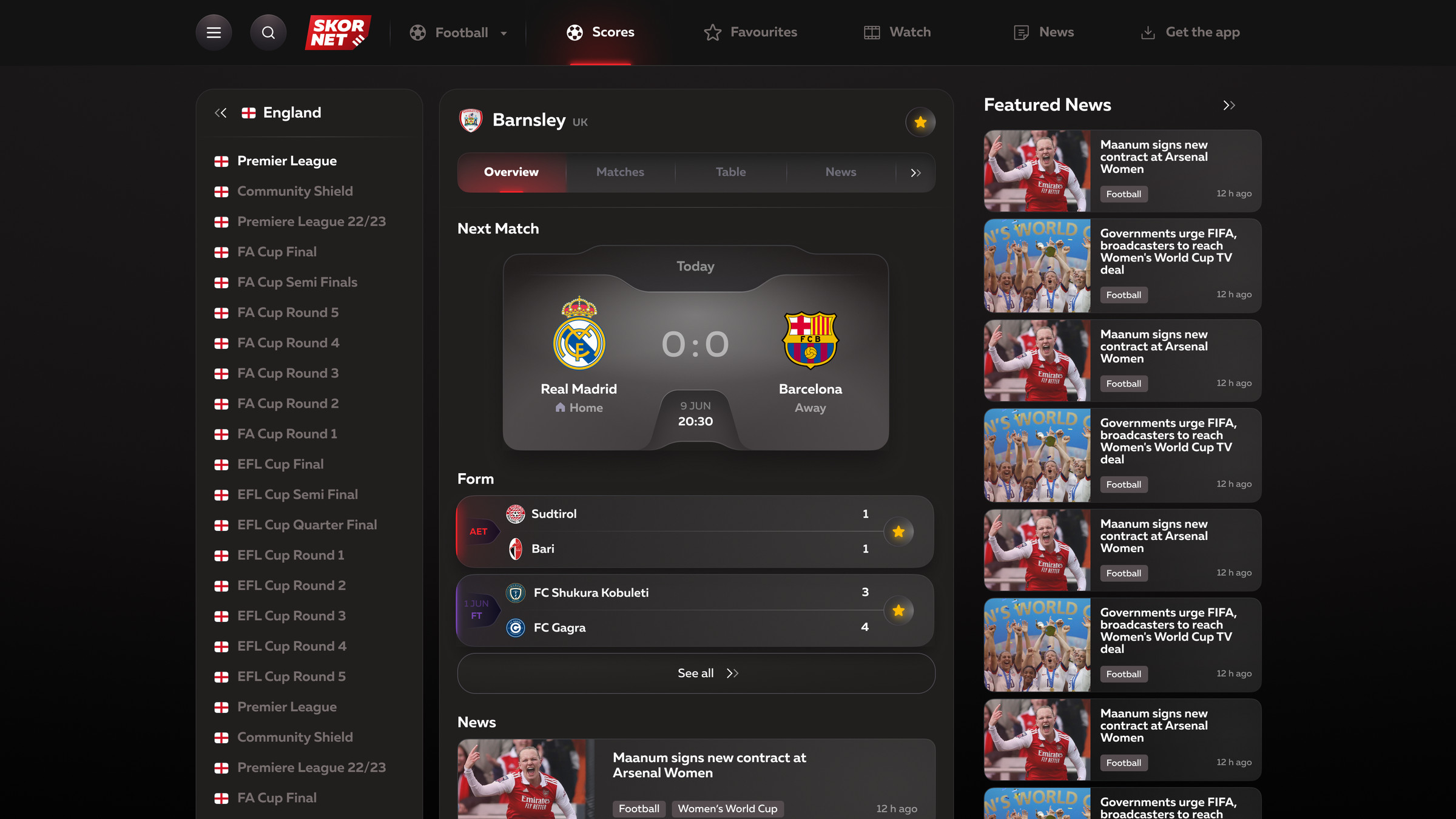
Everything about a match on one page: timeline, stats, lineups on the pitch and video. The score is pinned at the top, and sections switch with tabs. Above the tabs is a carousel of cards with league position, team form, attack and defense. Team form, head-to-head, recent stats and live statuses are the data people check before placing a sports bet.
Match timeline: goals, cards, substitutionsMatch statsShots and conversion on a pitch mapHead-to-headLineups and formations on the pitchMatch video right in the match center
League position, team play and stats over 5 matches
Favorites
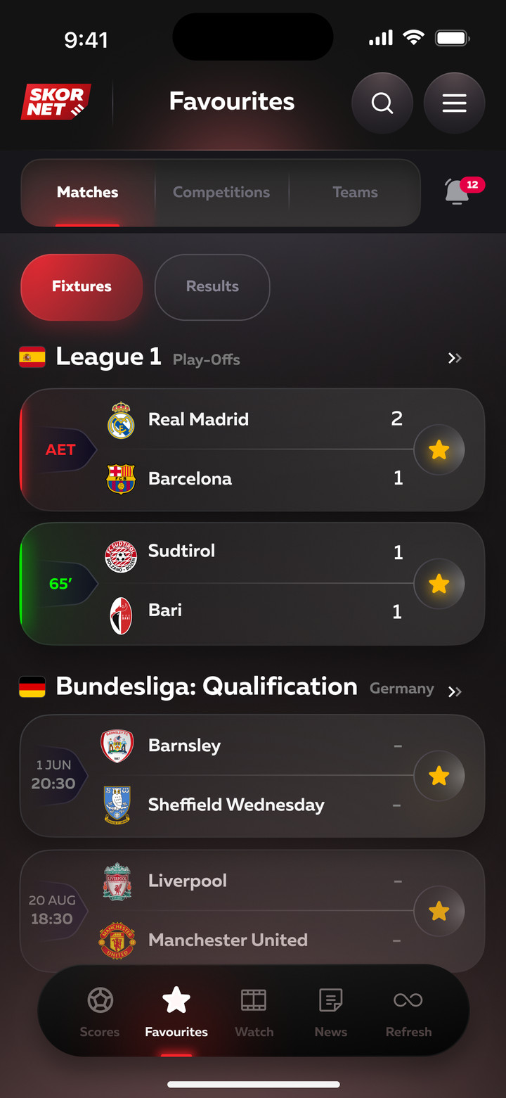
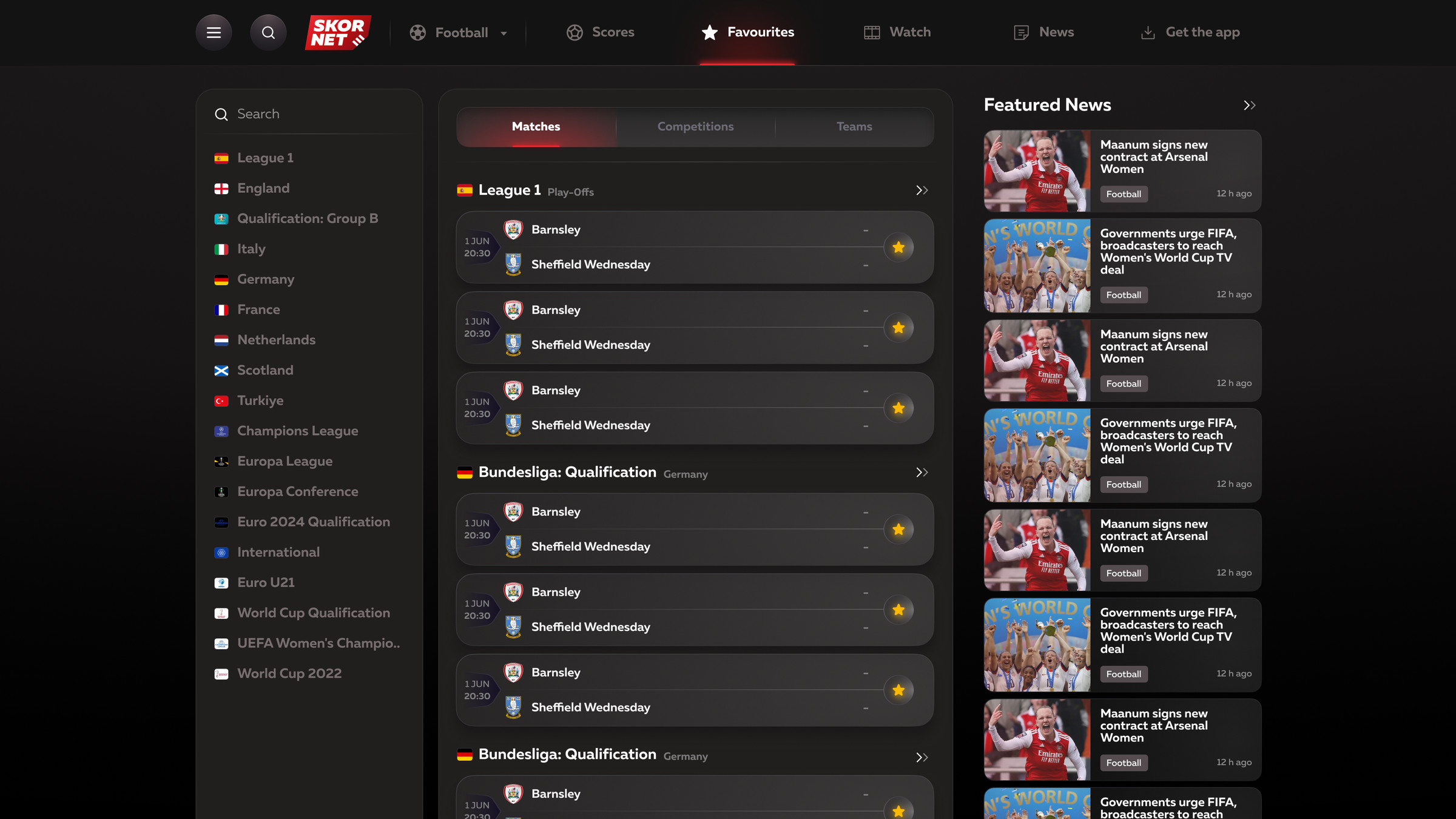
Starred matches, tournaments and teams are collected on one page. In the app, there's a notification counter next to it.
Favorite matches
League, team, player
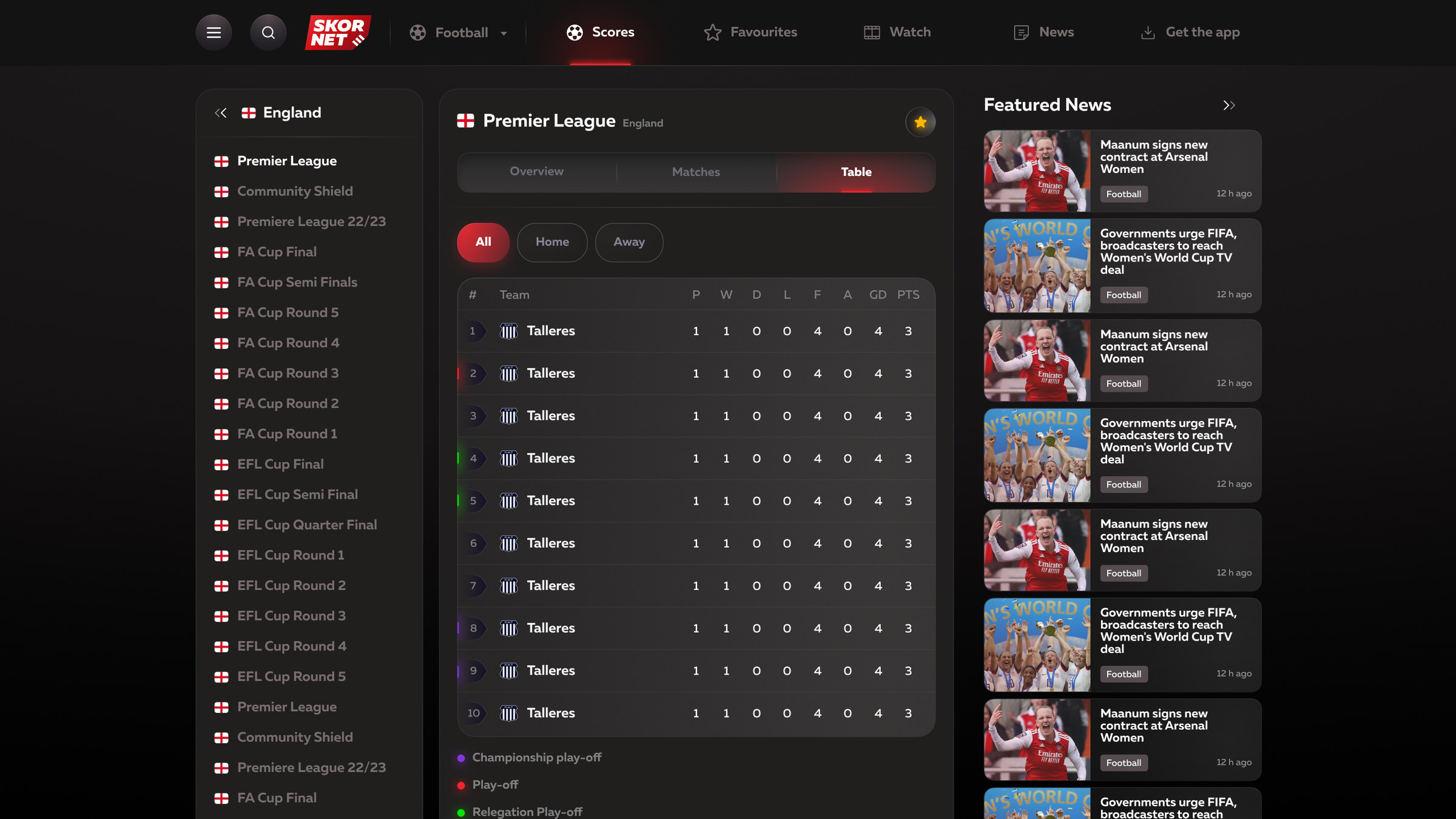
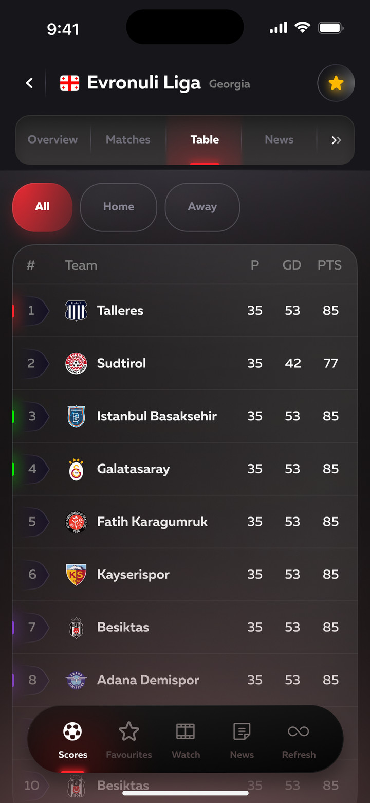
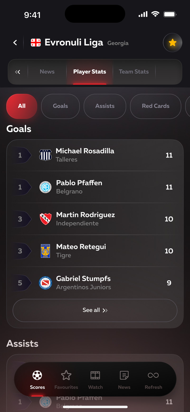
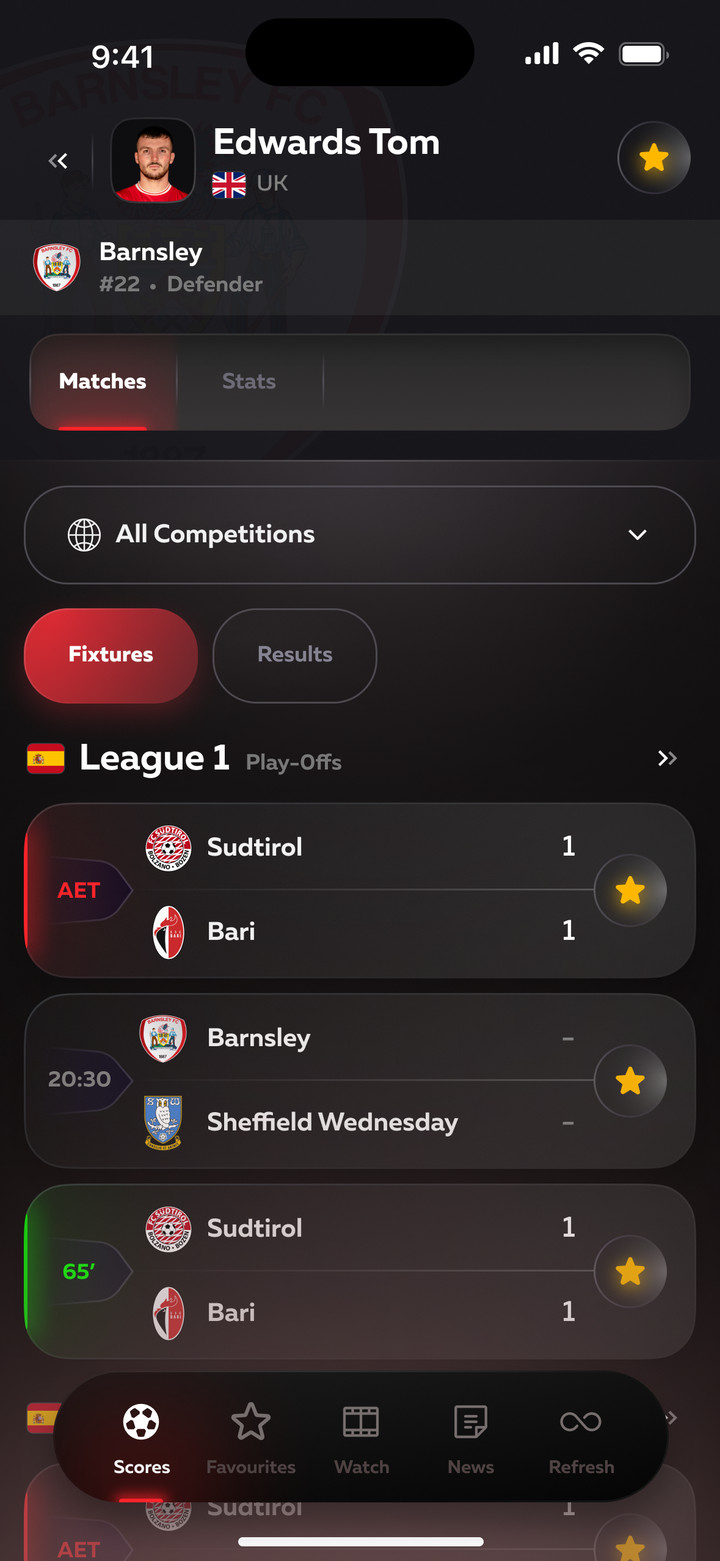
Tournament page: matches, results, a table with playoff and relegation zones, top players. Teams and players have their own pages with the next match, form and stats.
League: matches, results and tableLeague tableTeam: next match, form, news
League matches, table, top scorers and player page
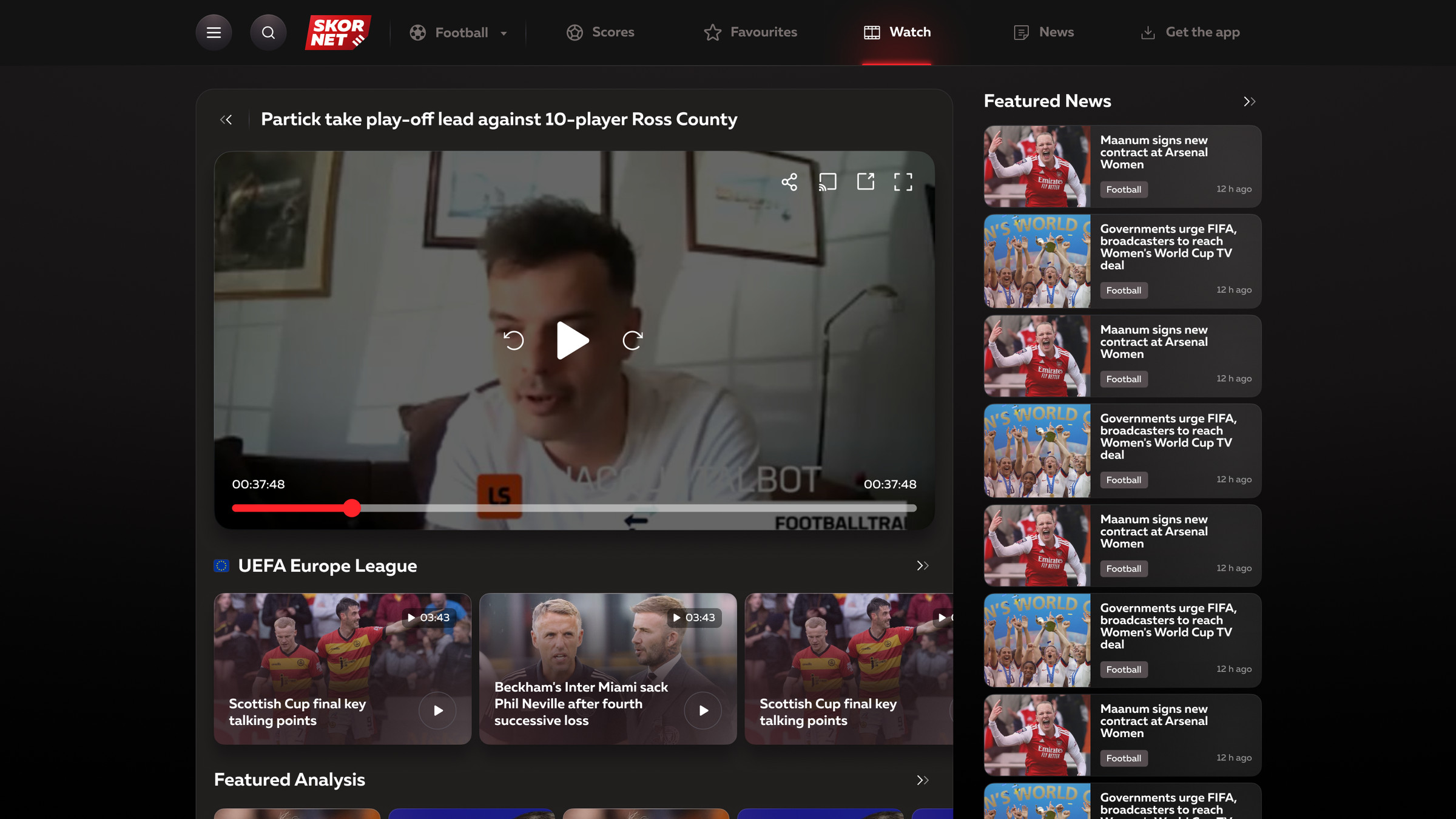
Video
Player and video collections by tournament.
Video: player and collections
Video on mobile
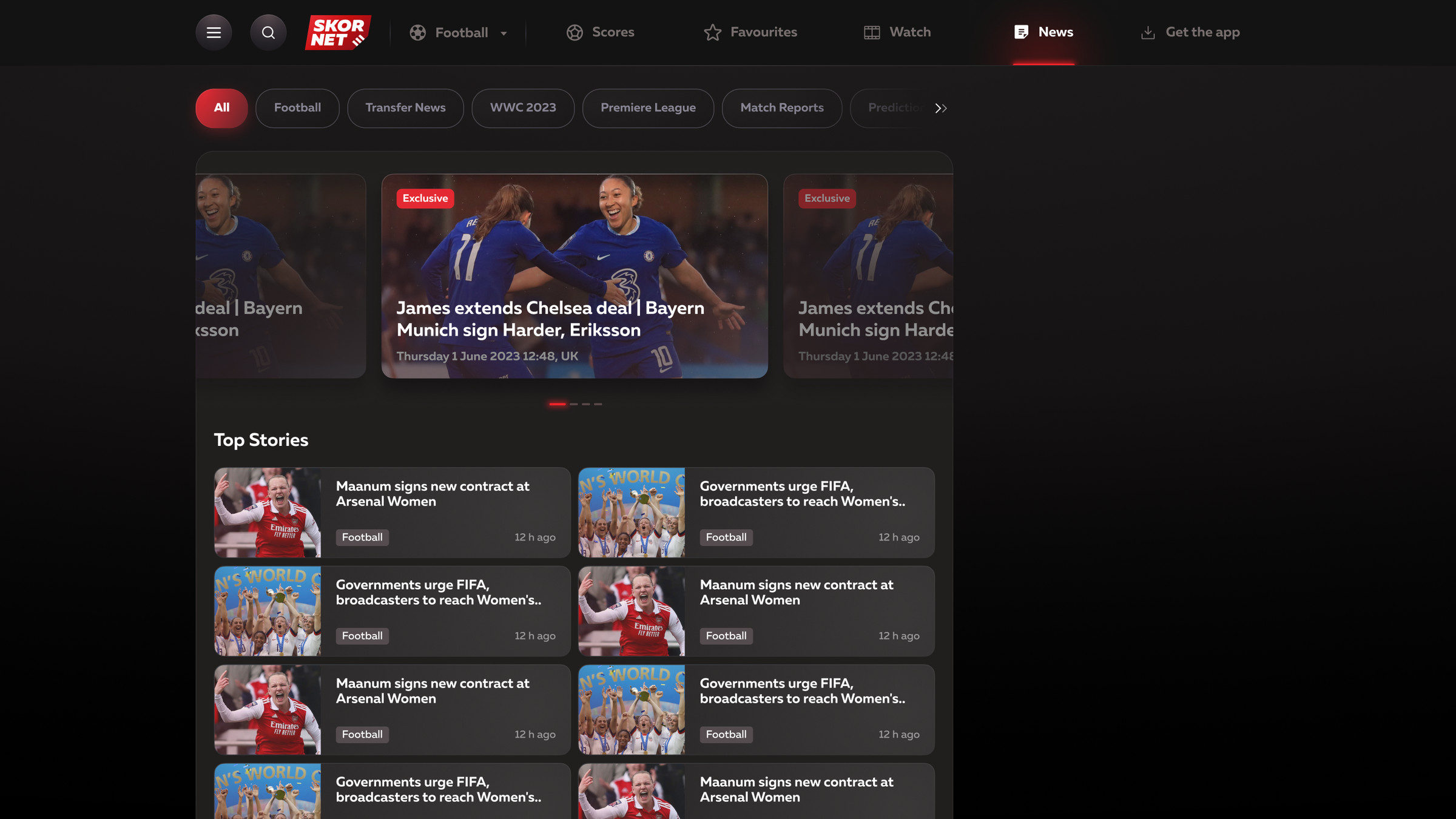
News
Top stories in a carousel, a feed and a topic filter.
News
Let's work together
Happy to talk about your project. I reply within a day.
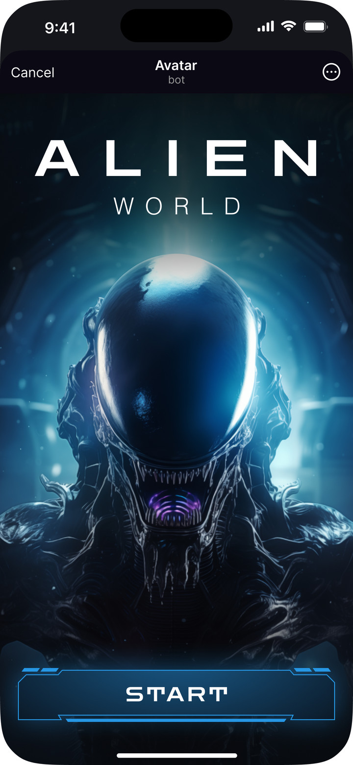
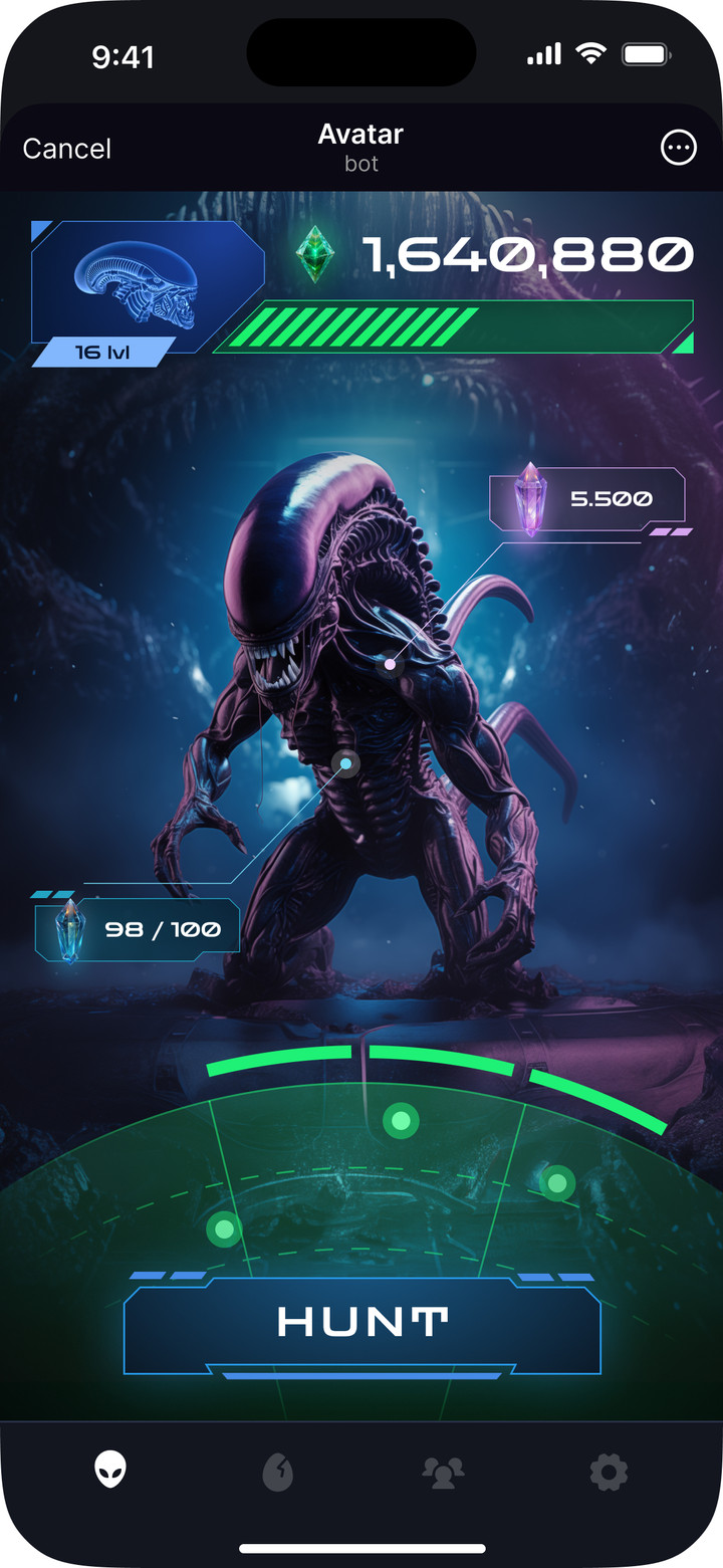
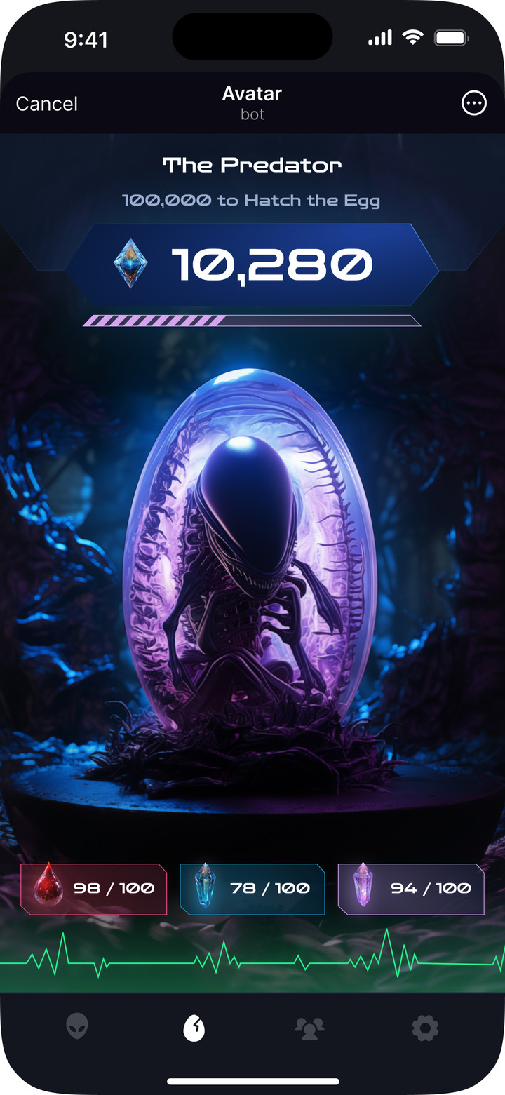
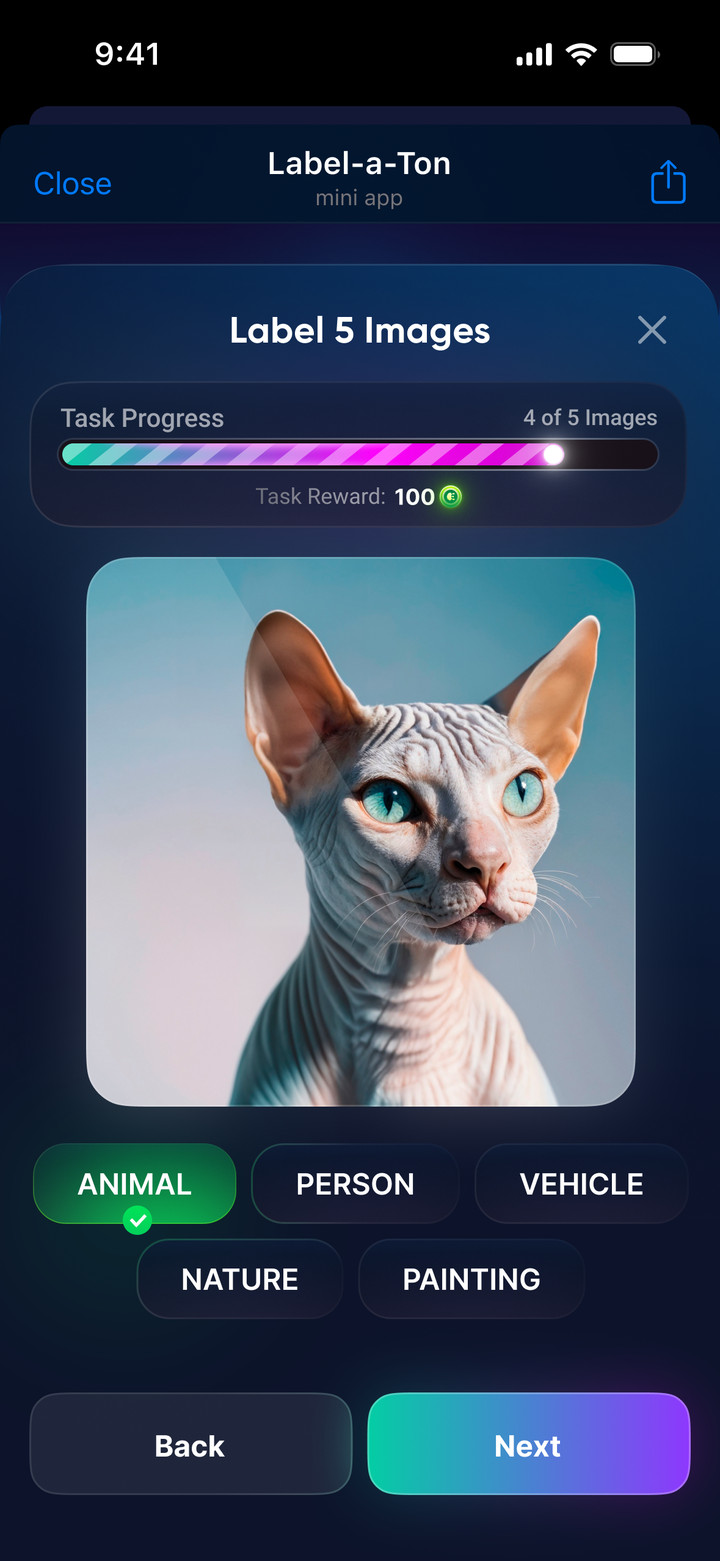
Game mechanics in Telegram: bookmaker promo game, wheel of fortune, cases and prize draws
Five Telegram mini apps, 2024–2026.
RoleUX/UI and Product Designer
WorkFreelance and MoreThan Design Agency
Years2024–2026
PlatformTelegram Mini Apps
The cases show key screens. The projects have more sections and states.
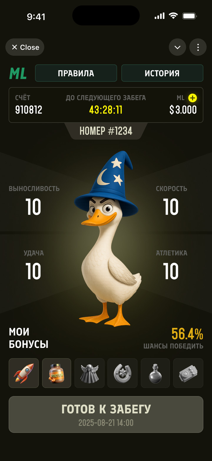
Goose Race
Telegram mini app for the bookmaker Maxline
RoleUX/UI Designer
WorkFreelance
Year2025
StatusLive
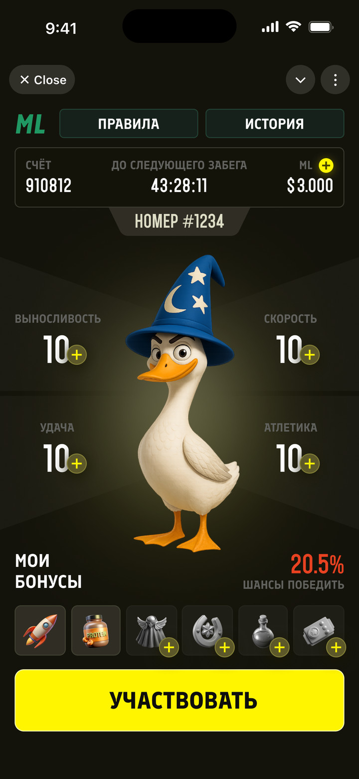
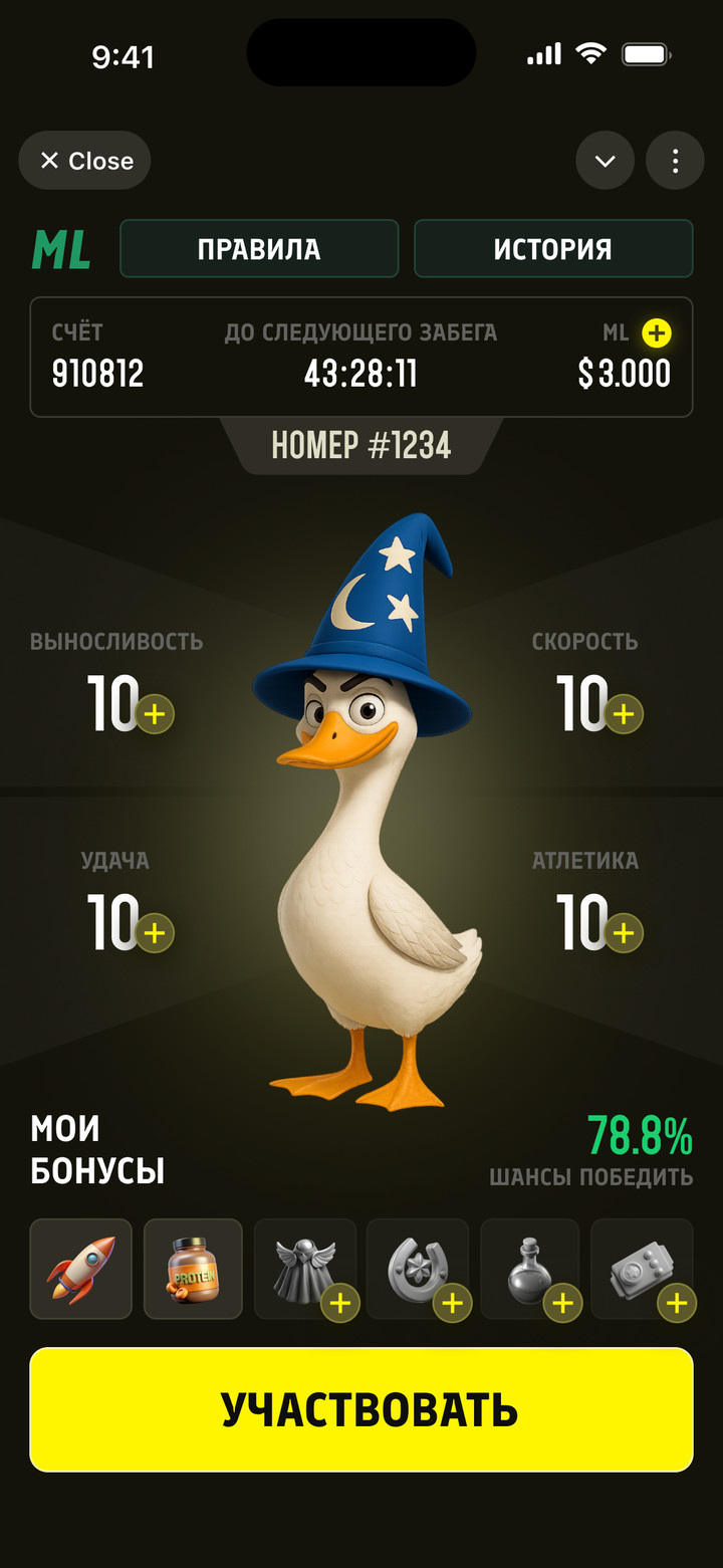
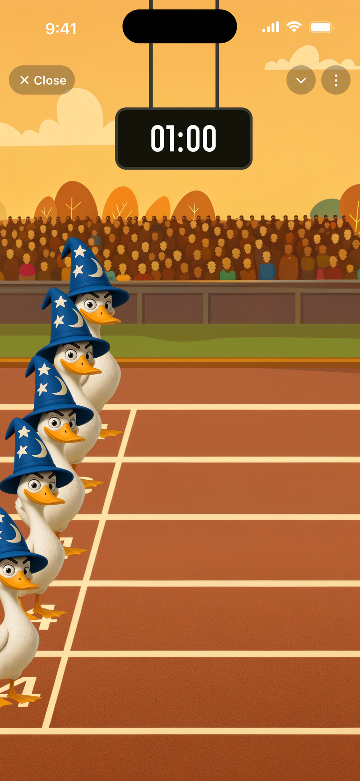
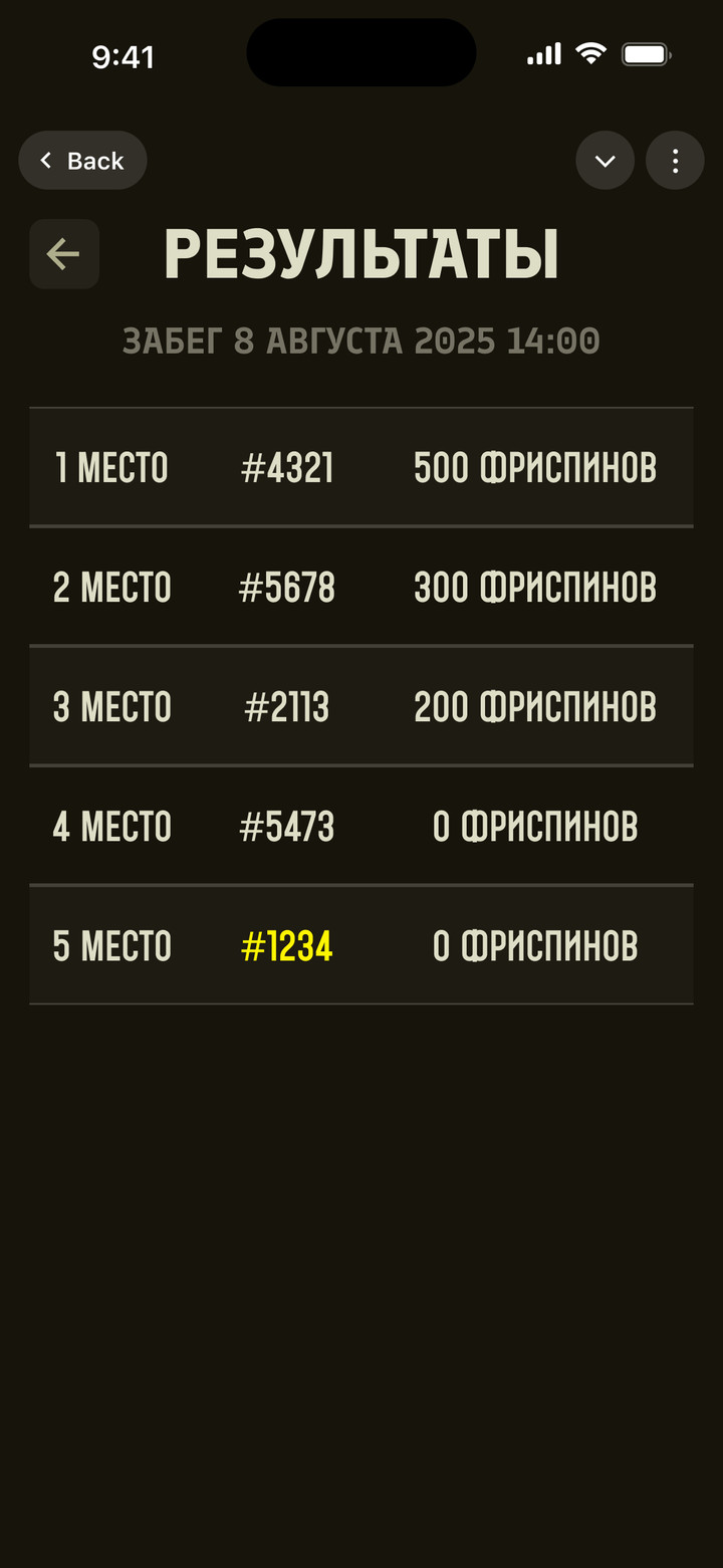
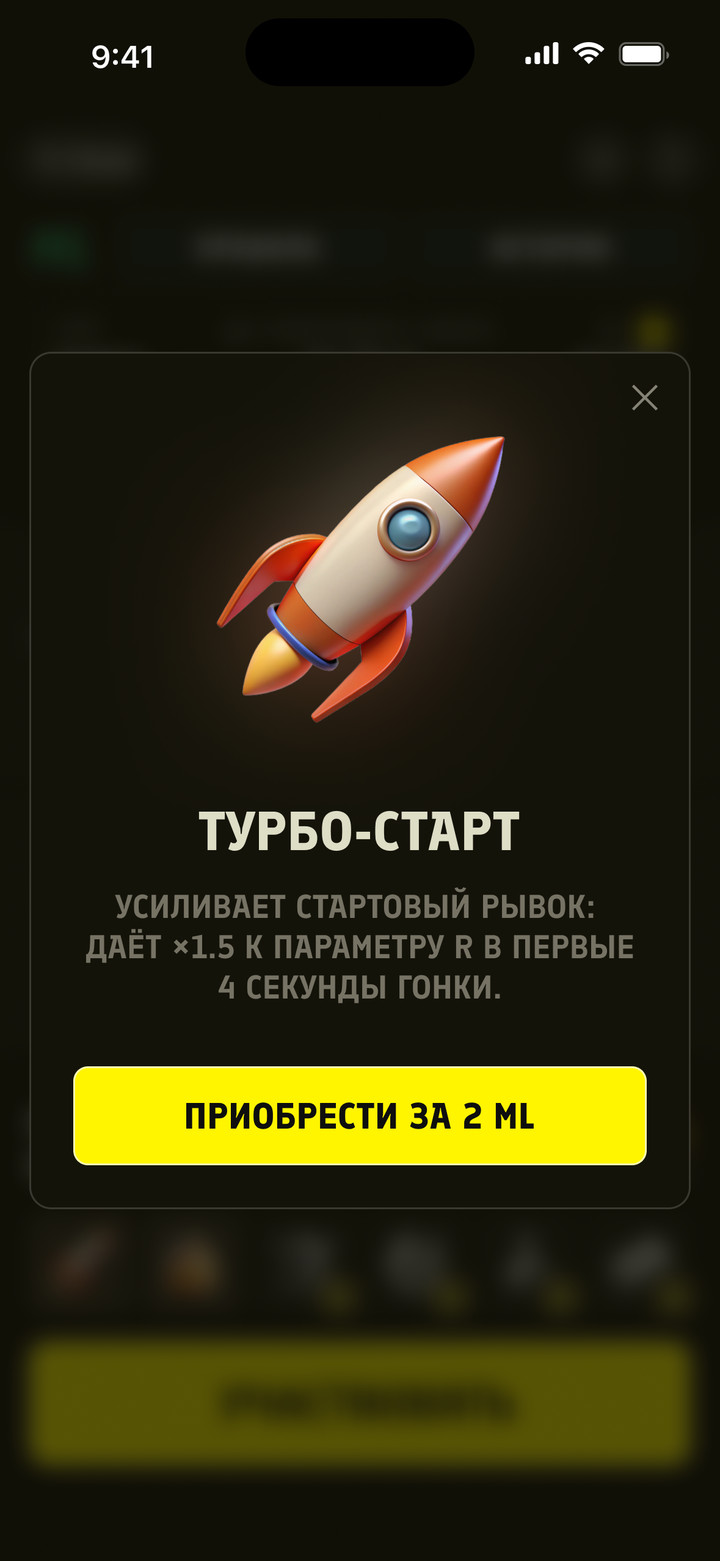
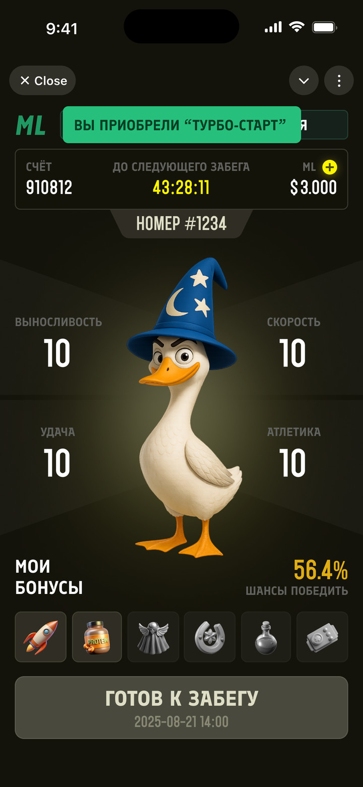
Promo game in Telegram: every hour, the geese line up for a race. Players see their chance to win, boost it with ML points and get free spins for prize places.
Chance to win, race registration, race and prizes
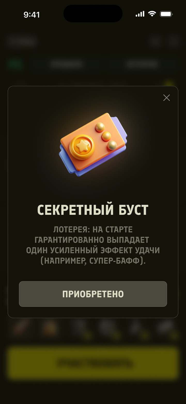
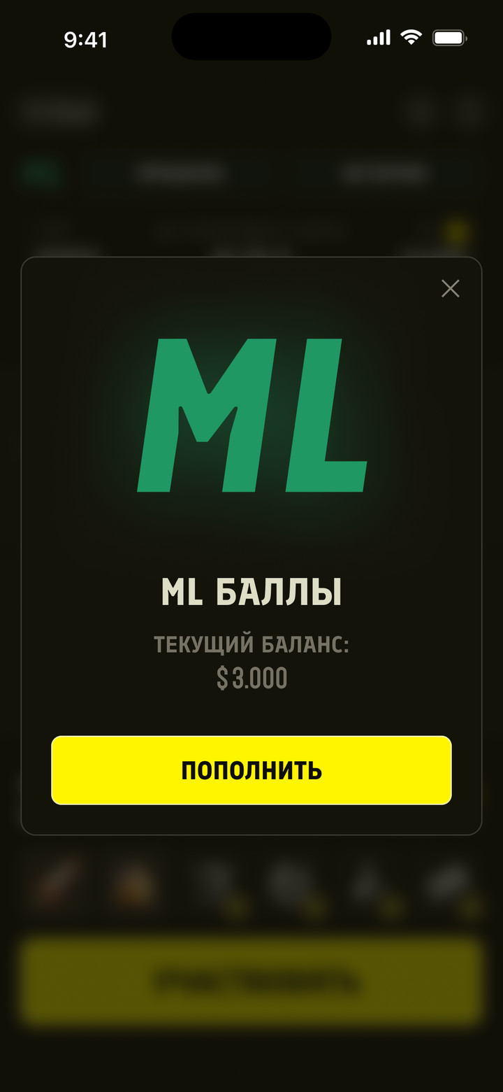
Boosts for ML points
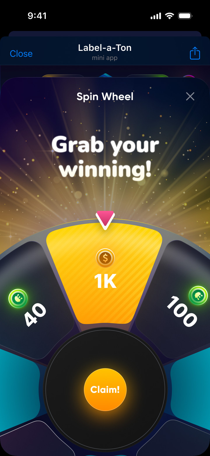
Lucky Spin
Telegram mini app
RoleUX/UI Designer
WorkFreelance
Year2025
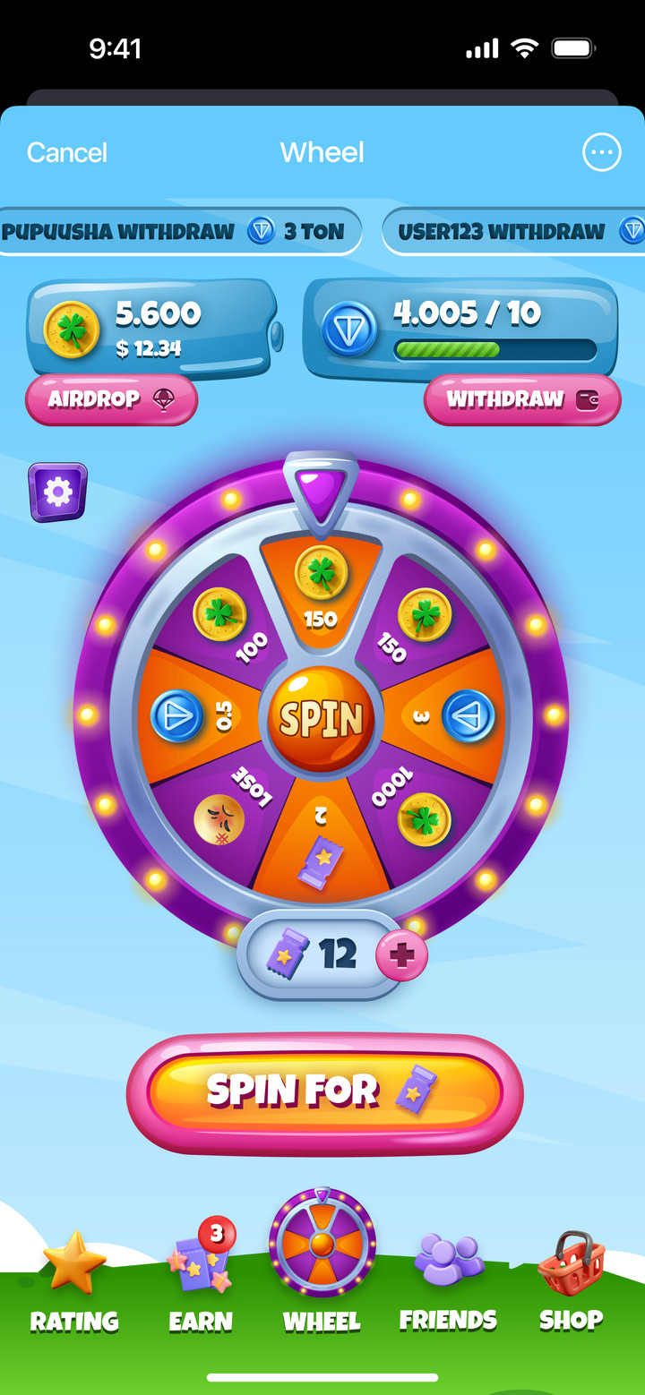
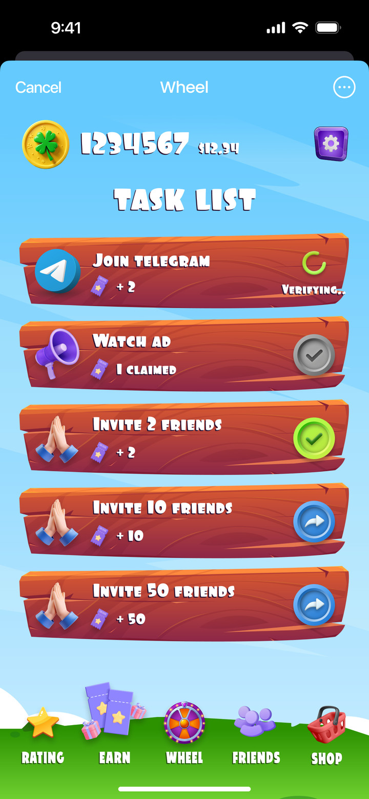
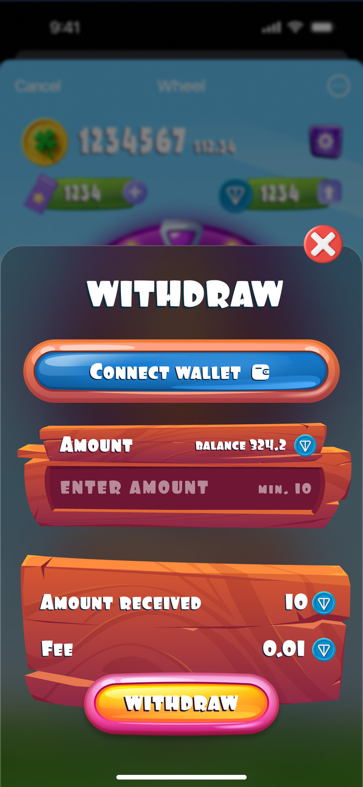
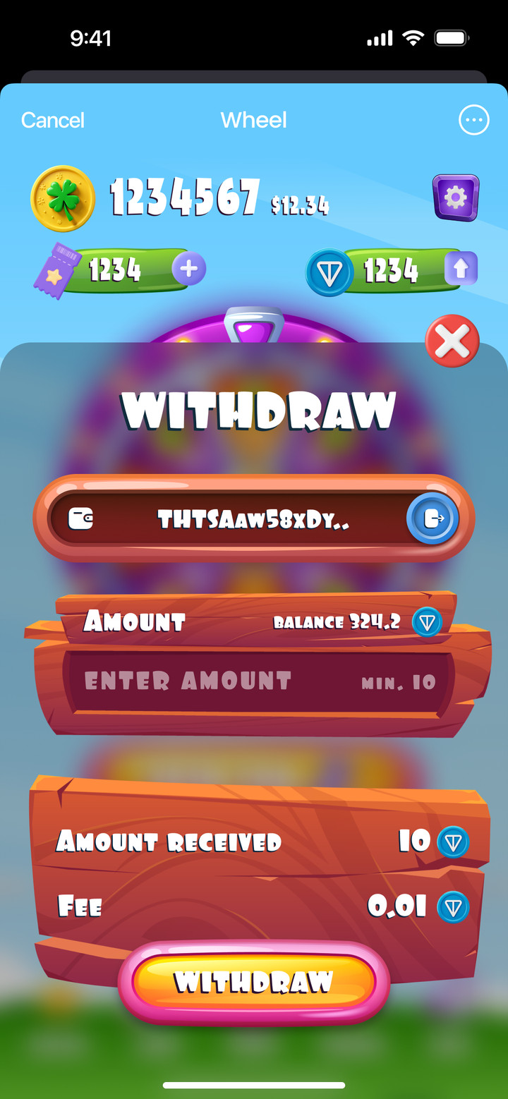
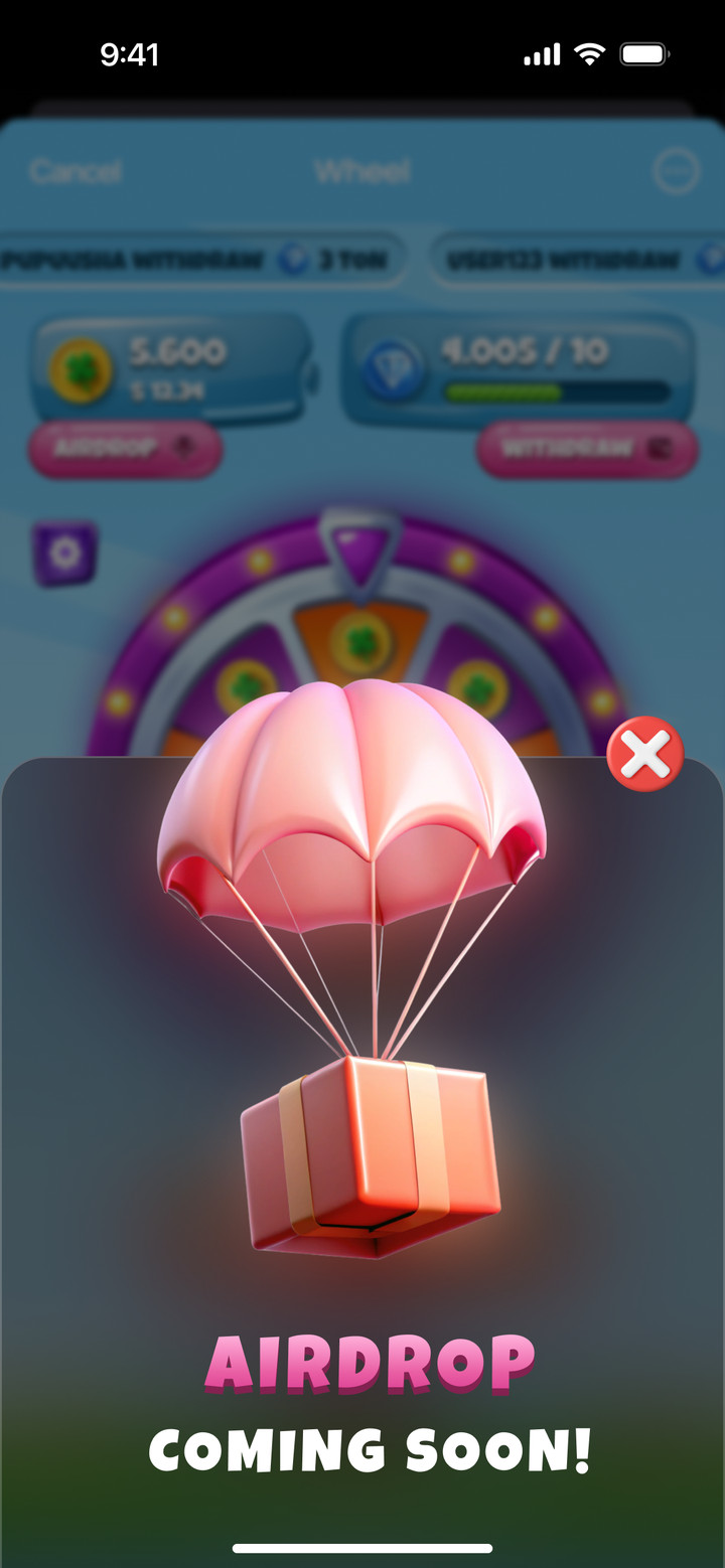
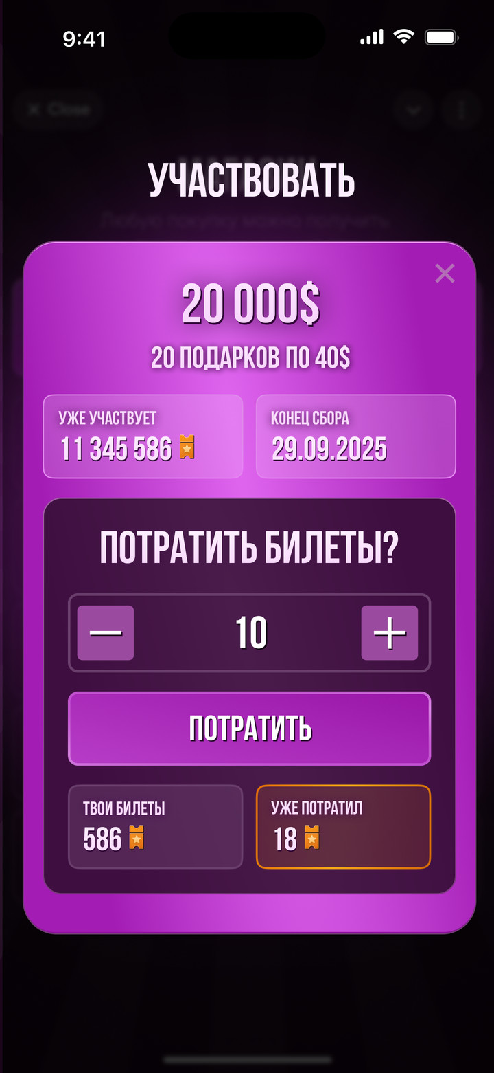
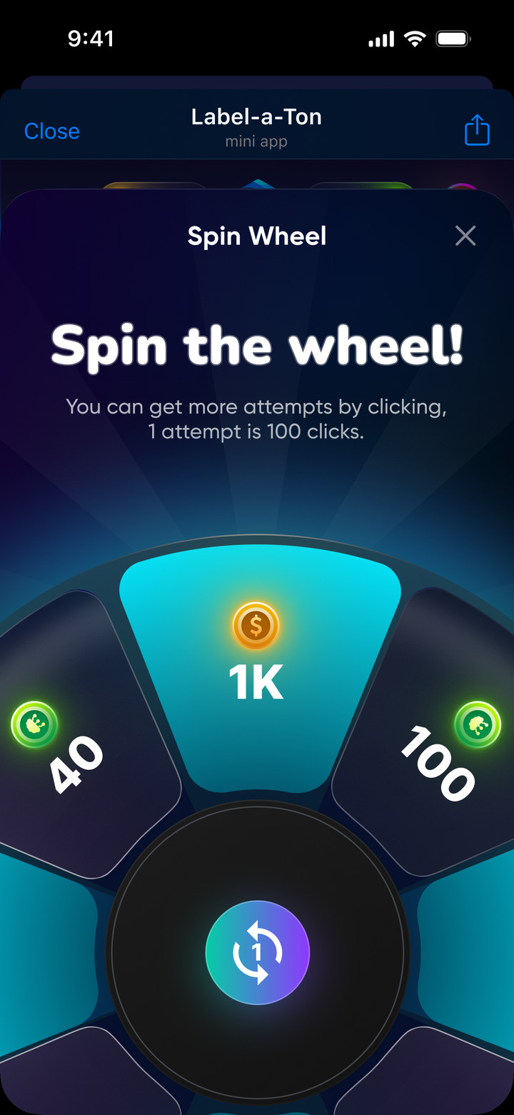
Wheel of fortune in Telegram: players earn spin tickets for tasks, collect winnings in TON and withdraw them to their wallet.
Wheel, tasks for tickets, TON withdrawal and airdrop announcement
GiftBeats
Telegram mini app
RoleProduct Designer
WorkFreelance
Years2025–2026
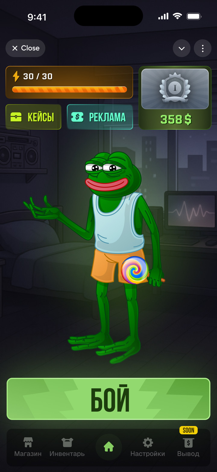
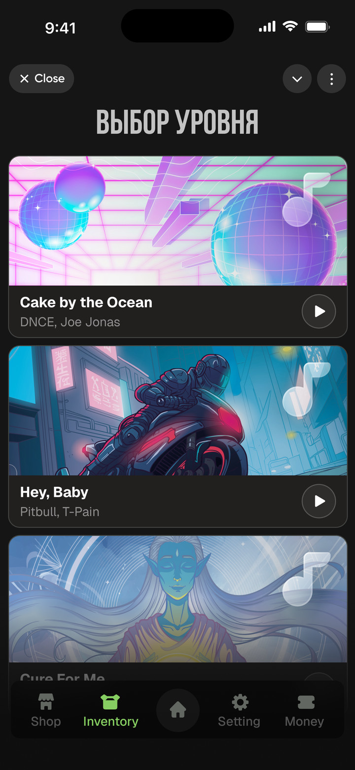
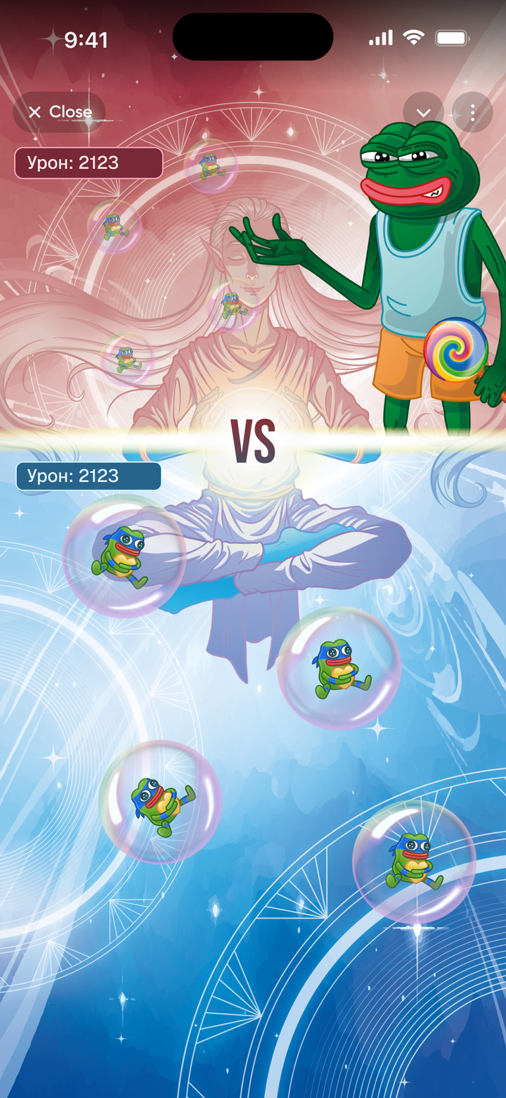
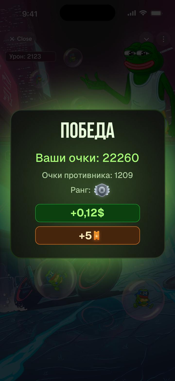
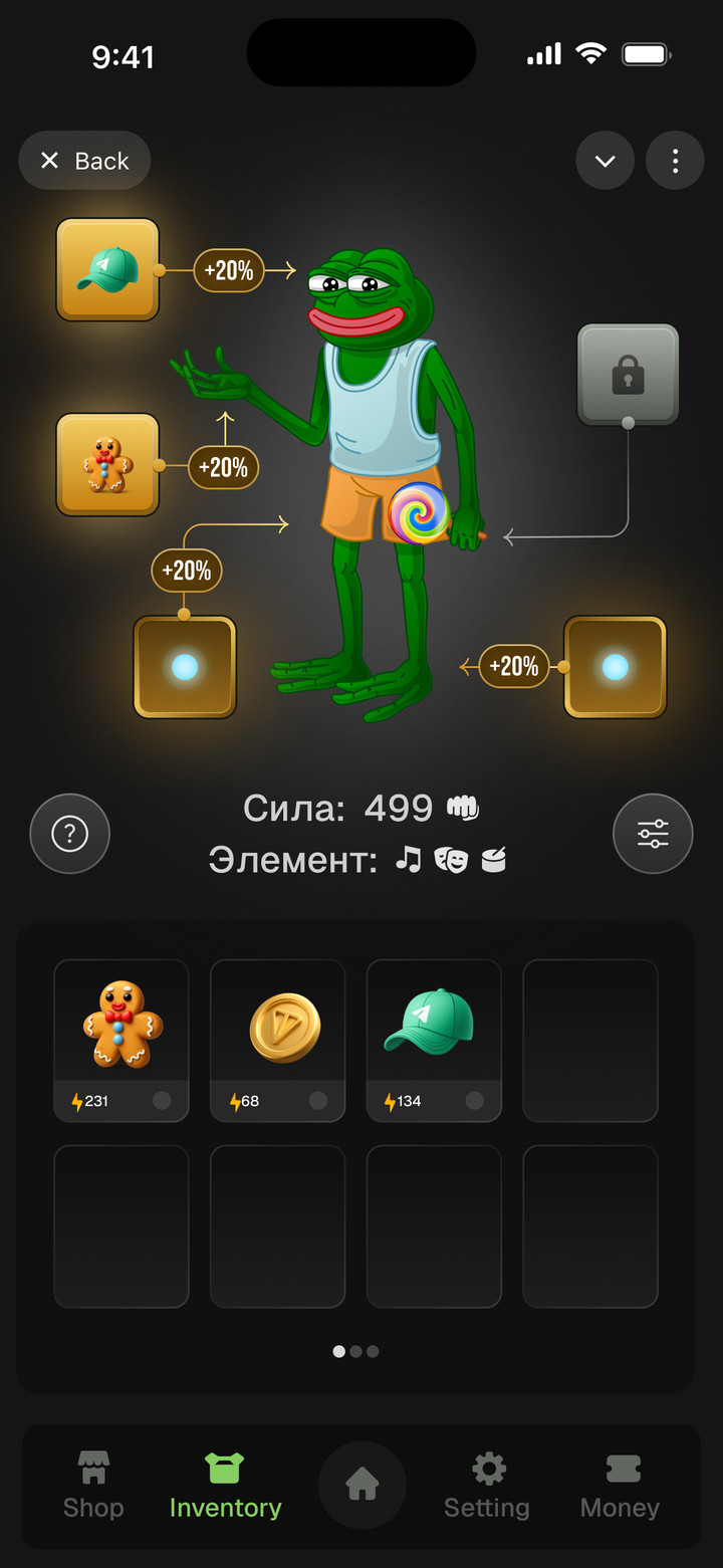
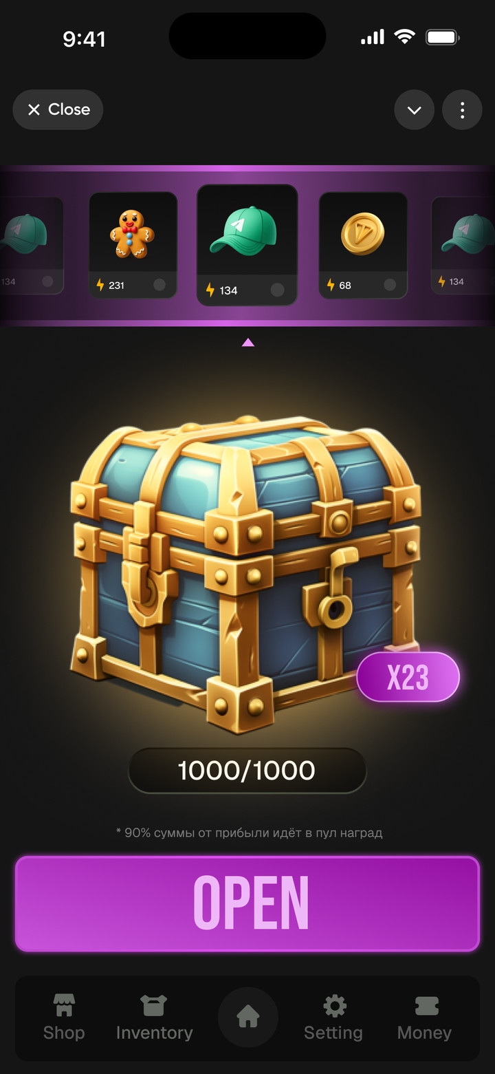
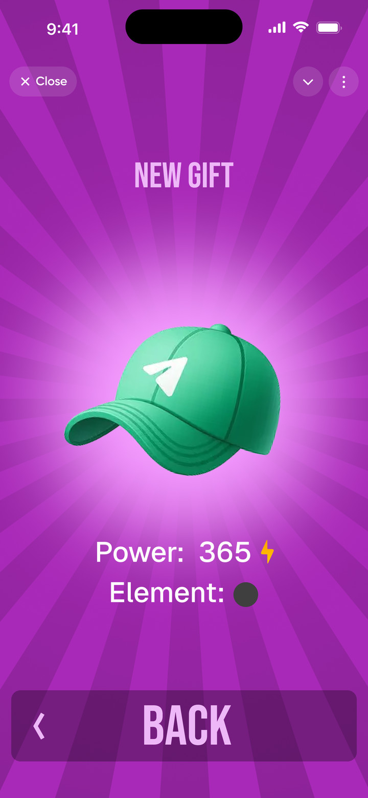
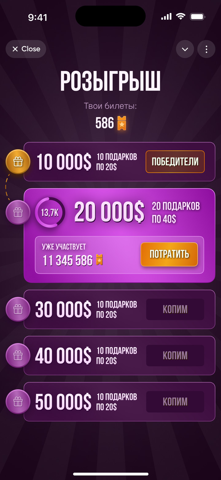
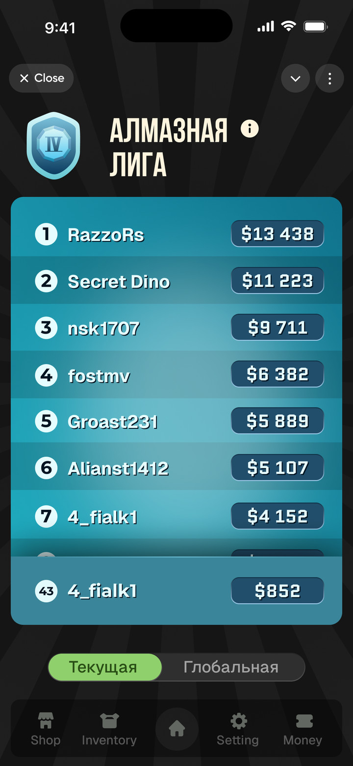
Rhythm battles in Telegram with gifts: players equip gifts, win battles and climb leagues toward a prize pool. Gifts drop from cases, and cash prizes are drawn for tickets.
Home, track selection, battle, victory and gift equipment
Cases, ticket prize draw and leagues with cash prizes
Dogiators
Telegram mini app
RoleUX/UI Designer
WorkFreelance
Year2025
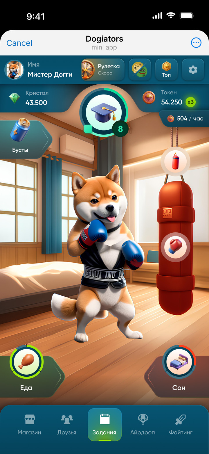
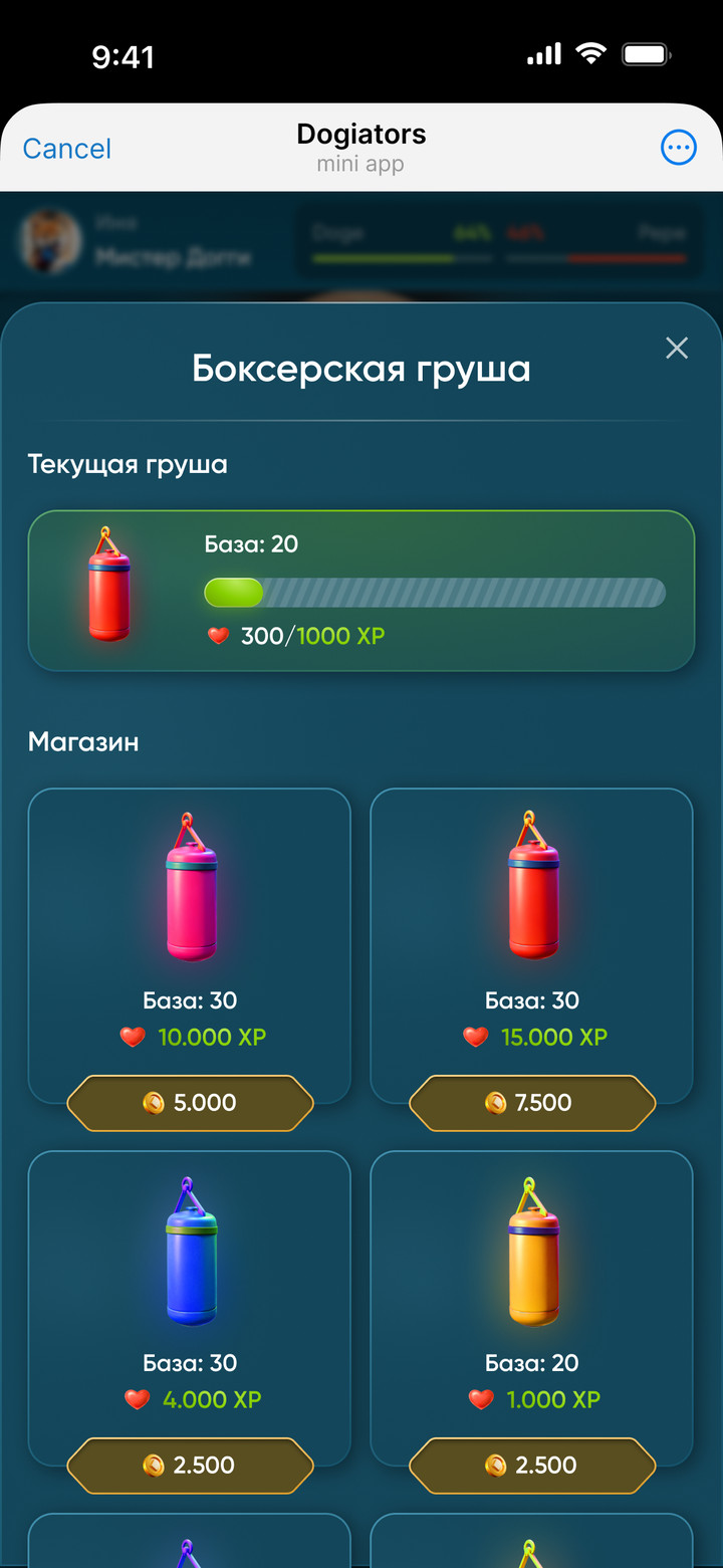
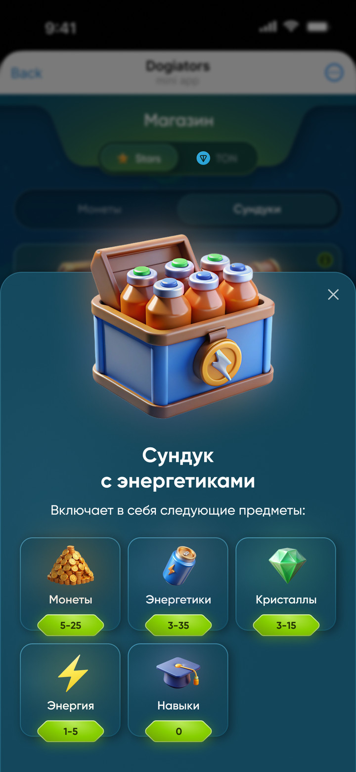
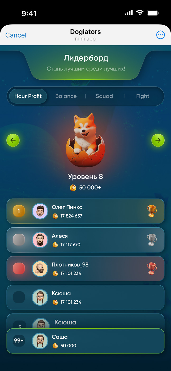
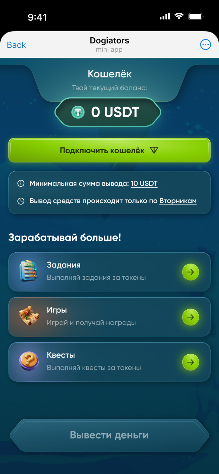
Tap-to-earn game in Telegram: players raise a fighter dog, feed it, put it to sleep, train it, take it to the arena and withdraw earnings in USDT.
Fighter, training, chest, leaderboard and USDT withdrawal
Hamster 2.0
Telegram mini app
RoleUX/UI Designer
WorkMoreThan Design Agency
Year2024
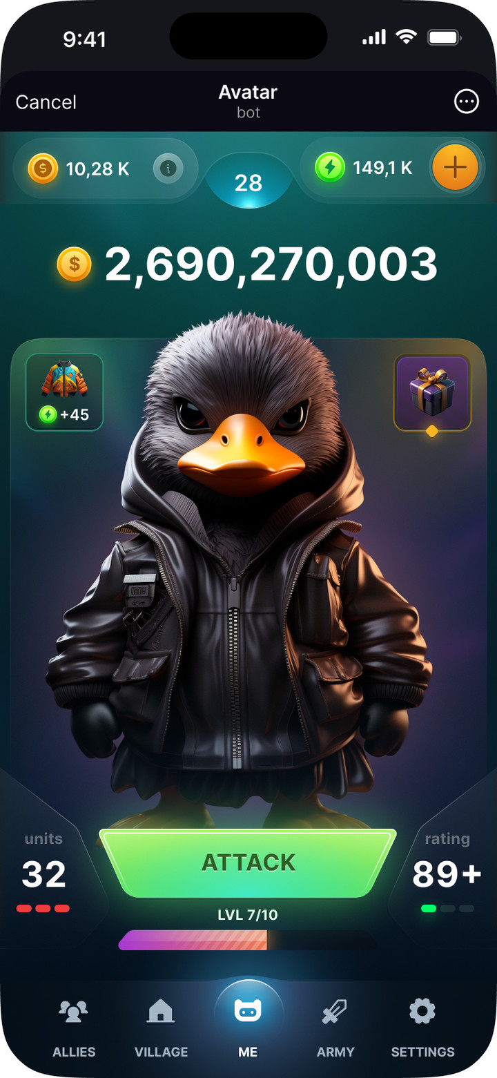
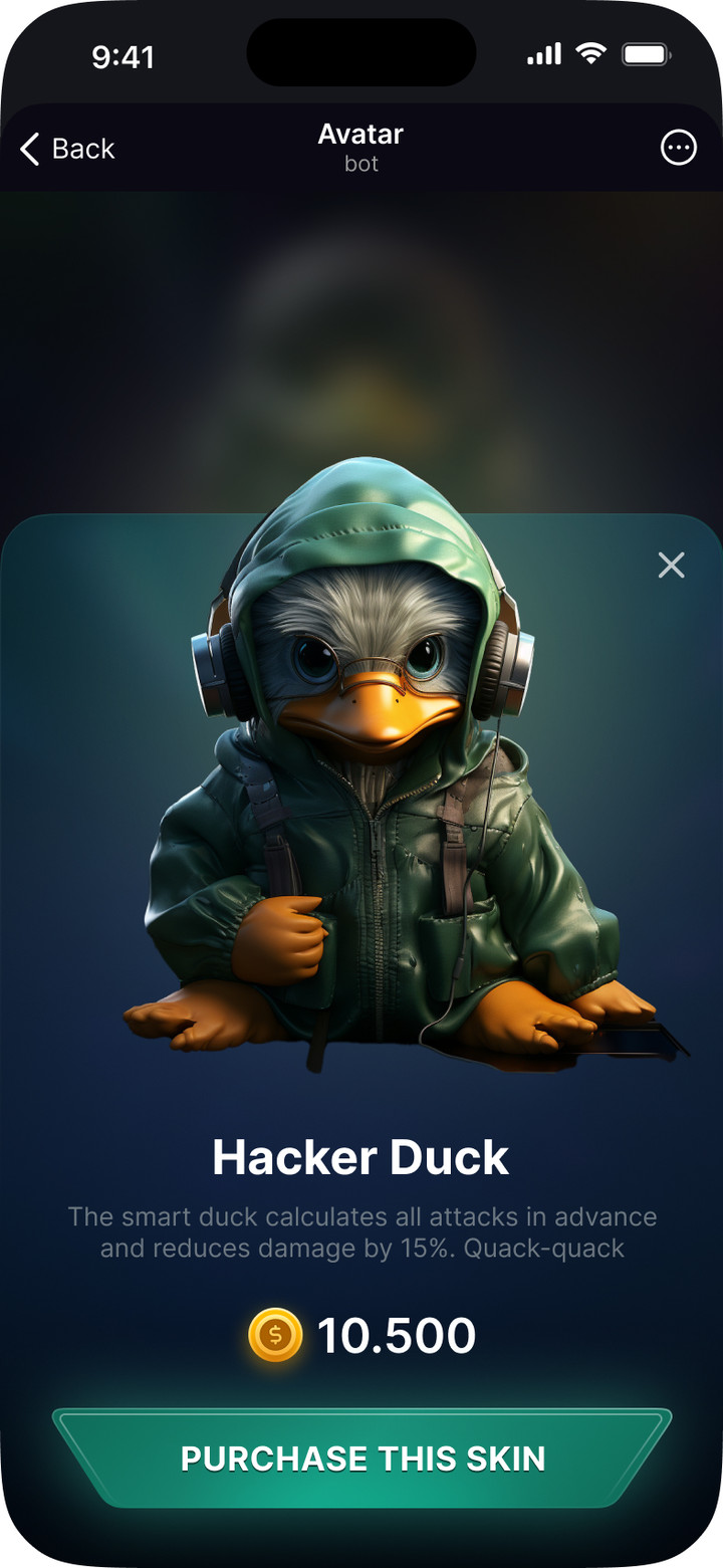
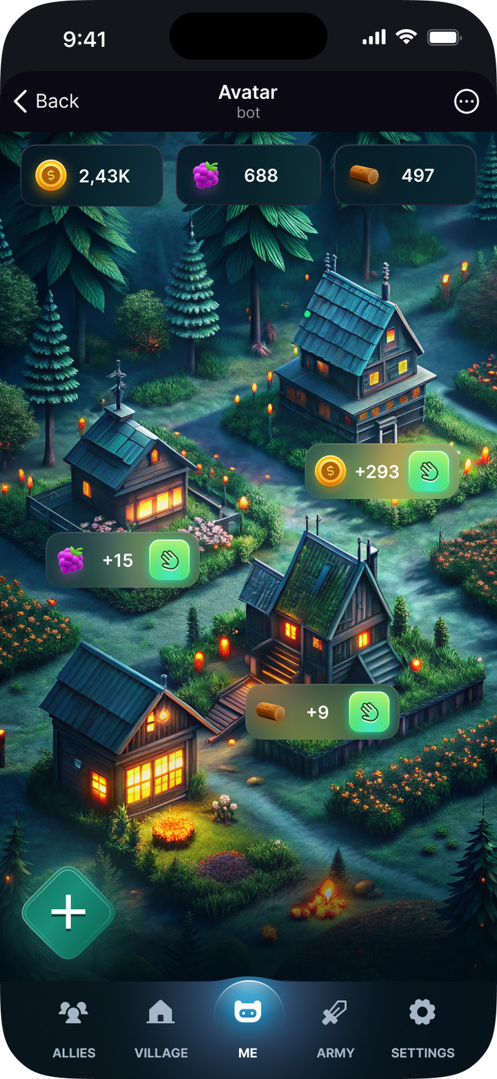
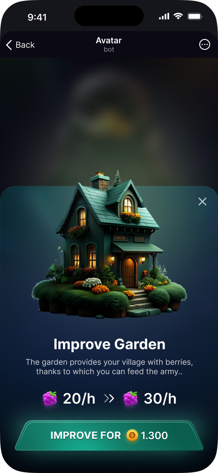
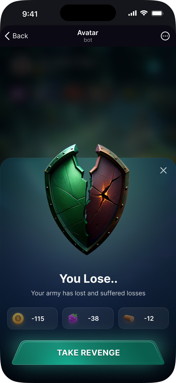
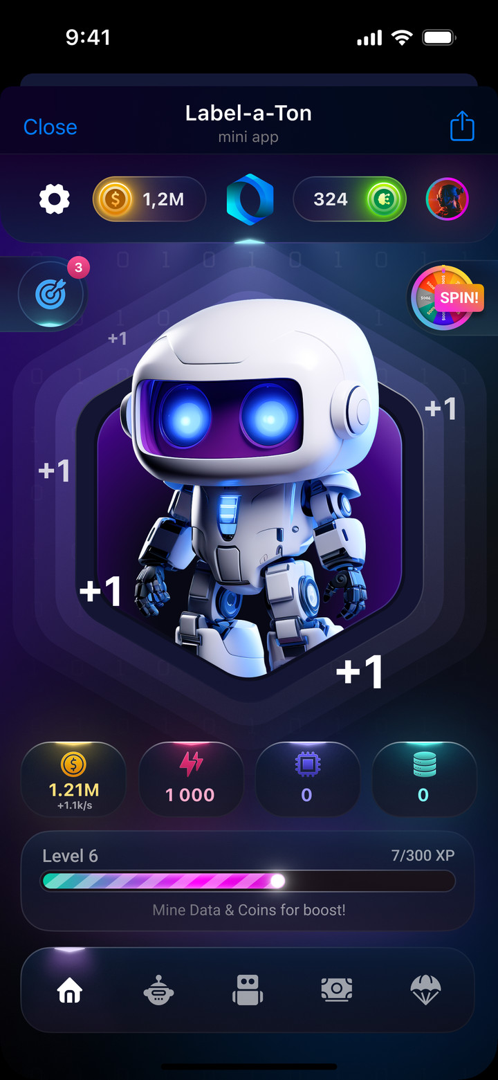
Tap-to-earn game in Telegram: a character with skins, a village with resources, alliances and an army for raids on other players.
Character, skin, village, building upgrades and raid result
Let's work together
Happy to talk about your project. I reply within a day.



 Secondary · Default
 Secondary · Disabled
 Primary · Loading
 Secondary · Loading
 M
 M · Selected
 S
 S · Selected
 Default
 With badge
 Default
 Filled
 Search · Default
 Search · Active
 Search · Typing
 Search · Typed
 Asset
 Order
 Home
 Brands
 Portfolio

 Positive
 Negative
 Pending
 Default
 Bar Tapped
 Negative Now
 Negative Weeks
 New Brand
 Success
 Error
 Info
 Info Sheet